Novel and Old Concepts
In the second entry of this series I’m hoping to explore my references and early inspirations.
I looked at lots of artists, games, and photographs from all kinds of places.
When you start a new art idea its good to look at plenty of references. You can source your idea or inspiration by mixing together existing paintings, photos, short stories, books and more. It’s also integral to look at real life photos. We aim for believable and realistic spaces and layouts (or at least I do in this project). That is even when our subjects are fantastical. As such parts of what we are about to create needs to be grounded on reality. Those parts need to have roots in what is already familiar in the viewers eyes. Then on top you sprinkle bit of the eerie, unknown, novel and bizarre.
Current Stage
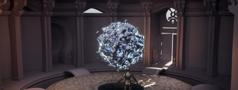
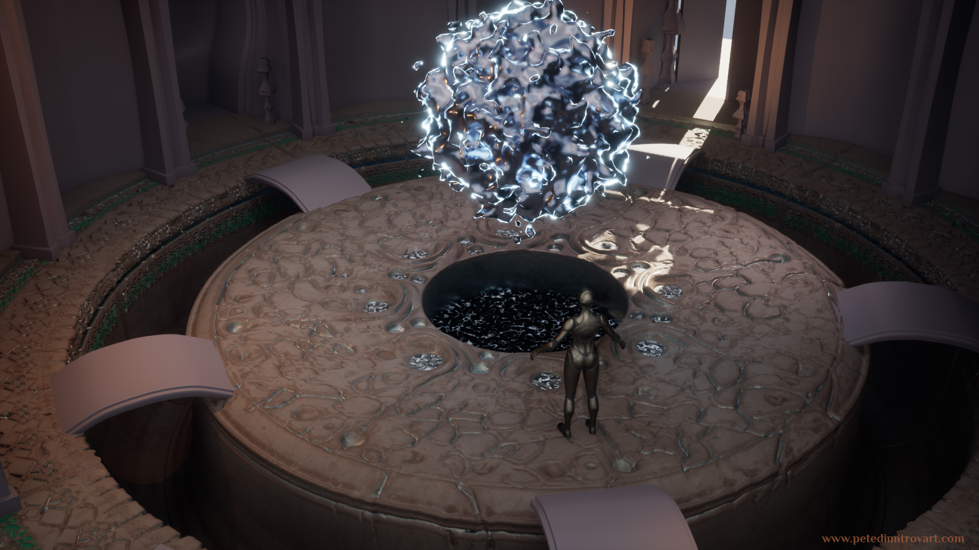
At the end of the previous blog (The Amarantos Ritual - 01 - Beginning) after figuring out my Houdini orb and that it will be the center piece of the composition and the layout, I was at this stage of the scene:
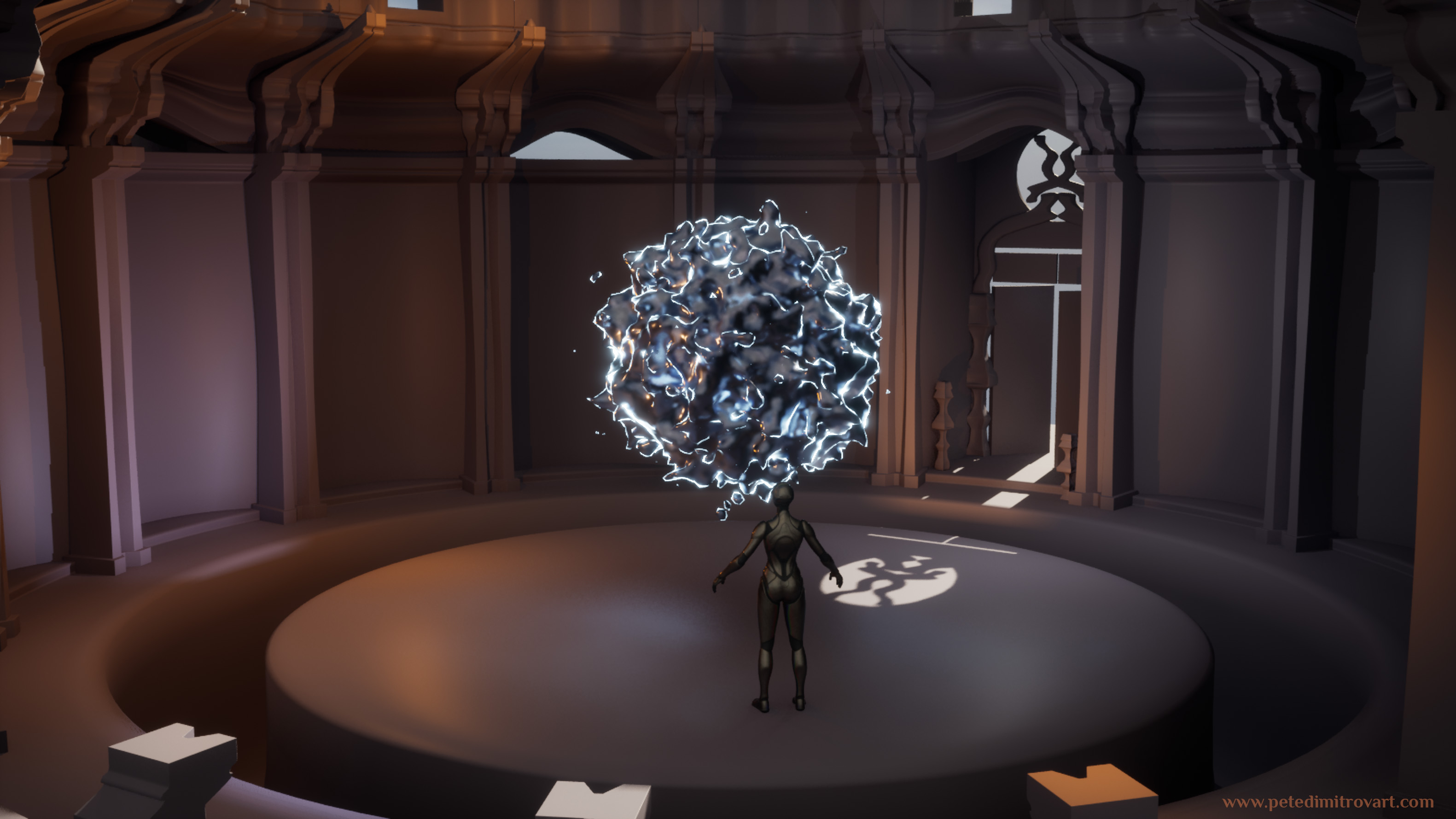
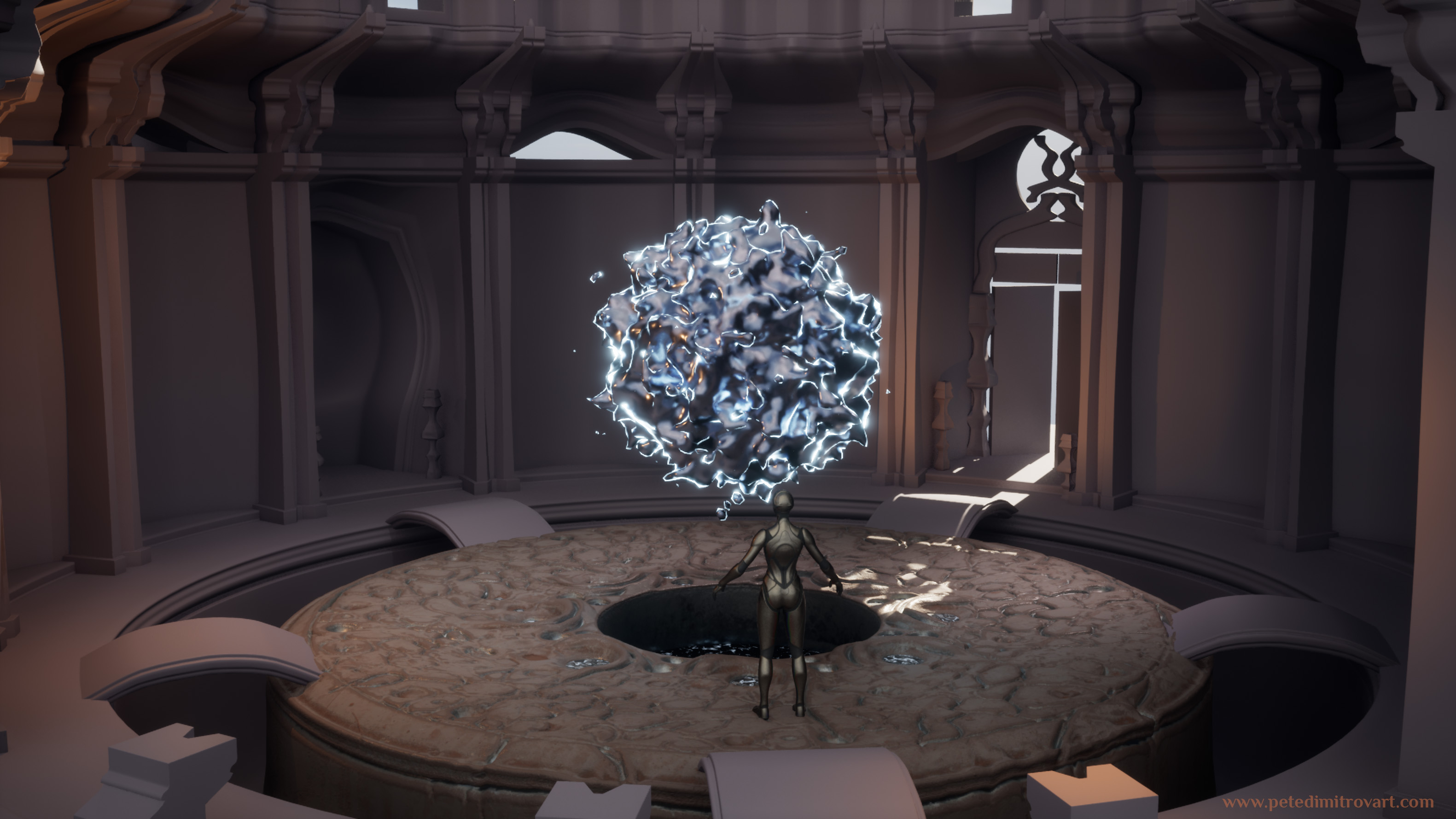
I did some further tweaks and added a little bridge platforms to connect the middle, circular platform to the outer edges of the room. In the very dead center, I cut a gap in order to place more “liquid metal” type of effect. I wanted to lead to the idea that perhaps in that basin in the middle of the room, there was an inactive substance. Few people, aliens, or some other creatures, enter the room and interact with that inactive substance. With their presence, it comes to life. It forms into the orb that then starts to float in the upper, middle point, space of the large room.
As you perhaps remember from the last entry, I really wanted to lead towards the idea of a ritual happening in this space. The creatures that enter the room bring the orb to life. They perhaps worship it, fear it, but are also astonished by it. Does it bring them energy? Food? Pleasure?
What is the relationship between these characters and this “inanimate” object that the next moment seems to come to life and be lively?
When I start new scenes, or any other type of art, I usually make up a few sentences that form a story. The moment I have that I start to ask questions. Those questions are very much like the ones above. They help me refine and see more than what there is at first in my mind. They help me make a 3D space that is more believable, interesting and rich in story.
That is an exercise I think you should try yourself. Whenever you create a layout, ask yourself why its the way it is? When you place props, ask yourself why they are there and what their relation to other objects around them is? Ask how you can tie up one item to another so they look more coherent?
Before diving into more screenshots inside this 3D space, lets take a step back. As mentioned in the start of this entry, I want to include my references and early influences behind the art.
References
I use PureRef to put all of my reference images in one place. I like using this piece of software because it’s very lightweight. Some people use Miro which has a similar idea but more annotation tools, sticky notes and other cool features. I’ve found that PureRef is easier on the RAM than having a webpage open or using the Miro desktop software.
On my ref board I make sure to mix plenty of 2D art, 3D art but also real life photographs.
When it comes to ref boards, this one above I would rate as a relatively tiny. In most of my previous projects I’ve went through many more bundles of subjects and pictures and usually my boards expand much more than this.
I think in the creation of this scene I’ve been more controlled on the scope of the pieces I want to capture and create. As such that is also reflected in my ref board.
Another thing to mention is that in the board above in some spots there are screenshots from the project itself. I like to screen cap where I am and put it right next to the reference in order to compare.
Initial Goals
Lets zoom in on some parts of the board above and see things further in detail.
I want to tell you about the artists that inspired me and credit them properly in here.
I don’t personally know any of them but their work is brilliant.
Before getting into this current ritual project I had spent a long while in another block out I was creating in Unreal Engine 5. It was the test scene where I transitioned from UE4 to UE5 and learned the intricacies of UE5s Nanite and Lumen. That project itself was in an “Early Preview” build of UE5 and had lots of issues and crashes. I never uploaded any screenshots from it, but at some point I might revisit it.
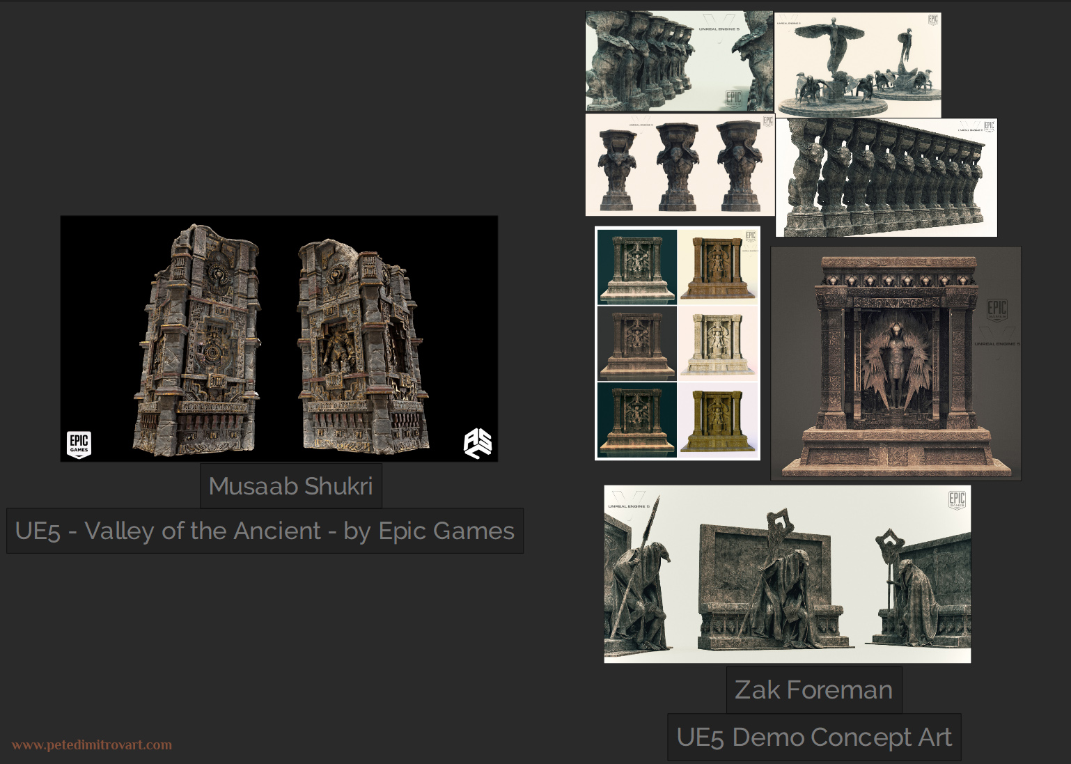
Before I got my hands on Early UE5, official demos such as “Lumen in the Land of Nanite”, then later “Valley of the Ancient” and “City Sample (The Matrix Awakens: An Unreal ENgine 5 Experience)” released. After reading official docs about Nanite and seeing the sculpts and works in those demos I put a goal for my project. That was to try and create sculpts that are as dense and details as some of the assets seen in there.
With that in mind, I came across the artworks in the image above. The left image, for example, is a sculpt by Musaab Shukri done exactly for the UE5 demo “Valley of the Ancient”. Work for Epic Games.
Images to the right are concepts by Zak Foreman. Those are again for the same demos. It depicts the visual fidelity and detail richness that Nanite could pull off.
Having realized these will be my visual fidelity goals, I set forward to find some real life photographs again. Some real spaces to get inspired from even further.
The Diwan-i-Khas (India)
The Diwan-i-Khas (Red Fort), or Hall of Private Audiences is a location in India that I found lots of inspiration in. It’s not hard to see the resemblance in the intricate carvings here when compared to the previous UE5 demos artworks we saw.
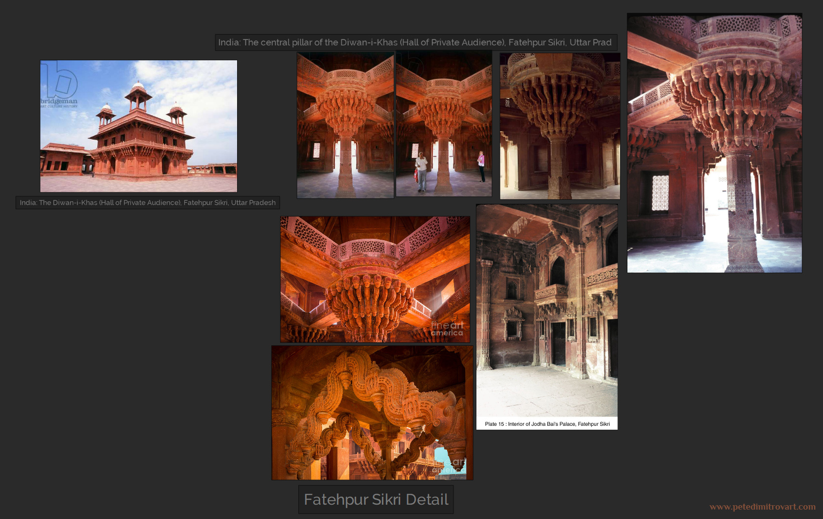
From the very early blockouts I had, I didn’t really plan to head towards red stone look like the above. I still thought that the carvings are amazing reference for the sculpts I had yet to create. Also for any texture work that would go on top.
Circular Rooms
I also pinned on my board some old, random photos of different circular rooms. I wanted a radial room after all, so I knew I should look at some from the get go.
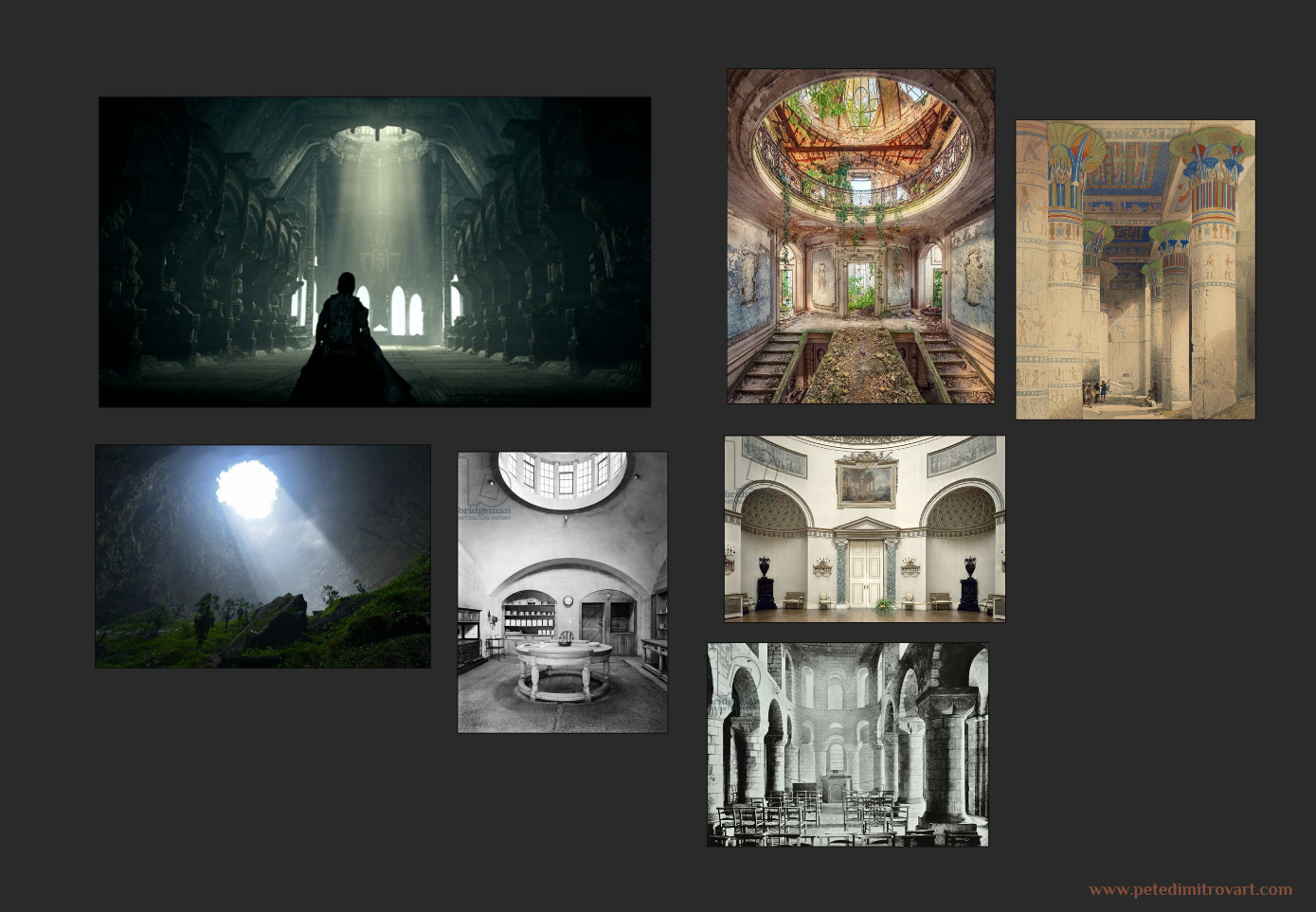
I was looking at different spaces that have above light leaking in and creating nice god rays. When showing my very early blockouts to some friends, they all mentioned “Shadow of the Colossus” as a game that has very impressive interior shots with lighting just like that one. I’ve not played the game myself yet, but I knew I had to put those nice screenshots from it on my moodboard.
Star Wars Jedi: Fallen Order
When I’m creating a project I always have immediate influence from the games I am playing at the time. In this case I was playing through Star Wars Jedi: Fallen Order when creating parts of this environment. These screenshots from the game came into the board relatively late. Yet they (and the game) had a big influence on some of the decision making I took. It also helped me solve some visual issues I had and introduce more details like crack decals on the walls.
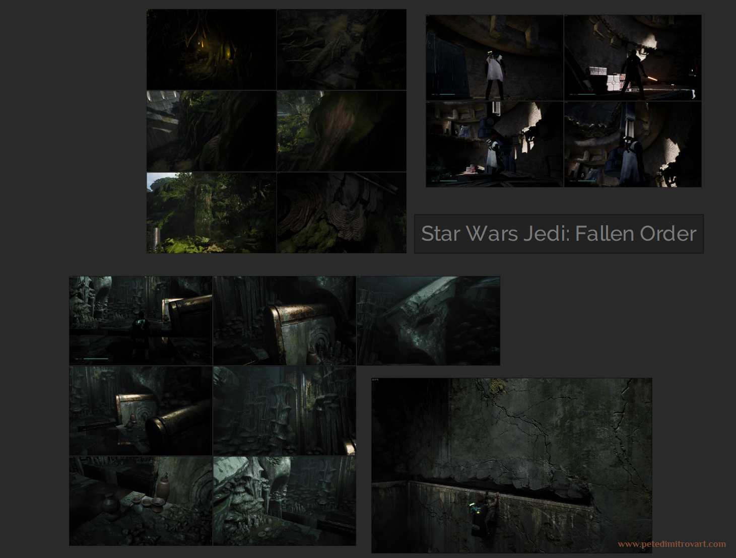
I particularly looked at this section of the images, seen below:
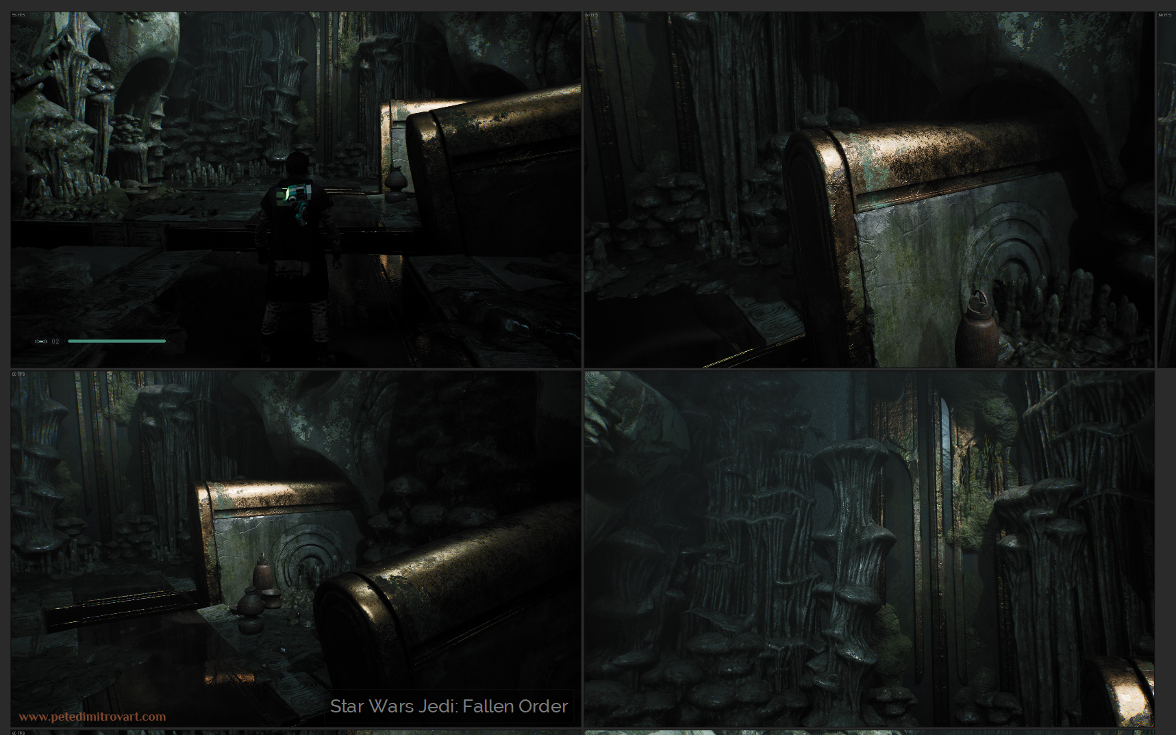
I looked at the decal work and base texturing here and found lots of inspiration. Later on I needed more props to populated my empty spaces with, and after being inspired by Jedi I created ground dirt scatter piece as well as a set of pots - some intact, some smashed into pieces. I will showcase these later on.
Collaborators
Later through the project I had the pleasure to be inspired and helped by few more artists. Those are some of my friends and their influence here was direct.
Hayley Rumbold joined me in the creation of this project as a collaborator and a Cinematic Artist.
Oliver Harbour did concept paint overs + few original pieces.
Sophie Deschamps gave me feedback a long the way and did a paint over as well.
Phil Cockburn left me lots and lots of tips and feedback through it all too.
I wanted to mention them now though I will show you the works they created and the amazing influence they had in more detail inside the next blog entries.
Initial Assets
Having seen most of the reference images, we could step back now and see some of the first blockout shapes I made in Blender.
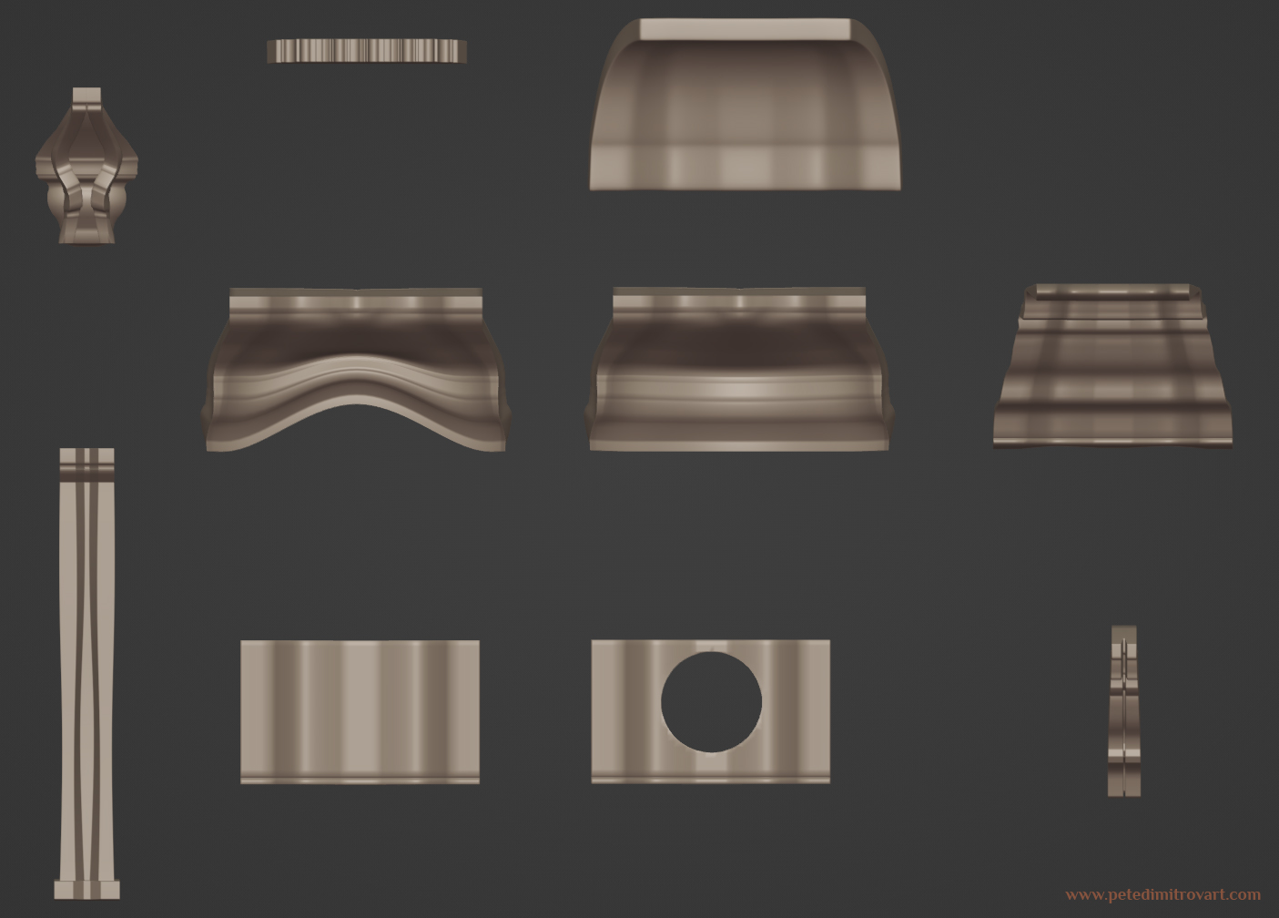
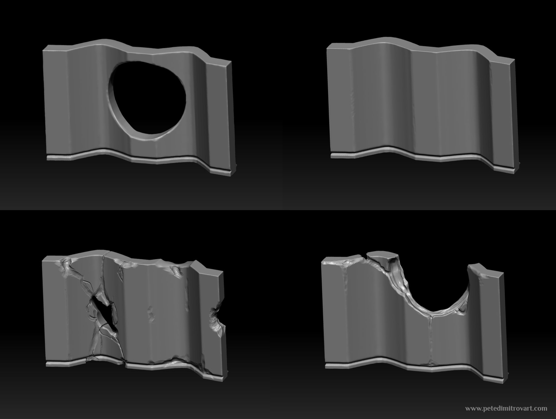
These are some of the pieces I initially made and blocked out the scene. Some artists use Zbrush to block out pieces like that. I prefer to make these using a subdivision workflow, directly in Blender. I start by extruding a cube around and then beveling it in such a way that when I apply a Catmull-Clark subdivision on top, I get smooth, but not overly smooth shapes.
I make an absolute mess of the geometry. In some cases I insert lots of ngons (not seen in many obvious places here, but I still do). When using Catmull-Clark I don’t really care about my geometry flow mainly because I know the algorithm will make all of it into quads by the end when applied. If those quads follow awful edge loops, I frankly don’t mind. I don’t because I know that what I am making is then directly going into Zbrush. Once in there I will Dynamesh to get my to a density of geometry I like. When I do that any bad edge loops and flows gets retopologized to something much better.
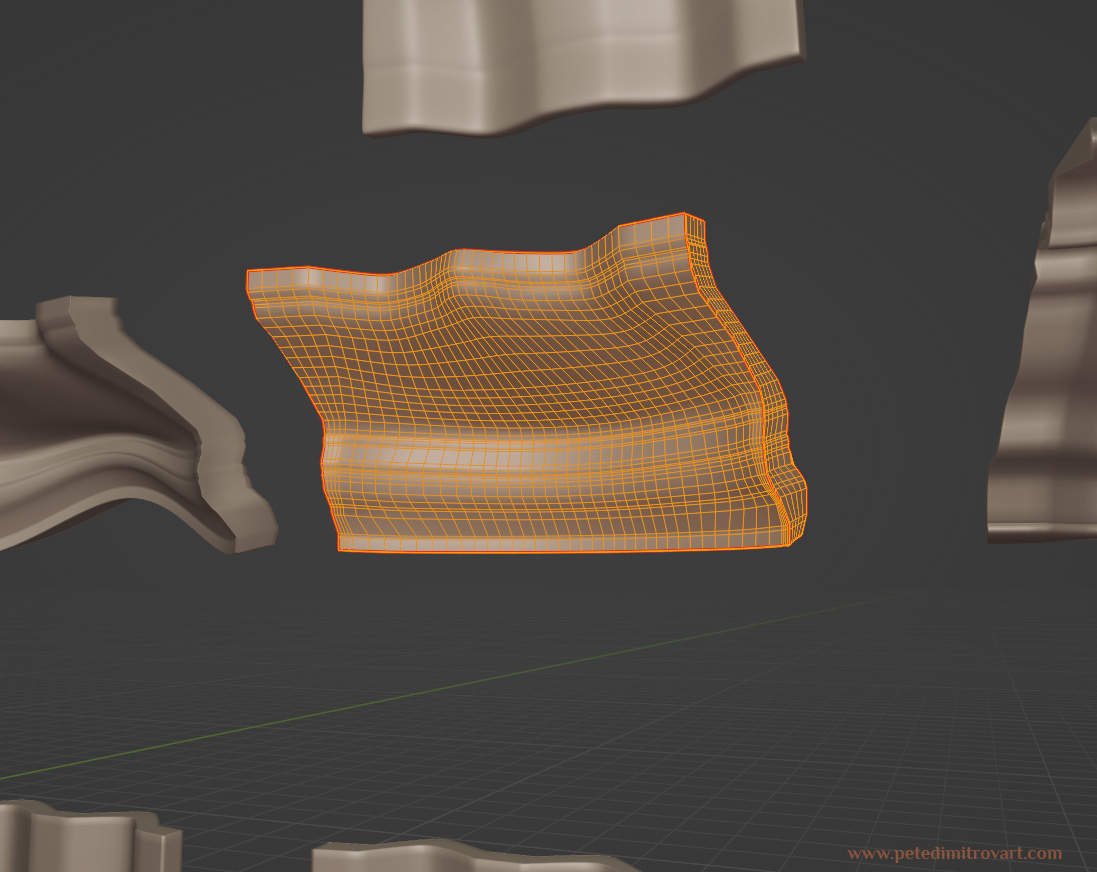
Here is an example of a resulting topology (image above). One that actually is pretty clean compared to some of the descriptions I wrote above, that happen most of the time.
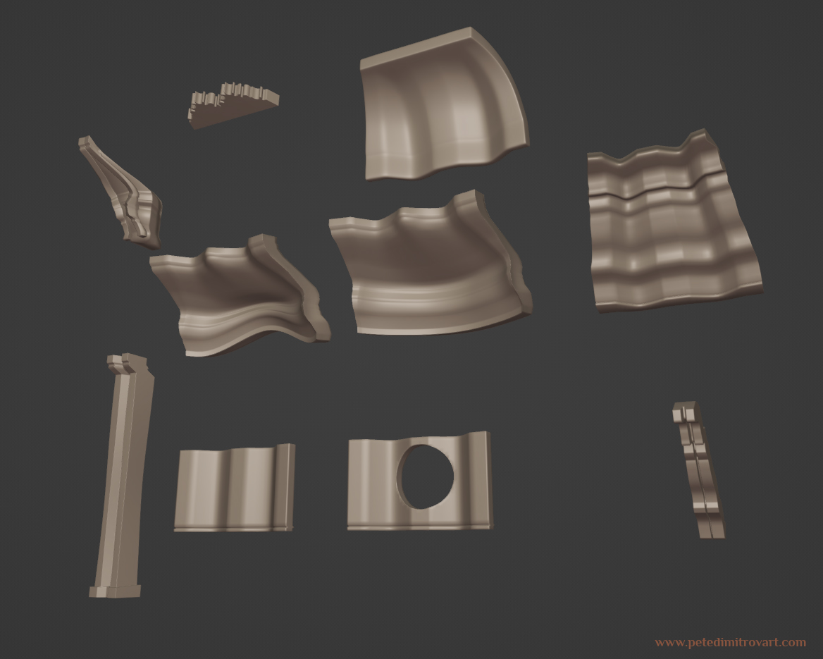
Some of the walls I later duplicated a few times in Blender:
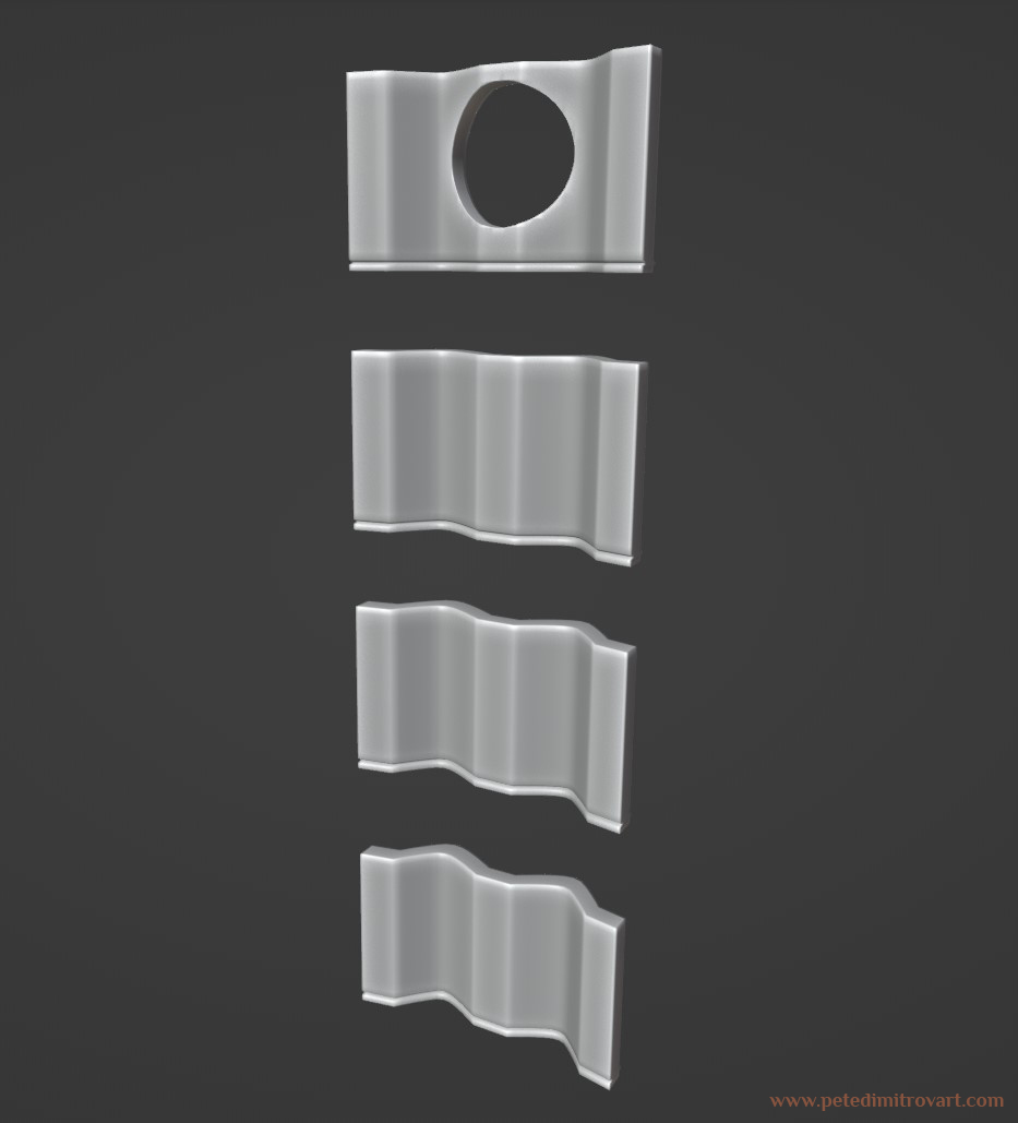
To then as described above take into Zbrush:
Where I refined my geometry, made topology that can hold good brush stokes and then detailed on top to get me to more finalized assets.
As this all is an exercise in Nanite, I was not scared to be dense in topology and detail. I tried to make silhouettes rich in detail where the cracks and damages are. In some of the other wall pieces, I stamped stencil details in the form of writings, symbols and ritualistic stone carvings. I didn’t want to rely on baking those down onto a lower poly, but instead use Decimation Master in Zbrush to get me to a lower dense poly, suitable for Nanite (as in being 150-200k tris. Even though Nanite could totally handle keeping some of the sculpts at 2-3m tris, it proved to be pointless and not add much detail).
Platform Sculpts
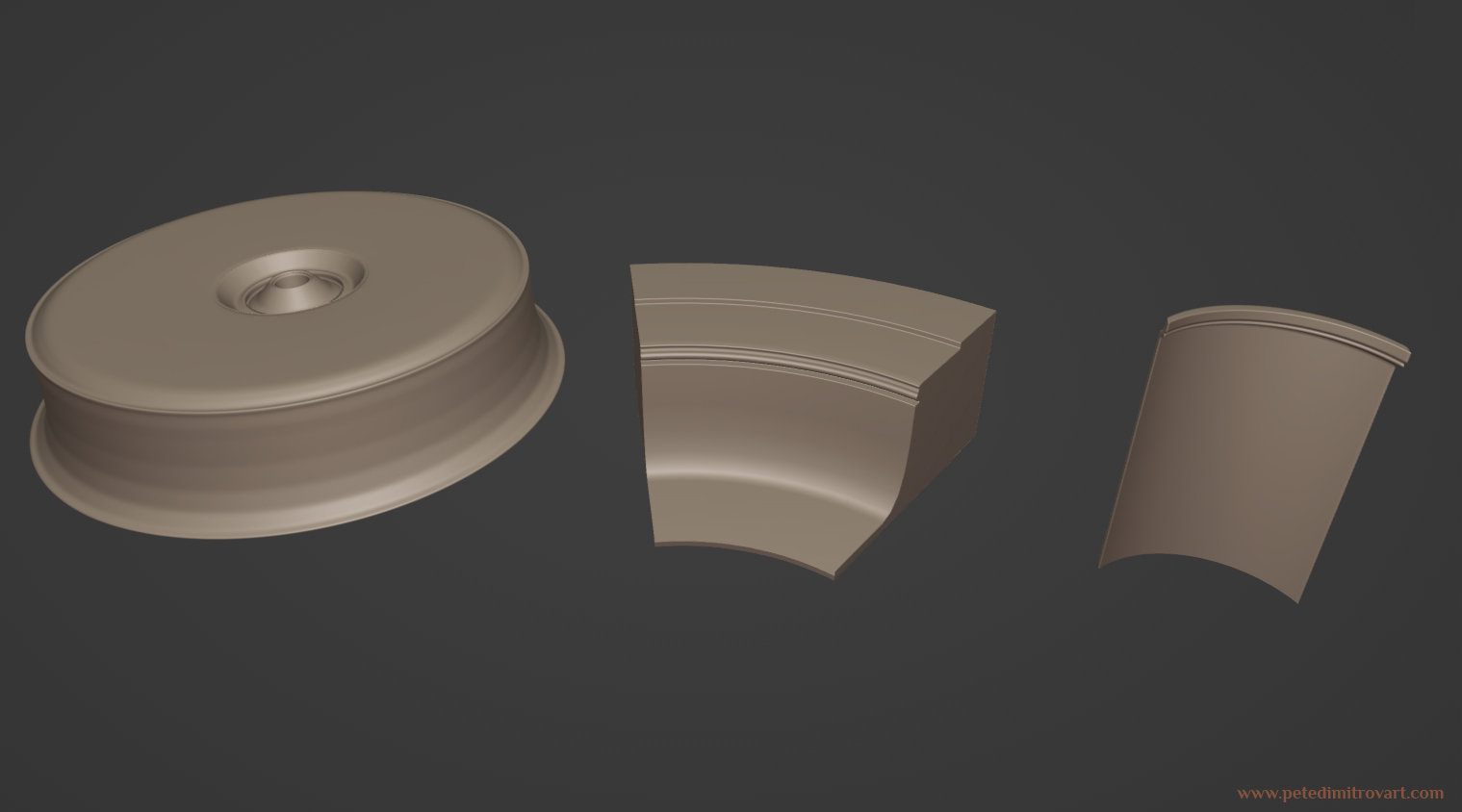
My platform in the very center of the middle, I kept as one big shape. That is the first prop seen in the Blender screenshots above. Keeping it one big shape might sound a bit insane because it might be incredibly hard to keep high texel density even on 4k textures. That’s given how large the entire piece is. As such I briefly considered making a pie cut 1/4 of it, to then rotate by copying 3 more times and getting me the entire circle. I decided against that mainly for one reason: I knew I will create a dense Nanite mesh. As such I knew that most of my detail will sit in the geometry itself. If on top a slightly lower density albedo texture went, I decided it would not be a problem. Sculpting details on a platform this large on top, would also be quite fun.
For the outer ring platform that wraps around that same platform, I decided to use the “pie cut” approach. I did that mainly because with its radius going further out the main platform, its cover area increased. I wasn’t scared of the texel density (though at that point I should have been) but more of the chore that sculpting such a giant piece would turn into, if I were to keep the entire ring a unique prop, instead of a pie cut. As such I made it into a “modular” cut and duplicated it many times in the scene, rotating it about, building up the rooms floor.
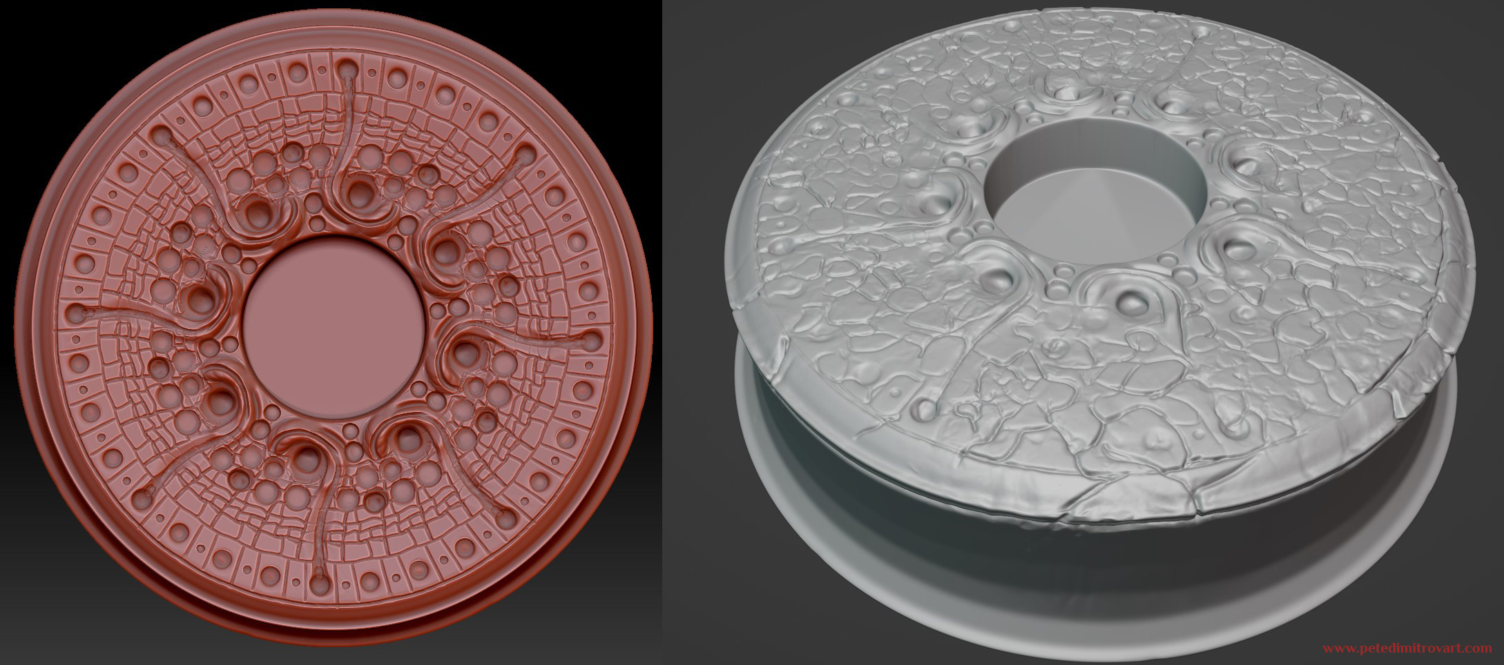
The above image was the first sculpt I did on the platform right after I took it into Zbrush. Going back to that talk about “familiar vs novel” right at the start of this blog, with this sculpt I later started to worry that the swirling, circular motives looked too alien. They are nice in an “alien crop circles” kind of way. But are they perhaps too abstract for this scene? Making everything look too smooth, too fudged and non-concrete?
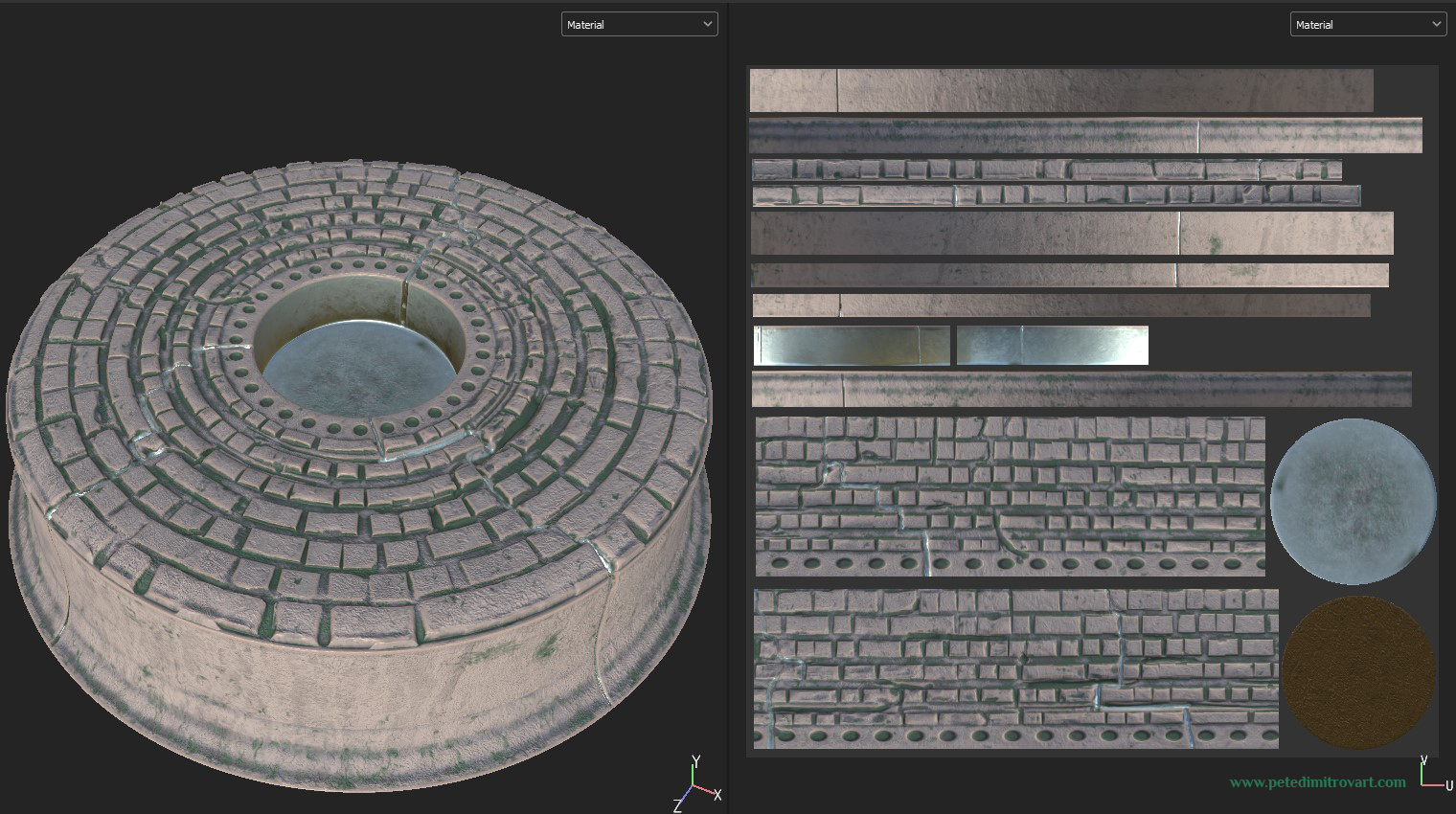
As such I went back and sculpted it once more. This time around keeping a certain array of circles towards the middle, but in the outer parts giving a more structured, brick appearance. Seen in the image above.
Scene Shots
Looking at the platform in the context of the scene:
Above is the old version. Below is the new one. I also put in some scene lights recolors and texture recolors to give everything a more controlled and realistic appearance.
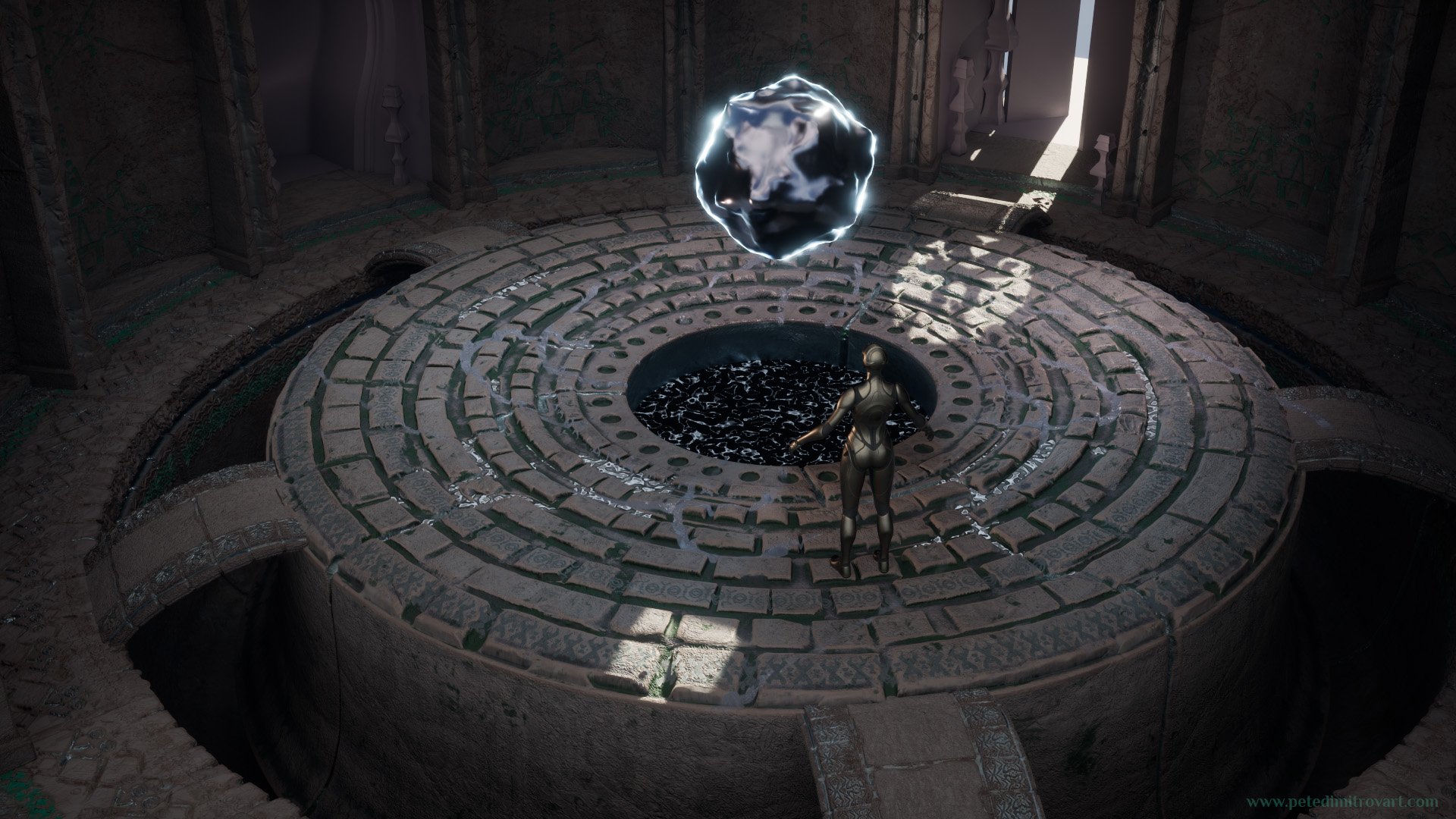
Zoomed in towards the middle, we can inspect the platform and the “darkness basin” in the middle too:
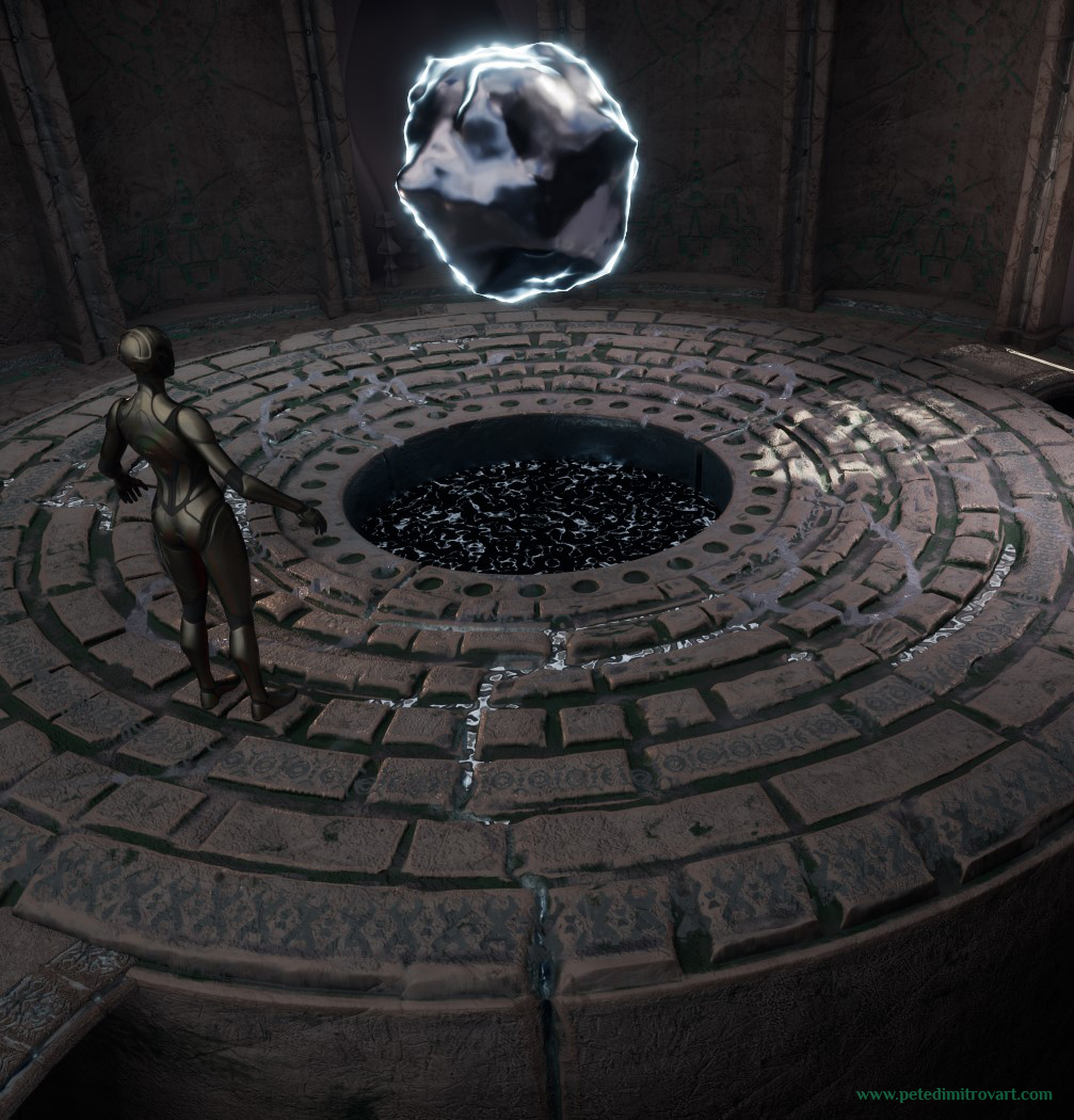
In the gaps of the bricks I put in flat planes. On those I added a liquid metal texture. At some point I was imagining the idea of cutting little canals going from the middle basin towards the outsides of the platform. In those canals liquid full of white stars would flow.
I thought its an interesting idea but I later abandoned it as I was worried that after introducing some other details on the outskirts of the scene, having black and white, high contrast, liquid in the cracks of the platforms proved to introduce visual clutter. It was making the scene fall a part more than it was tying it together or the novelty of the idea was worth.
In the next blog post we will look at the upper parts of the scene. We will inspect all of the wall and dome pieces seen in the Blender screenshots above which I used to create the higher parts of the scene.
I also revamped the pillars, just the way I reworked the middle platform above. I gave them more structure, carved runes and interest.
I hope you enjoyed seeing all of this,
Pete.
If you enjoyed this blog post, consider subscribing in the form below. That way you will get a notification the next time I publish a new blog.