Foreword - New Website Feature
Before diving into the art analysis and the showcase of the project progress, I wanted to take a moment to mention a new implementation.
With the help of my brother Miroslav, I’ve integrated a “before and after” image comparison into the website. As such from now on, in any blog entries where it’s fitting and useful, you might find an interactive element like the one below here.
This type of image box has a slider in the middle. You can move that slider to reveal two images positioned over one another. Handy for wireframe and tech views of meshes and environments!
Give it a go:
Interactive element below. Move the white bar and arrows in the middle to see comparison between two images.I hope you like it and find the reveal screenshots in it cool. Detailed write up on what we are seeing in the images above, you can read in the blog post further down.
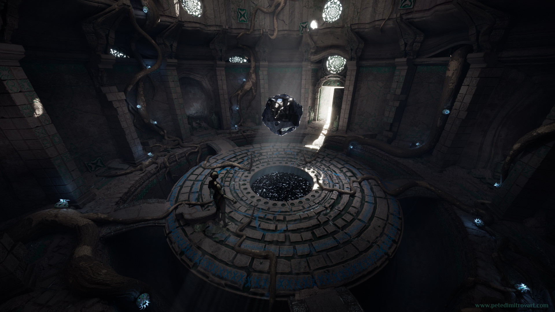
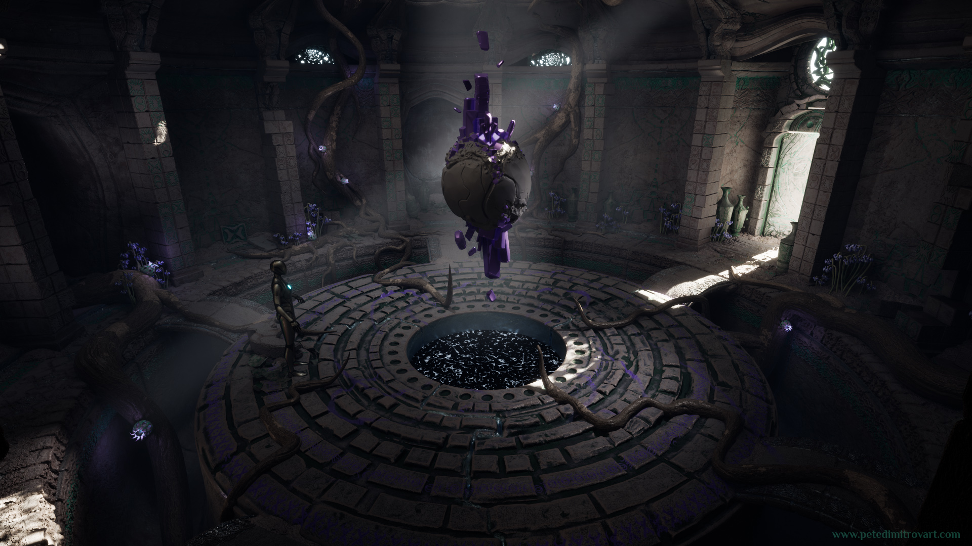
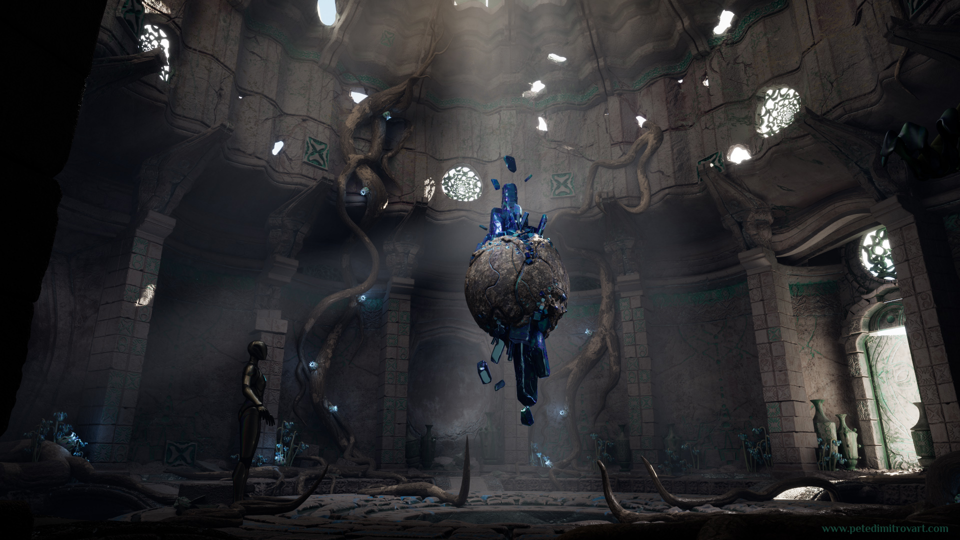
Main Angle
My attention in the scene, at this stage of the development, had been at crawling around roots and vines. I wanted to populate the walls so they have more visual interest through some props that break up their monotonous, bare look.
If you’ve missed reading about my approach to making those roots and the Blueprints and splines I used in the process, you can go back to the previous entry of this series and read it here.
When I was at the above stage, I remember thinking that the walls indeed look a bit more interesting now. The roots in front and the way they curl here and there, was giving a nice dimension and in some spots casting great shadows and ambient occlusion.
The thing was that the roots even warm in color and bright in the spots where the bark had been exposed, still looked relatively gray and merging with the walls color and texturing. As such I continued to have a big worry about color. I thought that the runes I’ve scattered around, the stone tablets and trim sheets with green color are all nice. I kept it overall saturated green, even though the space looks forsaken and old. Yet it felt like that green is not enough. It didn’t seem to be in juxtaposition to the grays of the old stone surfaces. In turn that was making the environment look rather flat and dull.
Color Tests
That’s when I decided to have an experiment of seeing what colors could be more exciting and look more invigorating than the current motives shaded in green.
Here I was mainly experimenting with the colors. However, I also quickly blocked out a pod shaped flower prop. I wanted to give that a bit of a glow. That was yet another way to splash some more color, given that the pods were going to be frequent and placed on top of the roots. In the last image (purple version, lower right corner) you can also see some actual flower foliage too. I thought that the lower ground levels were still mostly empty, even with the new roots and pottery. As such I decided to splash around some foliage and grass. The foliage, I thought, could on purpose have colorful petals that match whatever the main color in the scene was going to be.
Flower Foliage
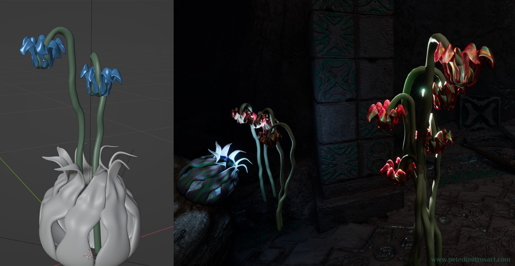
Creating these flowers really was an experiment that went quick and straightforward thanks to Nanite. Being in UE5 and using Nanite meant I could try out whatever petals and stems I liked. I could keep them geometry and not have to be concerned with baking them down to flat atlas textures.
If I were to use these props for an optimized game project, instead of just a pretty environment art scene, I would most definitely want to take the foliage one step forward and create some aggressive level of detail (LODs). It would also be good to bake the meshes into LOD cards. Nanite dynamically manages triangle counts very well, and one would think LODs are not necessary, but LODs are just way too good to be entirely removed. In the latest seasons of Fortnite, for example, where the game runs on UE5 with Nanite and Lumen, if one pays close attention, one can still see switches going from a Nanite mesh to an LOD super lowpoly static mesh or to a flat card billboard.
Concept Paintover
I had put in flowers and more color. Yet I could not make up my mind on my own as to if I wanted red, blue or purple as the main motive. As such I kept sending different angled screenshots of those color versions to my friend Oliver.
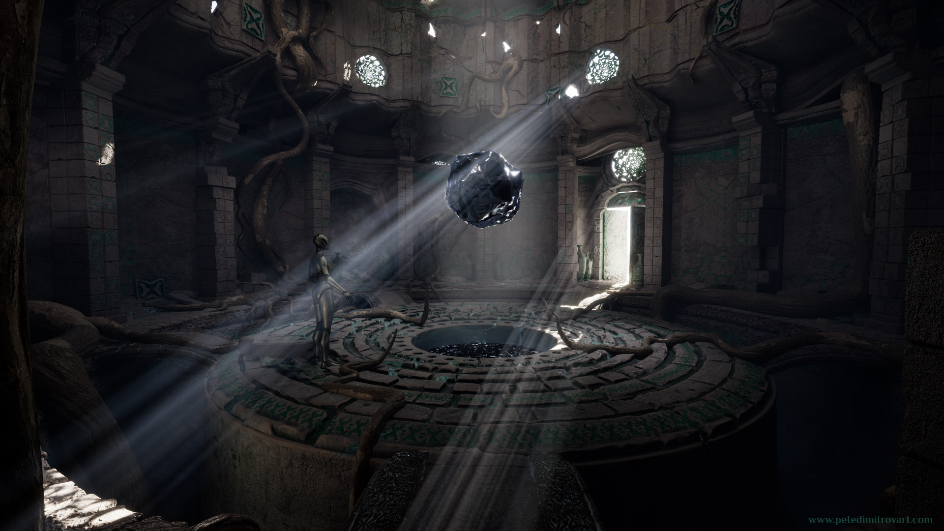
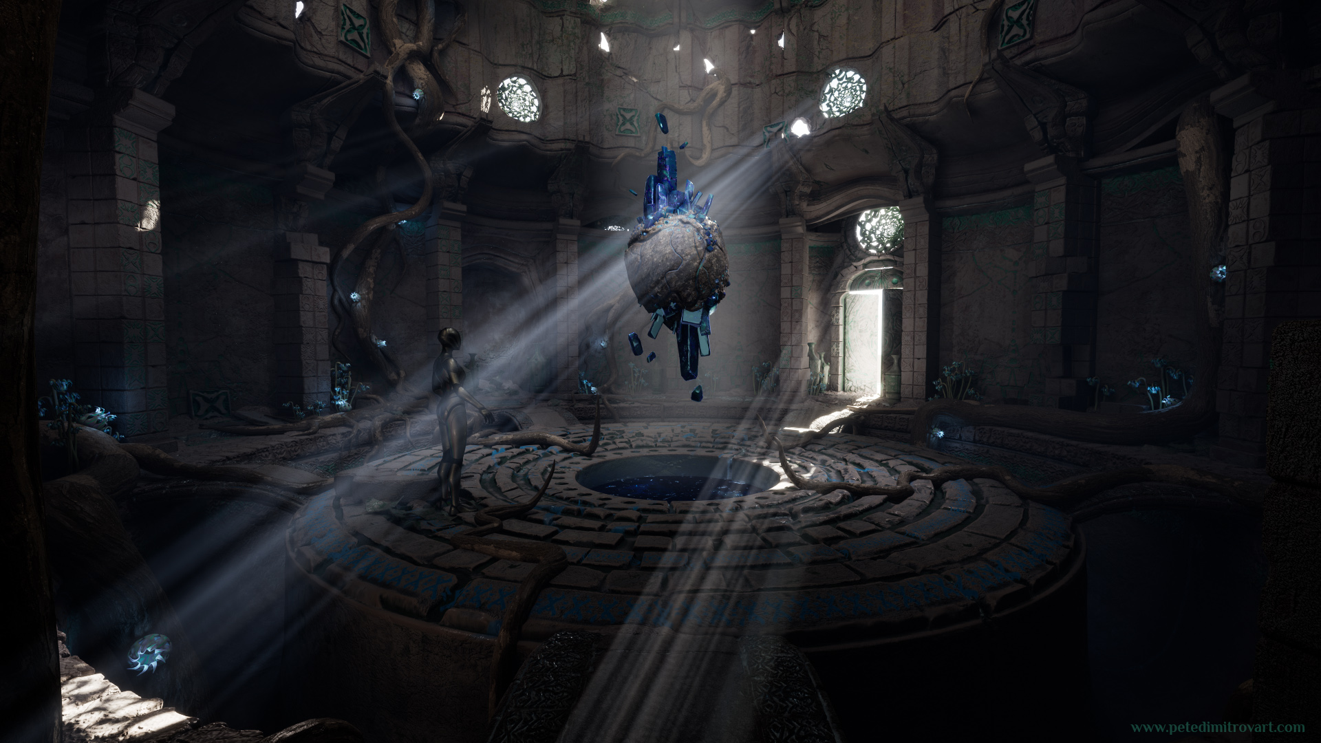
Ollie didn’t reply immediately but instead later that day he came back to me with a surprise paint over. He had taken one of my screenshots, seen the color variations I offer, heard the pitch where I was thinking out loud about how I want to replace the Houdini orb in the middle for a crystal. With those things in mind he made a really gorgeous concept paint over, featuring the colors he thought would be best plus a floating crystal visualization in the middle.
This angle above is the one Ollie took. And this is what he created:
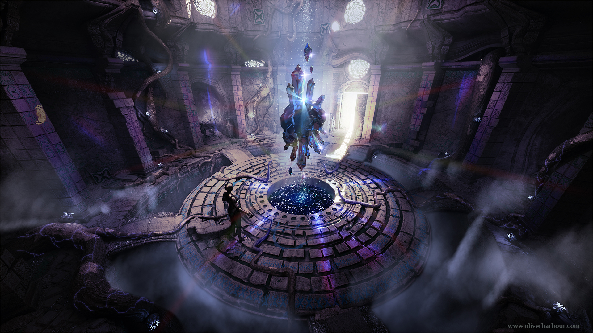
It’s a stunning paintover.
I was incredibly surprised and inspired when he showed it to me. I could not stop staring at it. In the following weeks, in the moments I felt down or like I don’t have the energy to keep working on the scene, his concept art was what energized me and kept me going.
Ollie visualized quite a few ideas I had in my mind but never got to trying out at that stage too. Later on I kept that paintover as a guide to what I want to do and try next, after I were finished with changing the Houdini orb to a crystal.
Few examples are the mist, clouds and fog surrounding the room. I thought they were very moody and nice and later in the project I filled the gaps of the platforms with VFX clouds using FluidNinja (something we will look at in detail in later blog entries).
The idea of the beams of light, like lasers, striking through the room and casting light as if offset in chroma to be both blue and purple, I thought was absolutely mind blowing. I tried that later on too. I did get a version of it working using spotlights and point lights. It was making the performance in the scene muddy though, as light overlaps was way too large, causing pixels on some surfaces to be lit too many times.
As such I had to instead try and “bake” the moving light effect through gradients created directly in the PBR shaders used for the floor and wall pieces. Something that I thought was a cool idea but didn’t get the chance to fully implement. Maybe I’ll revisit this idea from Ollie some other time, as an exercise in Tech Art.
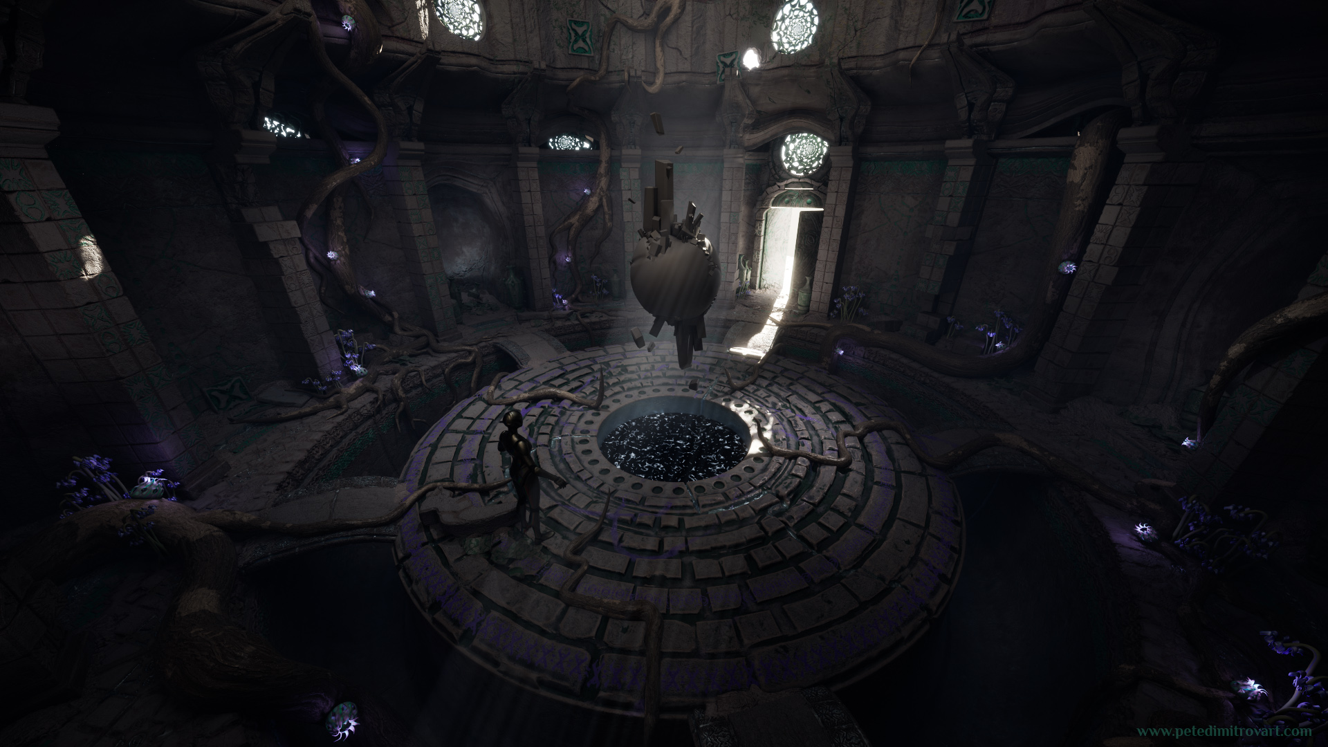
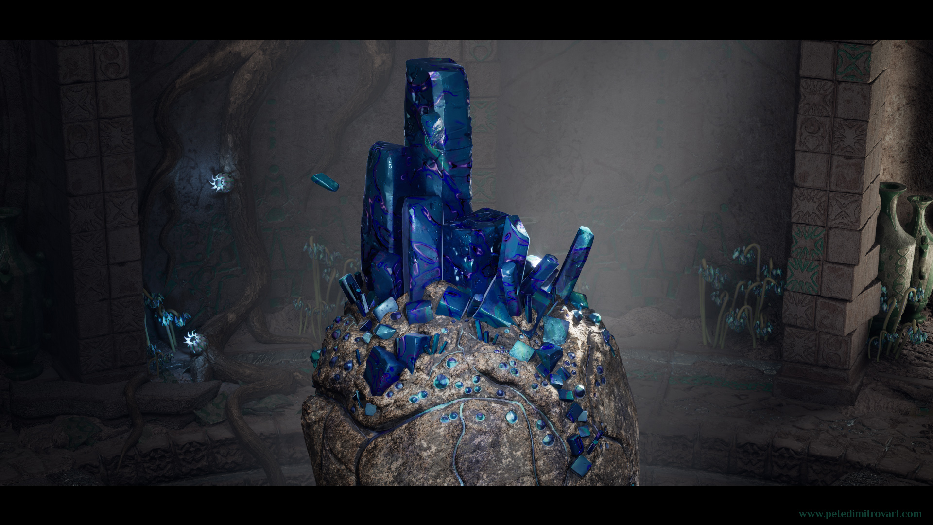
From an Orb to a Crystal
With Ollies concept guiding me I set off to replace the orb in the middle. For the time being I committed to a purple color too.
I have to admit it didn’t feel amazing to remove the orb. I had invested a lot of energy and time, learning how to make it in Houdini. In the shots seen in the past blog posts it might be static and boring. But it actually had a fluid sim animation on top. I had learned how to do Vertex Animation Textures (VAT) through it and of course the orb was very close to my heart.
No matter that though, I knew that the scene needed something different. An abstract, moving orb like that is cool, but perhaps in another environment and another context.
If you’d like to remind yourself of what VATs are and how the fluid animation looks, the one I refer to above, you can do so over at - The Amarantos Ritual - 01 - Beginning.
Orb Sculpt
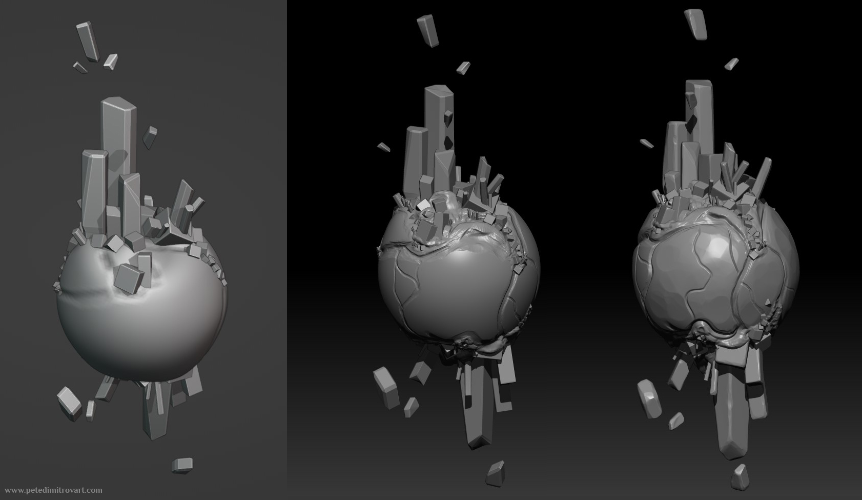
I blocked out the initial orb and crystal pieces in Blender. From there I took it into Zbrush where I cleaned up my topology to hold better brush strokes. I subdivided to get myself to a high polycount but didn’t go overly high. I knew I wanted Nanite meshes at the end and as such I mainly was after creating detailed and interesting silhouettes.
Ollie had went for staggering blues and purples in the concept paint over. With purple being his favourite color too, I went for that as a main motive for quite a while.
Later on, though, I once again struggled with color. I set off to texture the surface of the crystal and whatever textures and patterns I would try, with purple as dominant color, it kept giving me results way too noisy and busy.
I discovered that my mistake was to not rely on the already detailed geometry through Nanite and use simple albedo and normals on top. As in no overly complex and colorful albedo with edge details derived from curvature or thickness bakes. Also no normal map overcomplicating by having any of the edges pop in or out, to give them more dimension, again by deriving detail from smart masks using curvature or thickness.
Instead the albedo would be very flat. The normal map - nonexistent in the unique UV textures. The geometry was detailed so it didn’t need any normal maps a part from detail tiling surface normals.
As such in the shader of the crystal I did the following:
Unique UV texture: the Albedo channel. Some Roughness too.
Tiling texture UV channels added on top of that: two Normal maps. One with large tiling gaussian imperfections and dots. One with smaller tiled plasma-like noise, sharpened to look more like a crystal matrix.
That’s when I went a way from the purple and more towards blue. But Ollies love for purple extended as a love for purple in me and later in the projects I found other opportunities to bring back some of those hues.
Crystal Work
In the two images below, put on top of one another, you can inspect the difference between the crystal blockout and the Zbrush sculpt pass:
Interactive element below. Move the white bar and arrows in the middle to see comparison between two images.I prefer to blockout my shapes in Blender as I feel quicker over there. Then once I like the overall appearance, I take the blocks inside Zbrush where I Dynamesh and subdivide to then sculpt on top. As seen above (make sure you moved the white bar in the middle, so you could see the comparison between the two pictures).
Interactive element below. Move the white bar and arrows in the middle to see comparison between two images.Before heading into Substance Painter to bake any channels or start any serious texturing, I tested the purple colors and how the shapes react to light once they are more glossy (seen above).
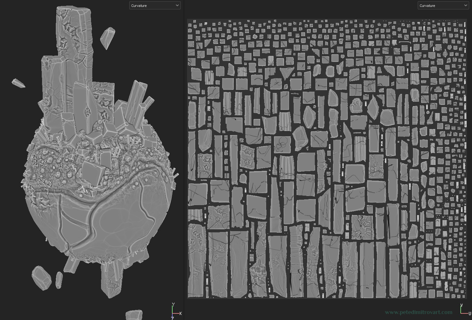
UV Maps
Once I liked what Im seeing as a preview above, I exported a slightly decimated geometry version of the sculpt. I set off to UV map it:
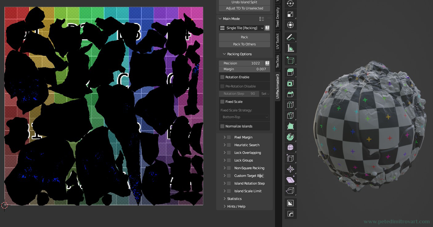
I UV map in Blender by adding seams by hand and then running an unwrap command. As long as you put in good seams, the unwrap comes out pretty good and doesn’t even need you to polish it by relaxing the shells or tweaking them by hand.
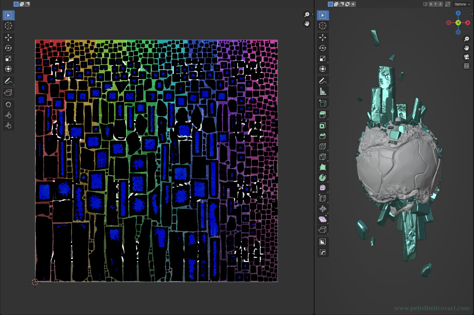
The mesh, as mentioned few times by now, was meant to be Nanite, as such I kept it a bit denser on poly. I didn’t want to run it through automatic UV mapping because it would have split it into many triangles and needlessly cut UV shells. If that happened, not only would its appearance not be so good after texturing, but it would also increase file sizes exponentially, given we are dealing with high geometry counts.
Texture Baking
With the UV mapping done I went into Substance Painter in order to bake some texture channels. I had a dense Nanite mesh, so I anticipated that I will probably not put a lot of importance on things like unique Normal Maps, instead I would tile normal map noises in the engine itself. Which is exactly what happened with the crystal parts of the prop.
I wanted to splash interesting colors and figure out what the patterns and tiling normal maps I might use would be, be it inside Painter or UE5. As such in Substance Designer I made these two:
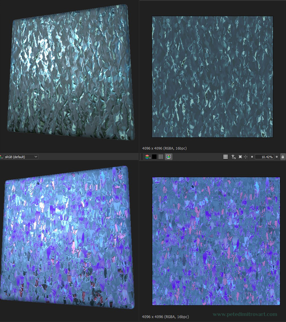
Back to Unreal
With the above things drafted, I started experimenting with using the Substance Designer graphs. I did that inside of Painter for the most part, and struggled once I previewed it inside Unreal 5. I say struggled mainly because I was not convinced by the visual and disliked most of it.
Interactive element below. Move the white bar and arrows in the middle to see comparison between two images.In this first test above, you can clearly see how using my exciting, very detailed Substance Designer material graphs, gave everything an incredibly heavy, noisy and terrible visual look.
The flat purple had a simplicity that was beautiful and now lacking.
Interactive element below. Move the white bar and arrows in the middle to see comparison between two images.I could see the issues I described in the sentence above, but I could not exactly figure out how to solve them. As such I tried to simplify - less colors, less noise, and what if I tried blue?
That was still wrong - the look was still noisy. The albedo rich in mud, the edge color derived from the curvature and thickness bakes was way too overpowering too.
Interactive element below. Move the white bar and arrows in the middle to see comparison between two images.I started to realize slowly its all too noisy so I started to simplify the albedo. What if it were blue but with larger tiled splashes of color, instead of small noise? Seen above.
(By the way, that albedo splash of color seen above is still one of my initial Substance Designer graphs. Here though its only used as albedo. The other channels are off. In Designer I had exposed lots of parameters such as color, noise type, noise size and overall tiling, among many other. As such here I reused my work by just changing parameters so the splashes are giant and not tiny, thus noisy.)
Interactive element below. Move the white bar and arrows in the middle to see comparison between two images.But that was too simple, and too bright. As such, a step back again, seen above. I tried purple again, tried edge detail, but more controlled. It was still way too noisy again!
Interactive element below. Move the white bar and arrows in the middle to see comparison between two images.As such I removed the edge detail, went back to flat purples and blues. But this time the crystal looked like from an ice cream advert… (colors seen in right image above).
I removed the purples and made the overall tones darker, less in the splashes of an ice cream advert visual.
Interactive element below. Move the white bar and arrows in the middle to see comparison between two images.I was still in love with the idea of purple that Ollie had given me. So even though I left it for the time being, later on I returned to it.
At this stage the crystal was a bit dark but I was making progress. It being darker and slightly more flat but shiny also helped me realize something else. It was the fact that if I wanted to capture the edges and give them detail, I should do it through Fresnel functions inside the Unreal material shader I was creating for this crystal. The fresnel for edges would work few times better and be more interesting than any albedo + normal + roughness edge detail created in Substance Painter. It would sit more elegant, more gem-like.
Interactive element below. Move the white bar and arrows in the middle to see comparison between two images.If above, on the image to the right, you inspect the crystal dead middle of the picture, you can see few white lines. Those are the most staggering examples of the fresnel from the above camera angle.
It also added little rays of bounced light (well not really, its not real light, its all fake!) in the edges and crevices of the Nanite geometry. Something that again looks few times better than anything baked directly in the albedo.
Interactive element below. Move the white bar and arrows in the middle to see comparison between two images.I then went back in Substance Painter and textured the rock orb. If the blue crystal above uses a unique albedo + lots of fresnels + lots of tiling normal noises, then the rock instead uses only unique textures.
The rock is pretty much a standard PBR shader with nothing fancy going on. The blue gems on it that I masked and texture in Painter to match the color and patters of the crystal, I didn’t even give fresnel. Because they are overly shiny it sat fitting and okay, even without a fresnel, when compared to the rest of the crystal.
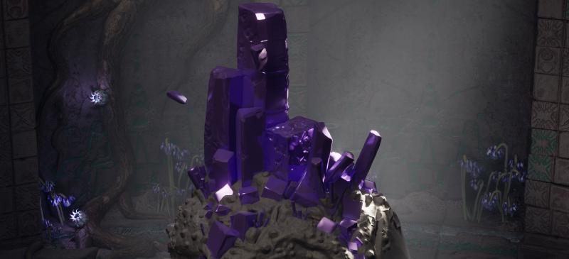
The final result, seen big (picture that you can click to zoom, unlike the before-and-after sliders above):
Recap
To recap some of the decisions, focusing on the crystal, blue part and putting them more as advise:
- Don’t put in albedo / roughness / normal details on the edges, through unique texture sets - instead use a Fresnel (this is our Fresnel Number One).
- Consider adding another Fresnel (this is our Fresnel Number Two). This one you can invert, so instead of shining as a cage around the edges of the geometry, it shines off the surfaces right in the middle of it, that look at us and at the camera angle.
- Instead of having busy unique normal details, consider tiling one surface detail with large dents and imperfections, as if looking at scratched surface.
- Tile another one right after - another normal detail - this time for smaller, micro imperfections.
The scene from afar
When looking at these shots, the lighter tone blues that you can observe in the lower part of the orb and its gem, are direct result from a fresnel of that color. This showcases how useful the fresnels are in making the whole illusion of looking at something that is a crystal.
Credits
Oliver Harbour, who did the initial scene paint over with the crystal seen in this blog, is an illustrator and a concept artist. You can find his work over at his website. He is also on Twitter, Instagram and Artstation.
Olivers help was inspirational and invaluable to me. Later on he also concepted some original crown designs for the character seen in the cinematic short of this project. We will take a look at a detailed breakdown of that headpiece crown and the concept art in a later blog entry.
Conclusion
In this blog entry we looked at picking colors. We went for red, then to blue, switched to purple, and then back to blue. But along the way, while testing those colors, we learned a lot about what works and what doesn’t. As such it was a fruitful experimentation.
We then went through a detailed breakdown of the texturing process of the crystal, as seen through lots of before-and-after image sliders.
As mentioned a few times, I went for an overall blue tone, but the help and inspiration from the concepts and the purple colors that Ollie did, were incredibly important for me. I mentioned this too, but later on in the project I revisited and relit the room a few times. That was in order to create a secondary “realm” and “world” of the scene, to be used in a cinematic short.
In that, I settled onto purple colors that are incredibly exciting and intriguing, and in later entries we will look at those in detail as well.
Cheers,
Pete.
If you enjoyed this blog post, consider subscribing in the form below. That way you will get a notification the next time I publish a new blog.