Intro
This tutorial covers how to create an Unreal 5 material shader VFX. In “Part One” we already went over how to create the geometry needed for the VFX.
In this “Part Two” blog entry, we will go over how to create some quick textured noises in Substance Designer. Those textures are one of the driving forces in the VFX effect.
Software that we will be using:
- Unreal Engine 5
- Blender
- Substance Designer
Tip:
I will be using Substance 3D Designer 2021. The nodes I use are widely available in older versions of the software too, so you should be able to follow along without an issue.
Before we dive into the Substance work, lets take a look at a reminder of what we are creating.
Videos Preview
(Youtube embedded video above, showcasing the final vortex VFX we will be creating.)
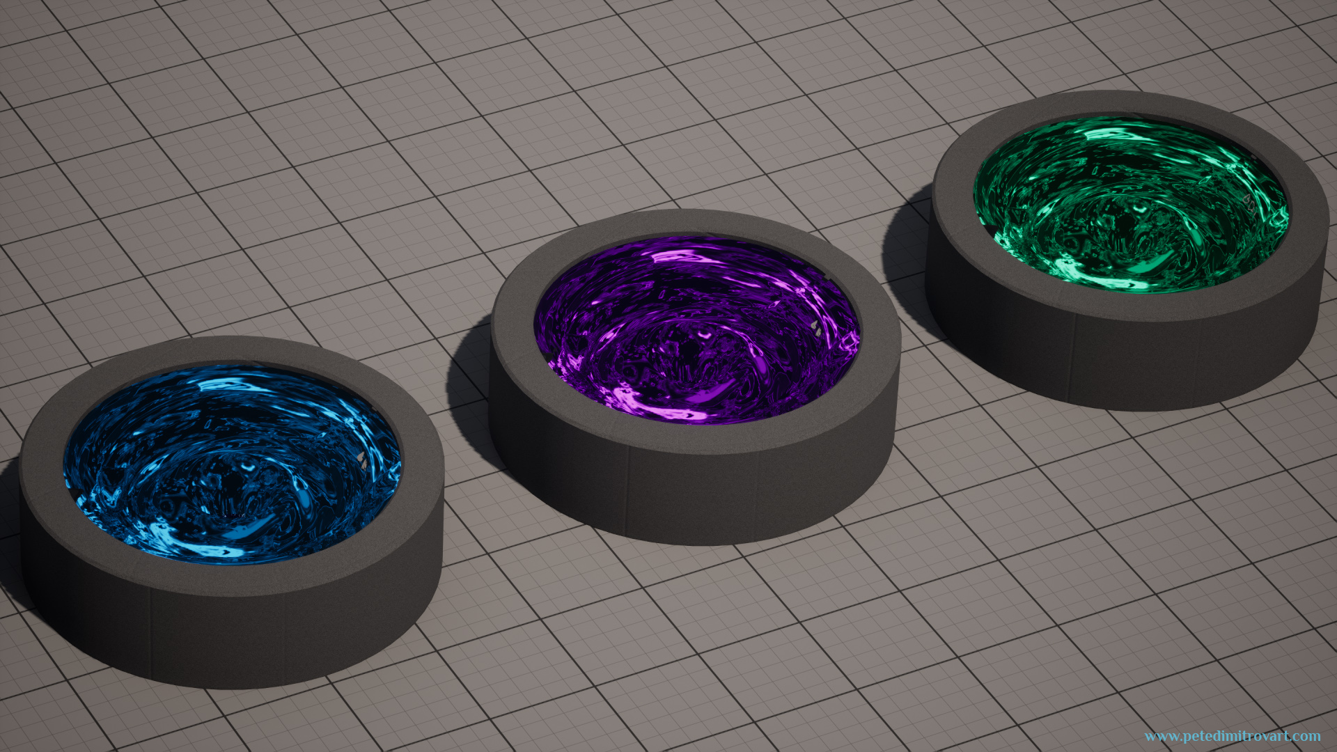
As mentioned in the previous tutorial part, the textures and shaders we create will allows us to derive many colored versions of the VFX:
(Youtube embedded video above. Shows the VFX basin duplicated three times. One is blue, the other is purple, the last one is green.)
Screenshots Preview
As seen before, here are screenshot previews:
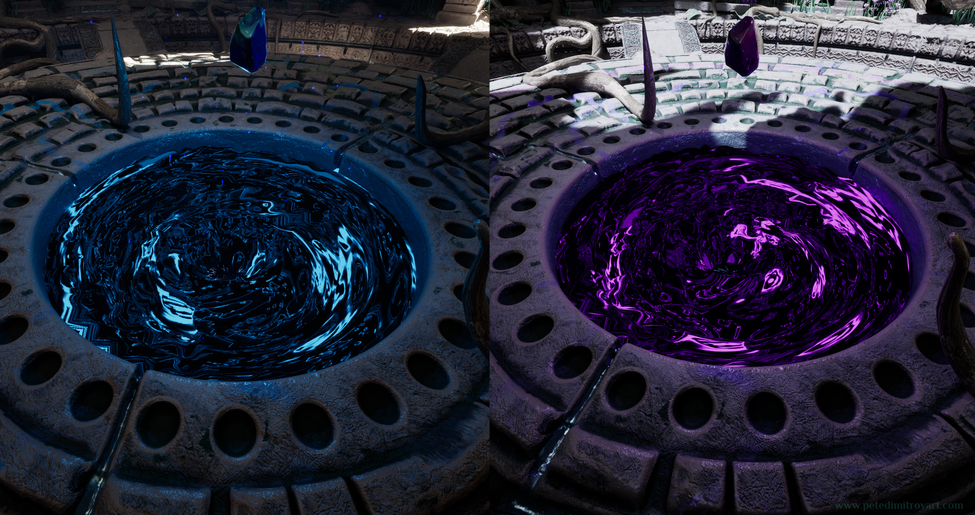
We are making only the VFX, not the rest of the room or art, but you can read about the creation process of those over here..
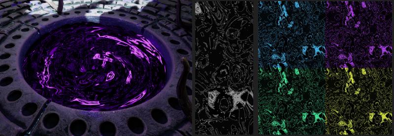
Textures Preview
Here is what we will create in this tutorial:
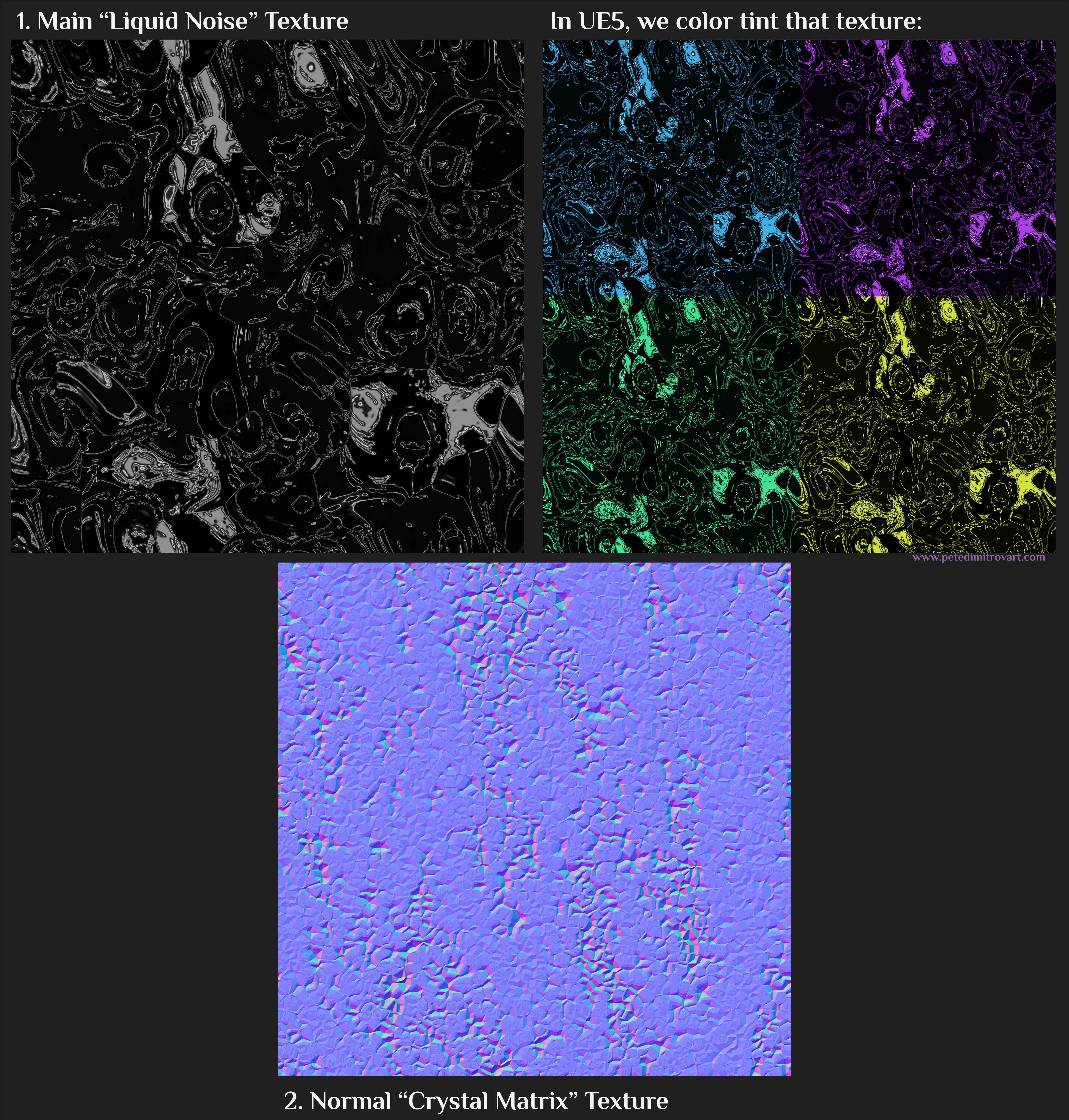
We need two textures:
1 - Main “Liquid Noise” Texture;
2 - Normal “Crystal Matrix” Texture;
Those are all very short and quick Substance Designer graphs. Some of the noises, like the crystal normals we then will reuse twice in the refraction shader for the VFX. My process when making VFX or any general 3D scenes most of the times includes creating “common” type of noises - both b&w and normal map ones - and then reusing them across assets. That’s what I did here too.
In fact I created the textures you see above for the normal tiling details and texture work on the center piece, giant crystal cluster prop in the scene over here: “The Amarantos Ritual - 04 - Crystal Sculpt.” I liked how they turned out and believed I could reuse them in a VFX.
Step One - Albedo (Main Mask)
Lets first create the liquid-spill, black and purple “albedo” texture. We will make a desaturated, black and white one first but then with a few quick edits in the UE5 shader for the VFX we will derive other colored variants in our Material Graph and Blueprint set up.
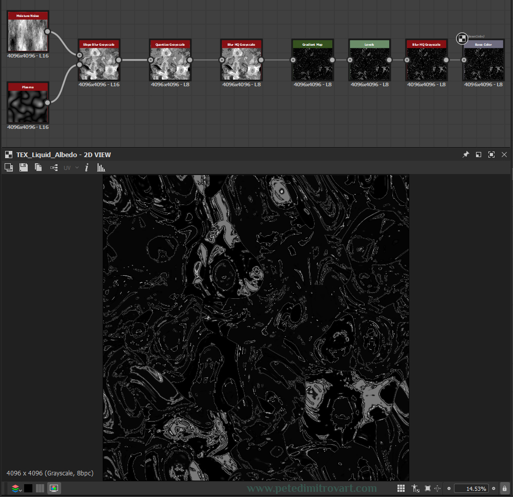
As you can see the visual here is powerful but quite simple, accomplished just by the use of 7 nodes. Lets go over them one by one.
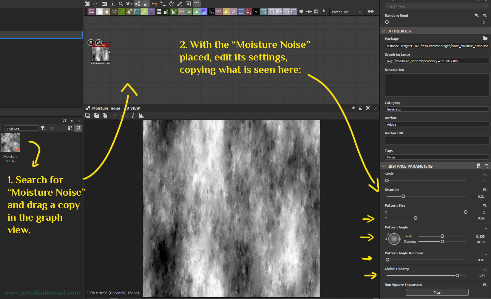
Moisture Noise
Create a blank 4k graph.
Search for a “Moisture Noise” and drag a copy into the graph. Select the node (the Moisture Noise one) and edit its Instance Parameters to the following: Scale: 1, Disorder: 0.21, Pattern Size X: 2 Pattern Size Y: 0.68, Pattern Angle: Turns: 0.505 and Degrees 181.8, Pattern Angle Random: 0.01, Global Opacity 1.79.
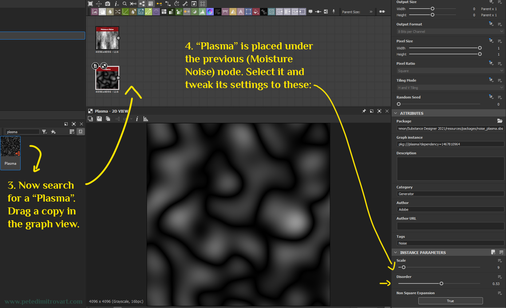
Plasma + Slope Blur
Under the Moisture Noise node, add a Plasma node. Edit its instance parameters to the following: Scale: 0 and Disorder: 0.53.
Now lets add a “Slope Blur Grayscale” node. Search for that and plop it to the right of the existing two nodes. Make sure you drag in a “Grayscale” one and not a “Color” one.
Tip:
We are currently defining our main shapes, noises and motives. We best do that in black and white as its easier to manipulate the nodes in that mode. Later on, once we like the shapes and patterns we have, we will introduce color. This is the reason we are currently using Grayscale nodes as opposed to Color ones. In general, in most art mediums, its easier to approach things step by step, starting black and white and then later moving to color.

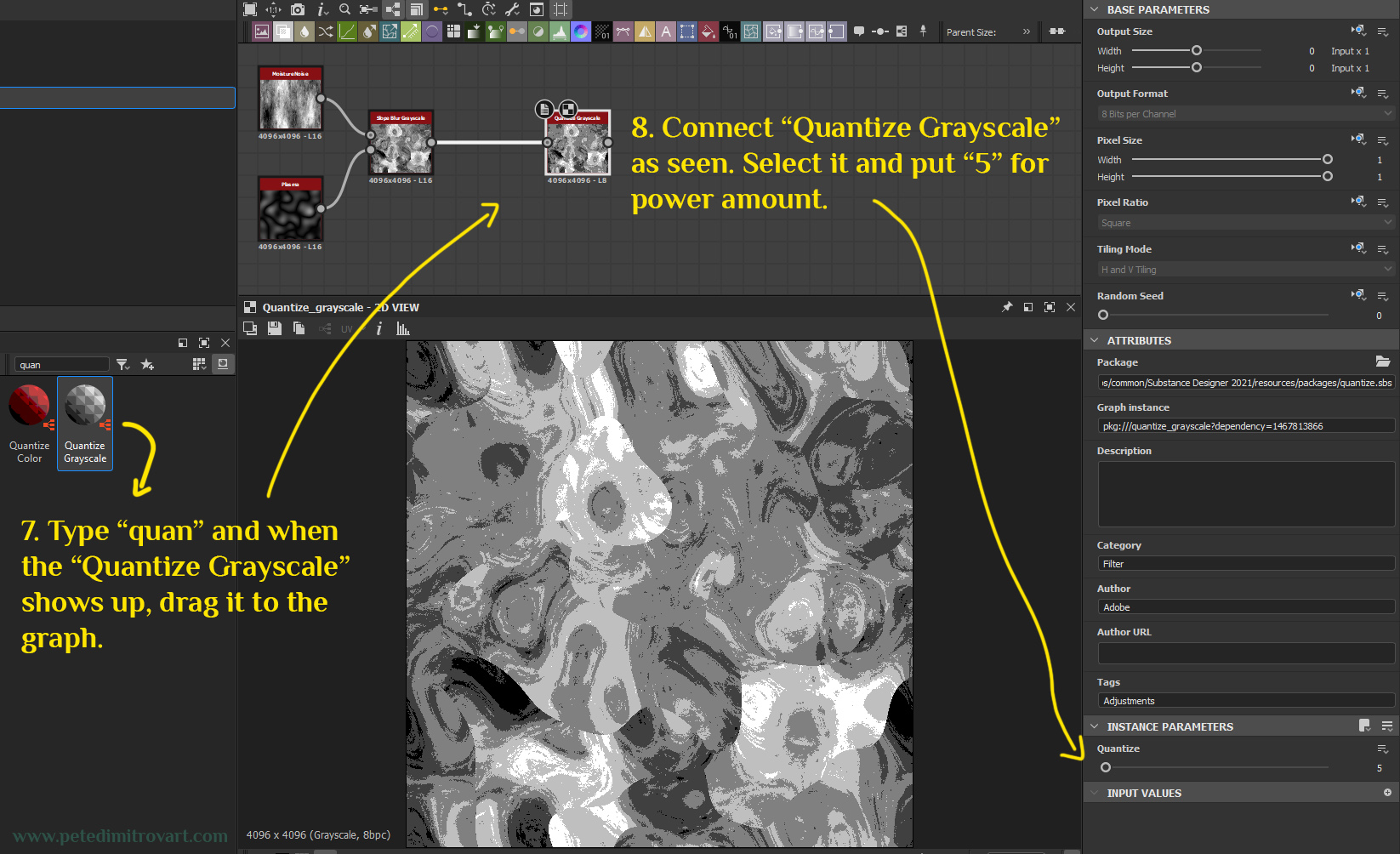
Next, lets simplify all we have and lose some of the fine details and gradient-like blurs.
Search for “Quantize”. Select a grayscale one. Add it to the right of the Slope Blur. For its instance parameters use “Quantize: 5”.
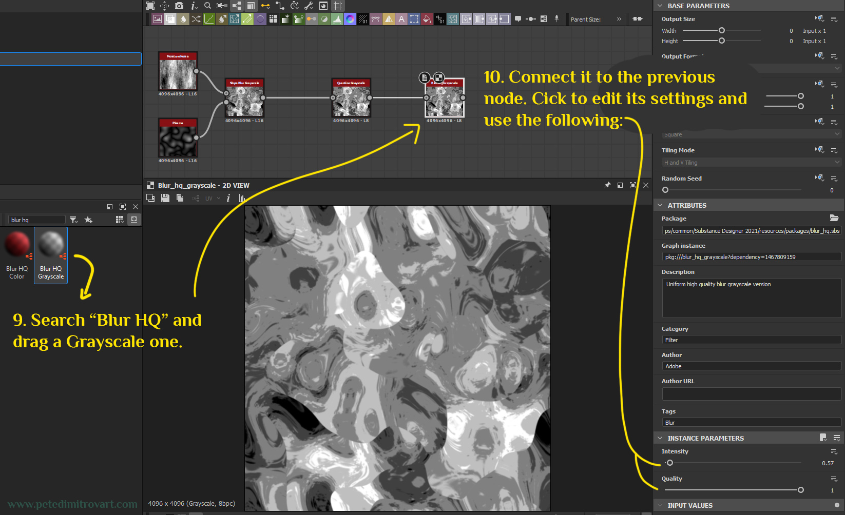
With the Quantize in, everything is more simple. But we don’t want to leave it looking pixelated and harsh.
Add a “Blur HQ” node and connect it to the Quantize node. Click to edit its settings and use the following. Intensity: 0.57 and Quality: 1.
Adding Color Gradient
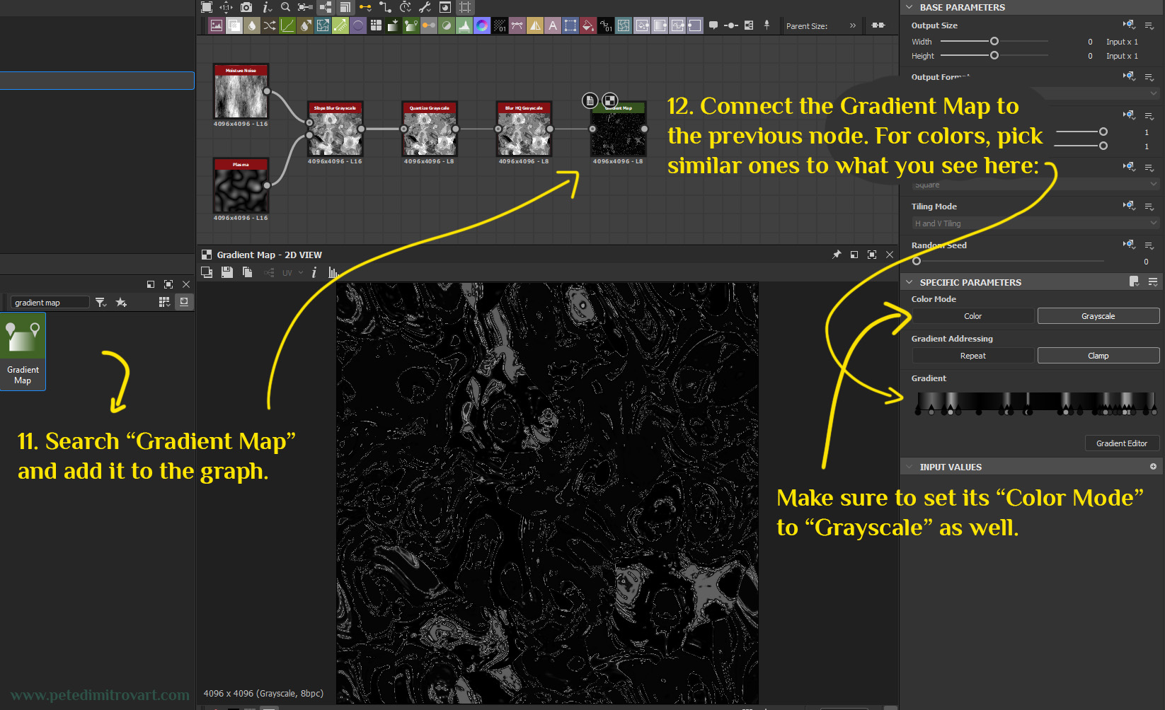
We have the main motives in. Now lets give them a grayscale color gradient. Search for “Gradient Map” and drag a copy of that node. Connect it to our previous node. In its settings put Color Mode: Grayscale. Then click the button called “Gradient Editor” under the “Color Mode” and “Gradient Addressing” options in order to open the Gradient Ramp expanded window (where you select colors).
You want to hand place color pins, similar to what you see here:
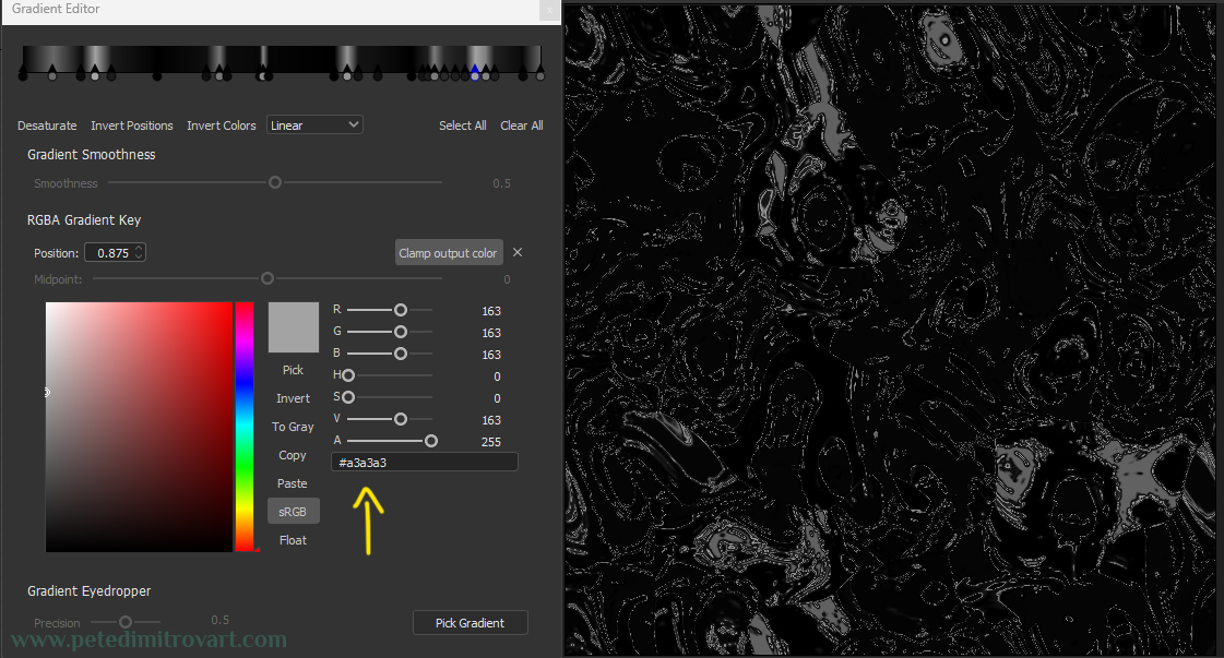
You don’t have to entirely match it. In fact, you don’t have to be precise at all. If you like my shade grayscale colors and the result, then copy the gray color seen above (its hex code is #a3a3a3). Then start hand placing similar pins left and right. You can expand the Gradient Editor window by dragging its right corner. That way you can see better.
Here is min expanded, hopefully you can match yours to it better that way:
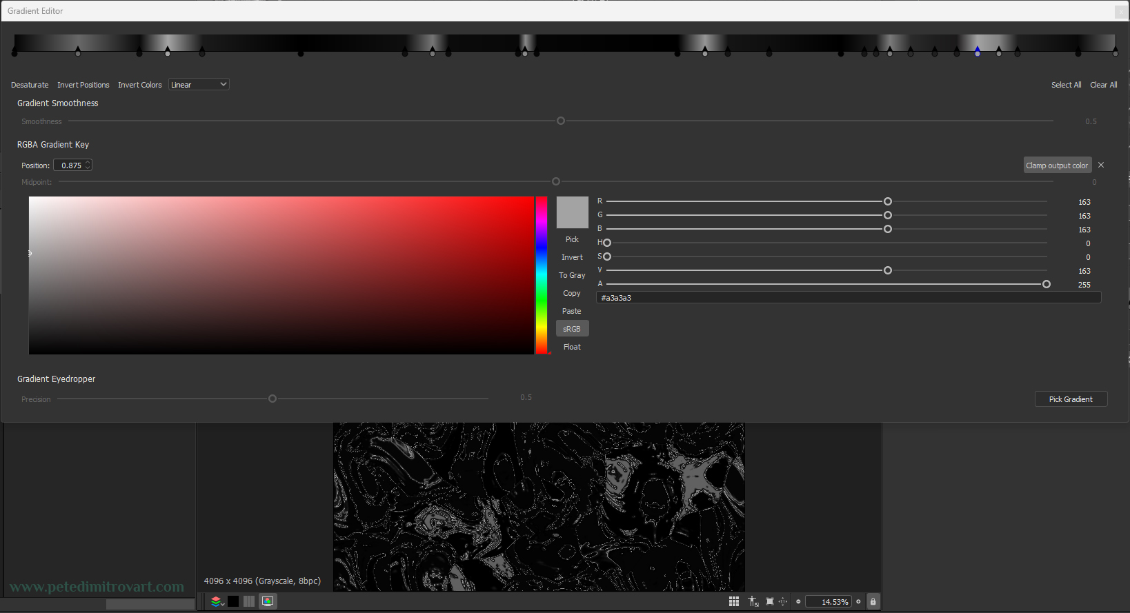
I encourage you to experiment and give your own touch and vision to this step. Use my placement of gray pins if you want identical effect. If not, try your own but just try to have a good amount of darkness spots, as in above, as that is what keeps the VFX easier to read, stylish and mysterious. Also keep it black and white because we will tint it in color in UE5.
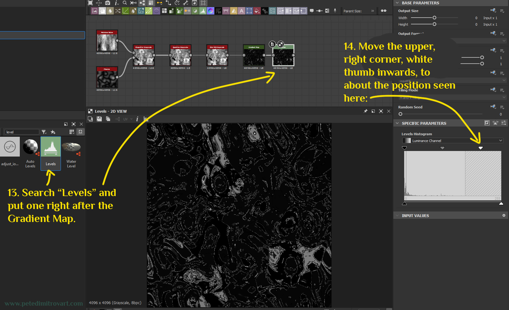
Next lets add “Levels” node.
Search “Levels” and put one right after the Gradient Map node. In its settings (its Specific Parameters), there is a Levels Histogram. It looks like a large mostly white (gray) square. On each corner it has a thumb. Move the upper, right corner, white thumb inwards. Move it to about the position seen in the image below.
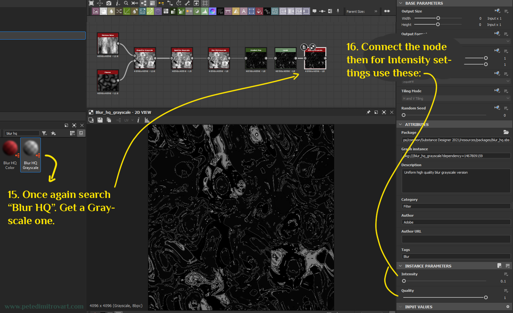
Lets quickly blur HQ once again though. That will make sure we don’t have any overly sharp areas. In the world of textures, sharpness is good, but when its too much it gives artificial, low-quality look to things. As such we want to avoid that.
Search for “Blur HQ Color”. Add it and for its settings use: Intensity: 0.1 and Quality: 1.
Output Node
Once you are done, add an “Output” node. That together with proper compression settings will let you export your texture.
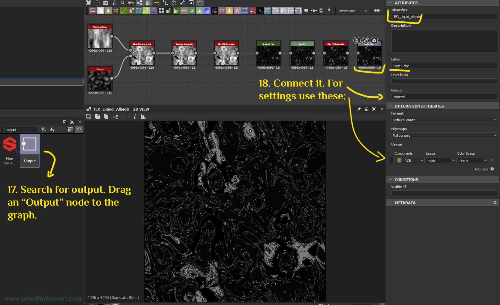
For the settings of the Output node, use these:
Identifier: whatever name you want. Mine happens to be “TEX_Liquid_Albedo” but yours might be “output” which is fine. You might want to name it similar to mine as it will be easier to identify later on.
Description: empty
Label: Base Color
User Data: empty
Group: Material
Format: Default Format. Mipmaps: Full pyramid
The above ones are mostly used for visualization in Substance Designer. As such they are not overly important but you might want to match them to mine nonetheless. Then come the important ones which will dictate how the bitmap looks and behaves after export. Those are:
Usage: Components: RGB with usage “mask” and Color Space put to Linear.
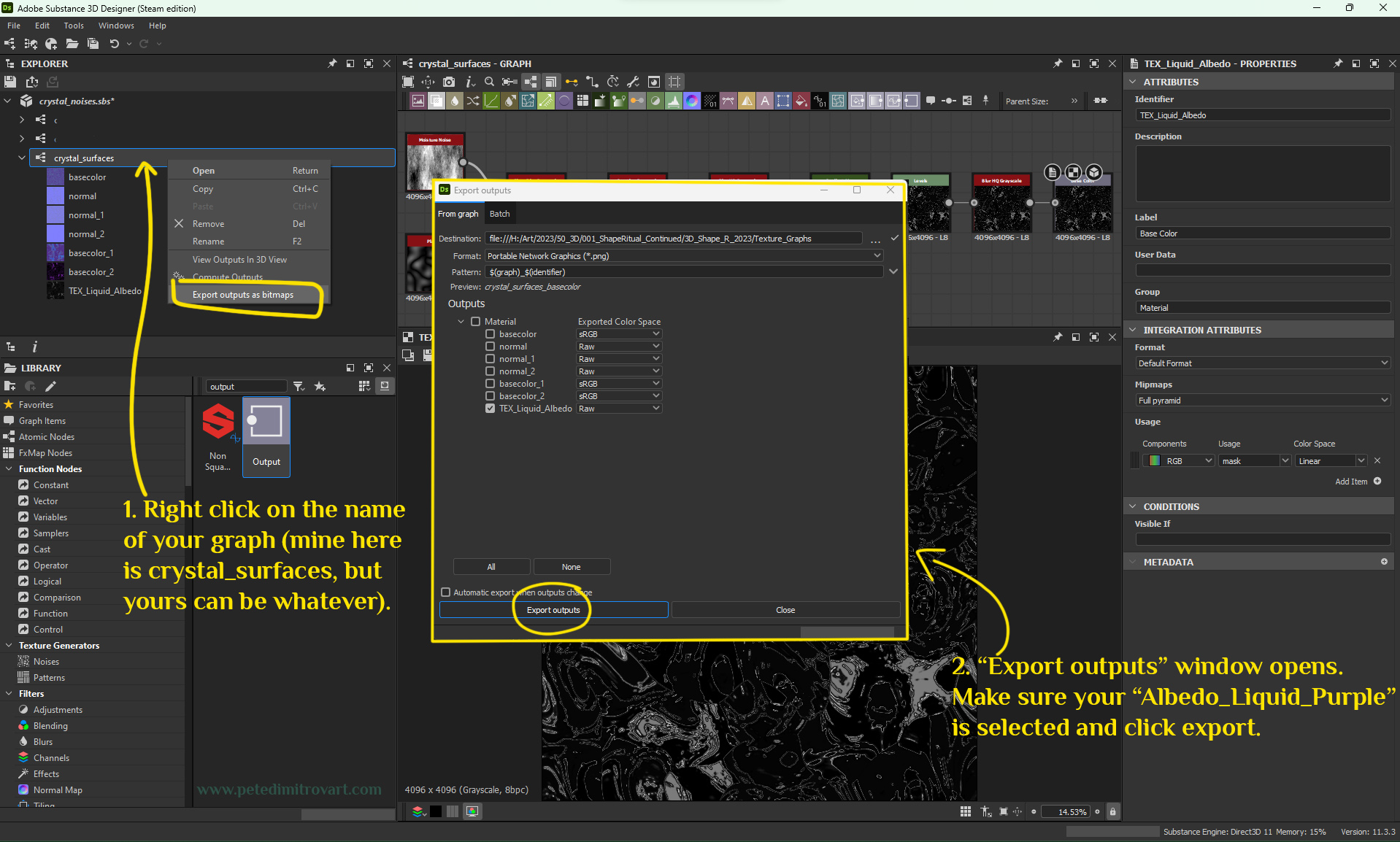
With the settings put to what is needed, now right click your graph name under the *.sbs work file you have open. This is in the upper left corner of the screen, where it says EXPLORER. From the context menu that shows up with right click, select “Export outputs as bitmaps”. In the screen that pops up, make sure your “TEX_Liquid_Albedo” is selected, pick an export destination and hit “Export outputs”.
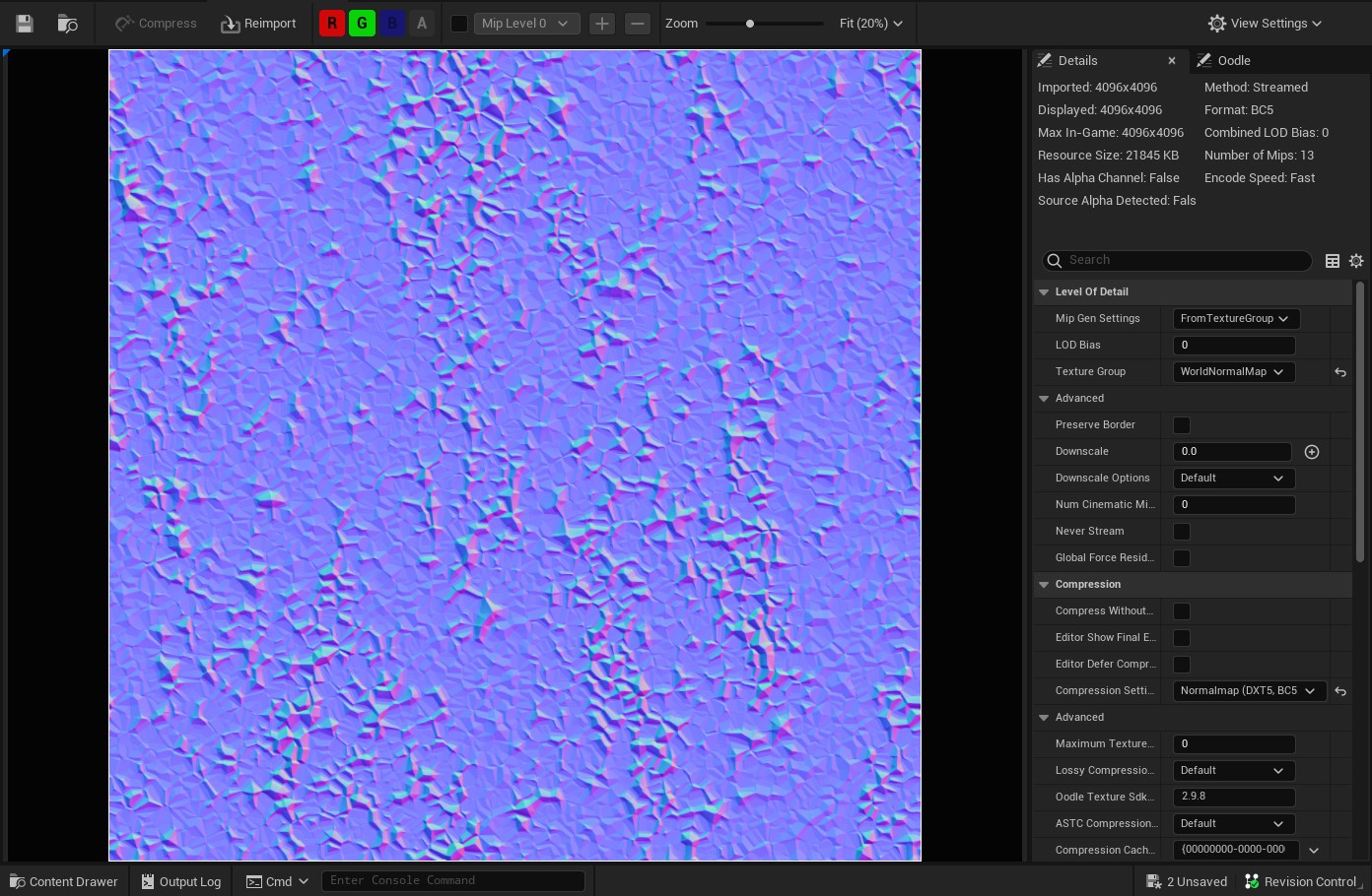
Step Two - Normal “Crystal Matrix” Texture
Now, lets create the normal map that we will use in the refraction shader that gives a secondary level of detail and visual interest to our VFX basin.
This one is a relatively quick node graph as well. If the previous one we did was 7 nodes, then this one is 10 nodes (without taking the output in this total sum).
Crystal 1 & Crystal 2
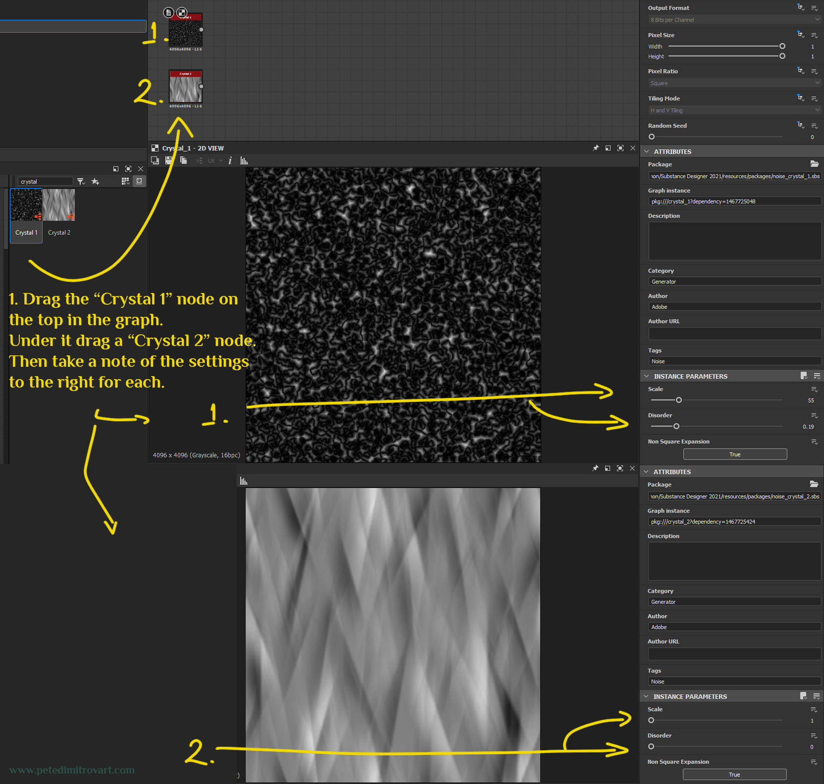
Let’s begin by searching for “Crystal”. Two nodes will show up. We want both. Drag the “Crystal 1” node on the top in the graph. Under it, place a “Crystal 2” node. Then take a note of the settings to the right for each, displayed in the image below:
(Settings for Crystal 1 - black one - Scale: 55, Disorder: 0.19)
(Settings for Crystal 2 - white one - Scale: 1, Disorder: 0)
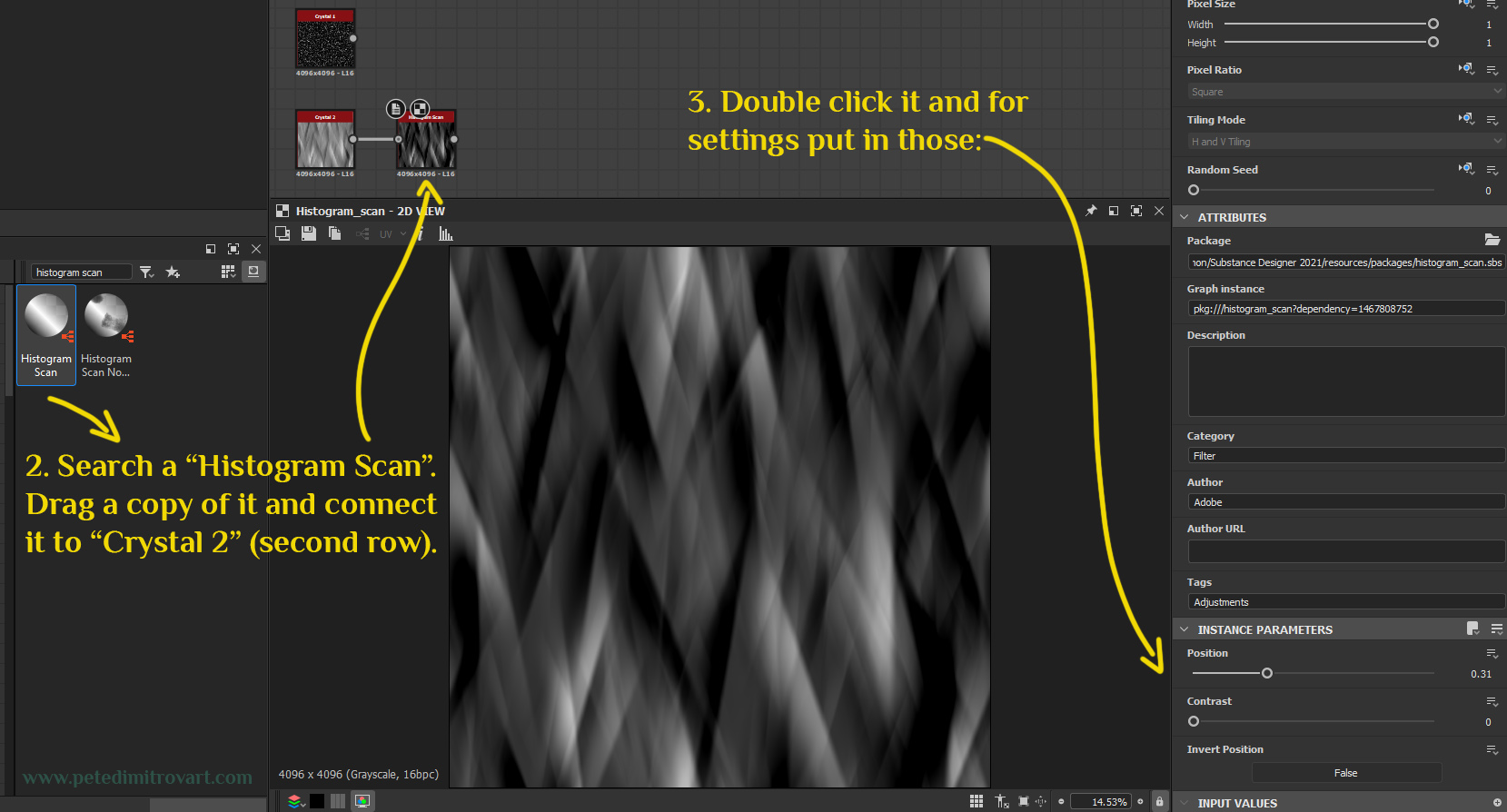
From the right of Crystal 2 (bright one) lets add a “Histogram Scan”. Search and drag a copy of that. Connect it as seen below. Then double click it and for settings put the following: Position: 0.31 and Contrast: 0. Invert Position: False.
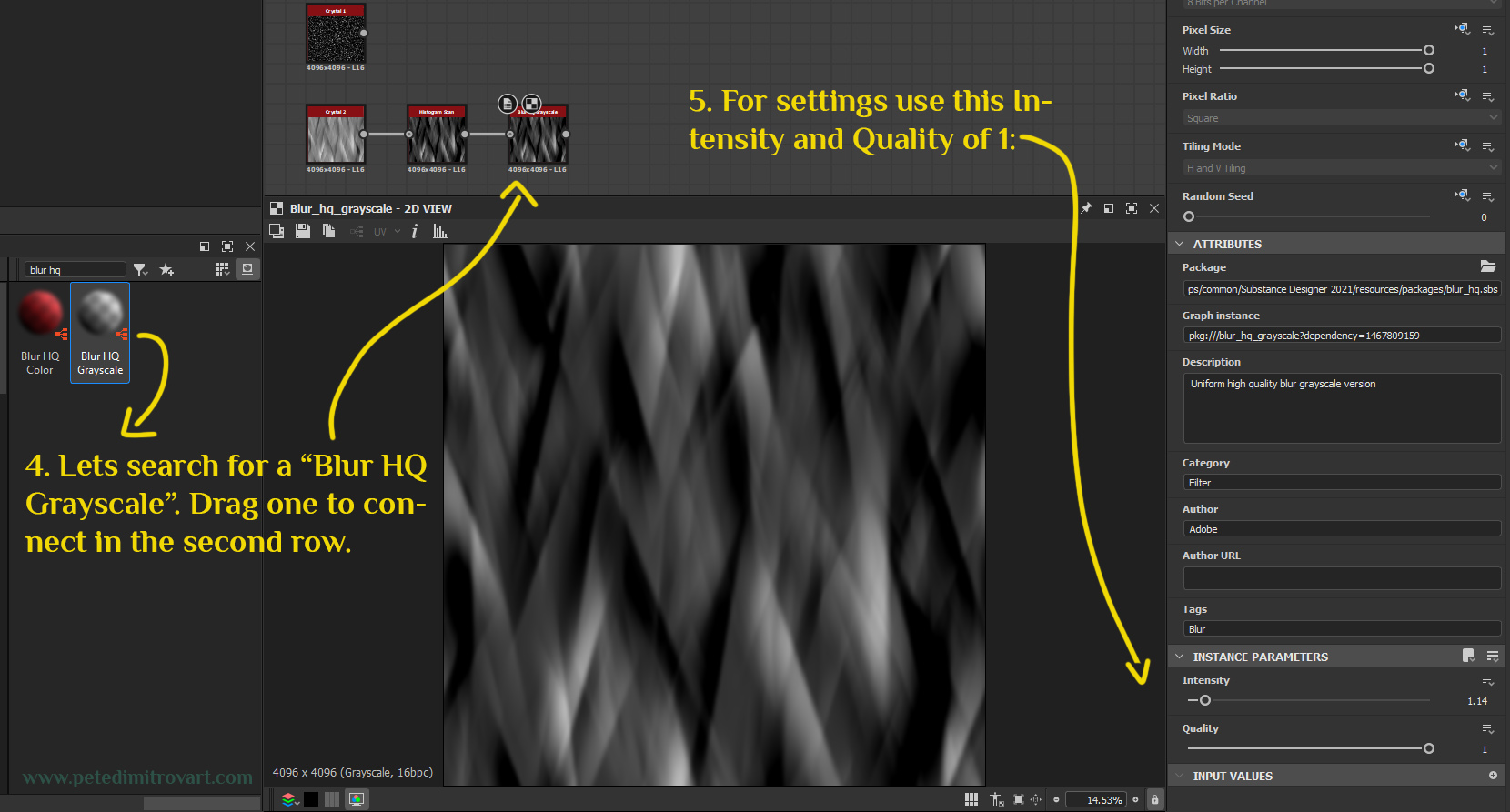
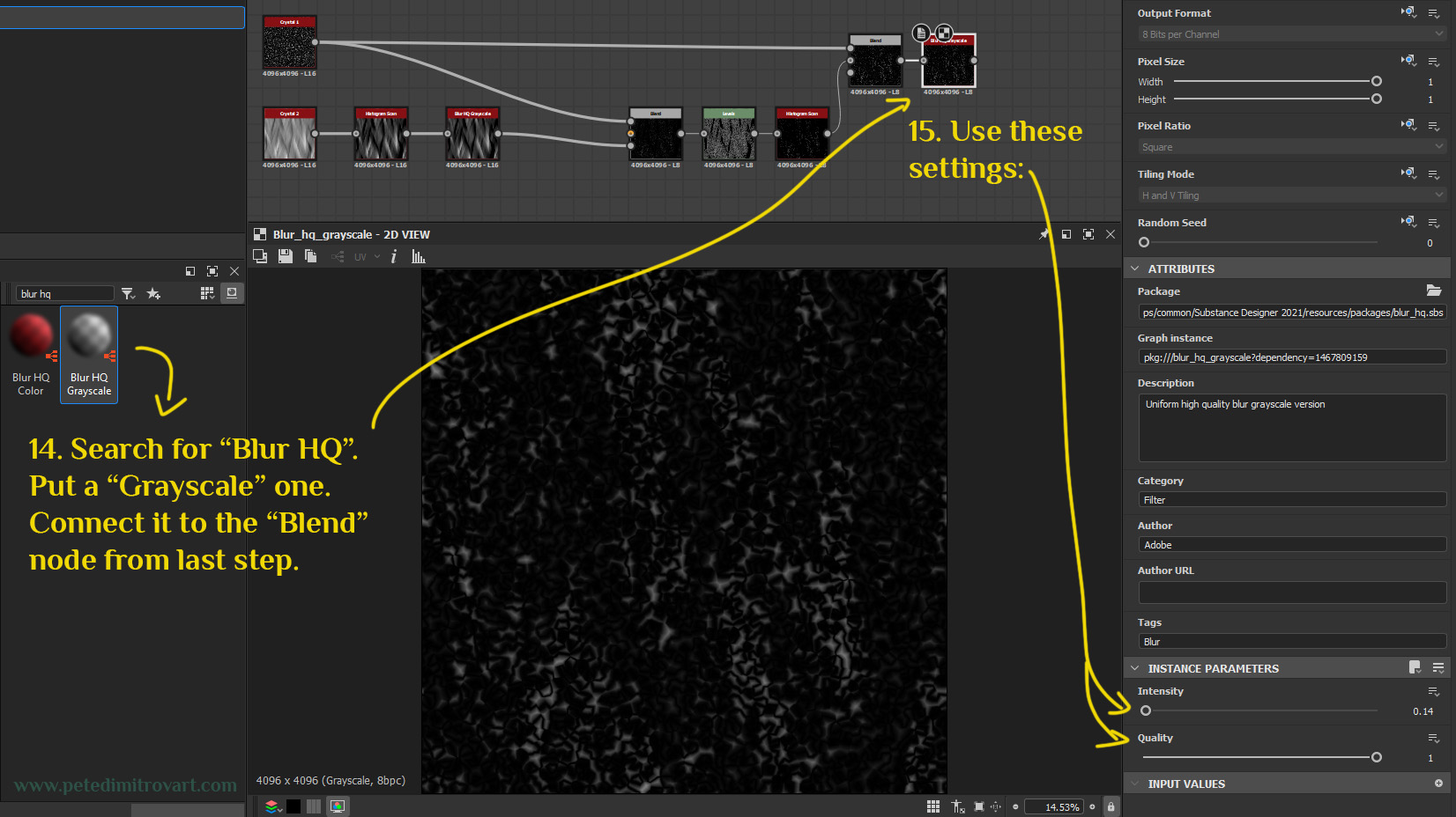
Blur HQ
Let’s add a Blur HQ Grayscale next. Search for that and drag one of it, connecting it in the second row (where Crystal 2 is). For settings use Intensity: 1.14 and Quality: 1.
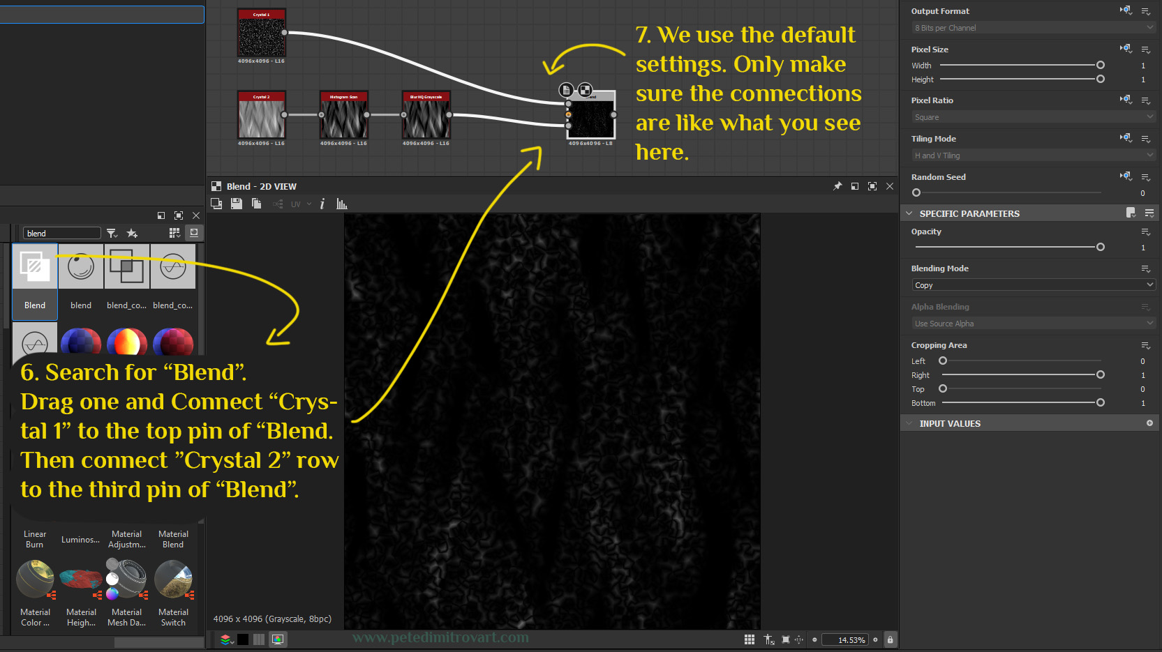
Search for “Blend”. Drag one and connect top row “Crystal 1” to the top pin of “Blend”. Then connect the bottom, last node from the “Crystal 2” row to the third input pin of “Blend”. As illustrated below.
We use the default settings for “Blend”. Only make sure the connections are like what you see here.
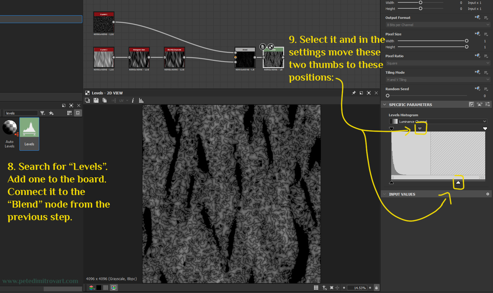
Search for “Levels”. Add one to the board. Connect it to the “Blend” node from the previous step. Select it and in the settings of it, move the upper middle thumb and the lower right corner thumb inwards. Push them to the positions seen in the image below.
Histogram Scan
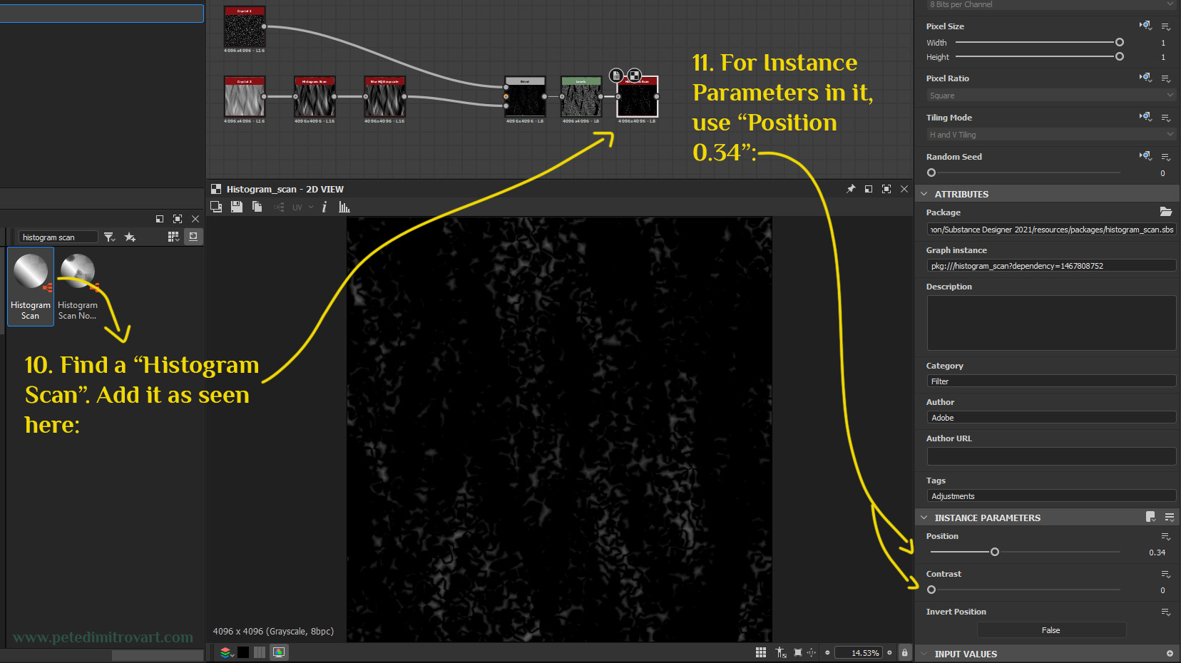
Search for a “Histogram Scan” node. Add it as seen in the image below. For “Instance Parameters” (its settings), use Position: 0.34 and Contrast: 0.
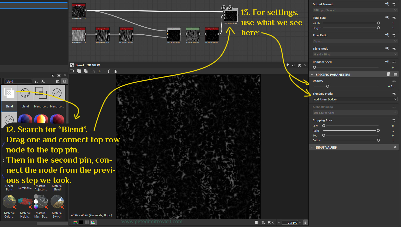
Lets once more blend. Search for a “Blend”. Drag one and connect top row node to the top pin of “Blend”. Then in the second pin, connect the node from the previous step we took. For settings for “Blend” use the following: Opacity: 0.21 and Blending Mode: Add (Linear Dodge).
Search for a “Blur HQ”. Put a “Grayscale” one to the board. Connect it to the “Blend” node from the last step. For settings use: Intensity: 0.14 and Quality: 1.
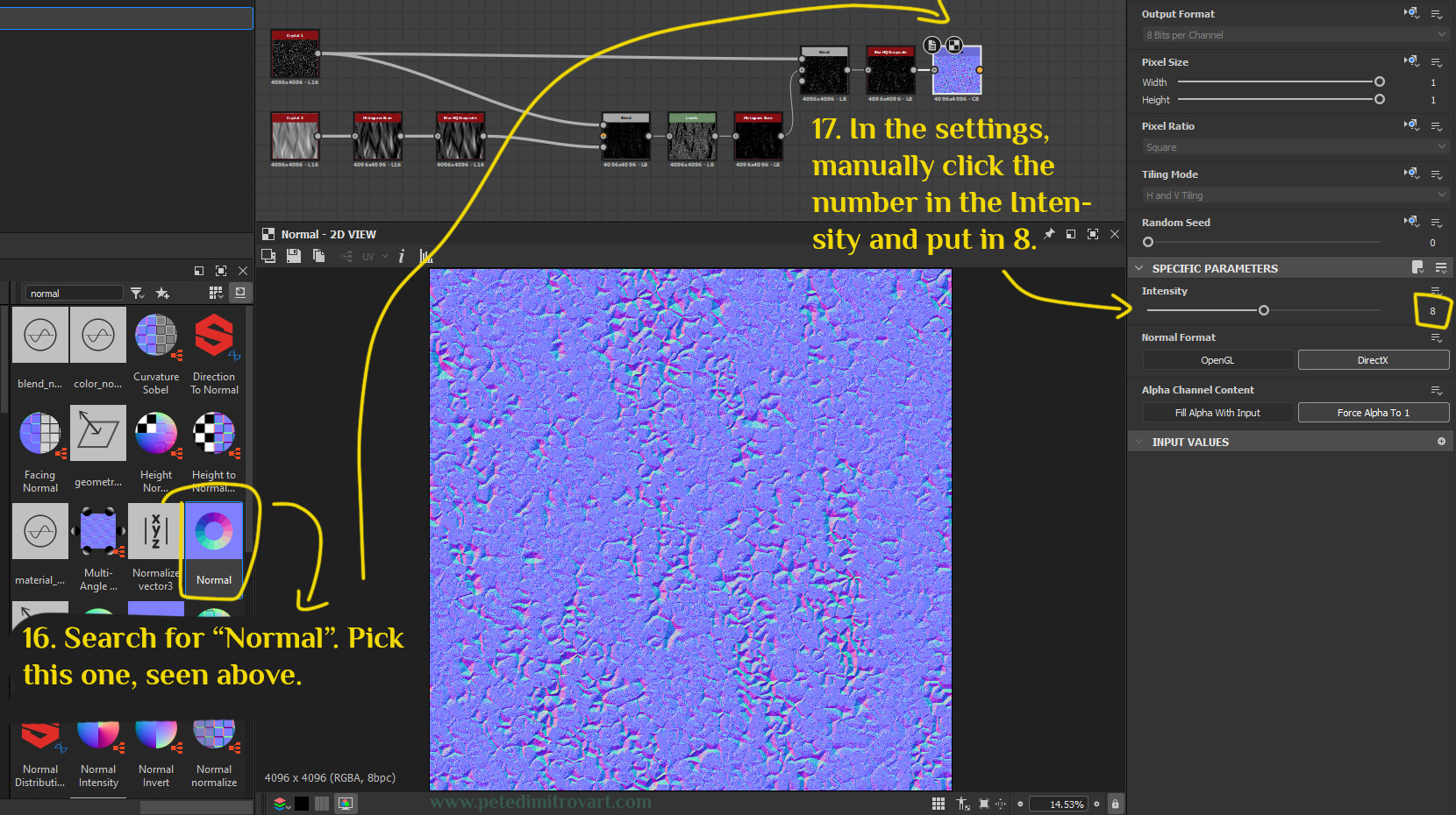
Normal Conversion
We want to turn this black and white texture into a normal texture now. Search for “Normal”. Pick the one seen below as an icon (if you are on an older version of Substance Designer, your icon might be different. Try to find a node that takes any input and turns it into Normal). In the settings of “Normal” node manually click the number of the “Intensity”. That will let you type 8 as a value. If you just drag the slider, you might reach an upper limit of 3. We can go over it by clicking on the number 3 itself and putting whatever we want through our keyboard.
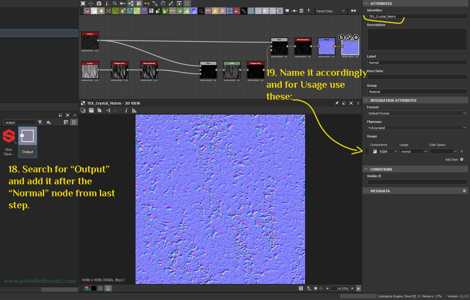
Output Node
Search for “Output” and add it after the “Normal” node from last step. Name it accordingly. I named my “TEX_Crystal_Matrix”. For the other settings do the following:
Description: empty
Label: Normal
User Data: empty
Group: Material
Format: Default Format. Mipmaps: Full pyramid
Usage: Components: RGBA with usage “normal” and Color Space left blank.
Note:
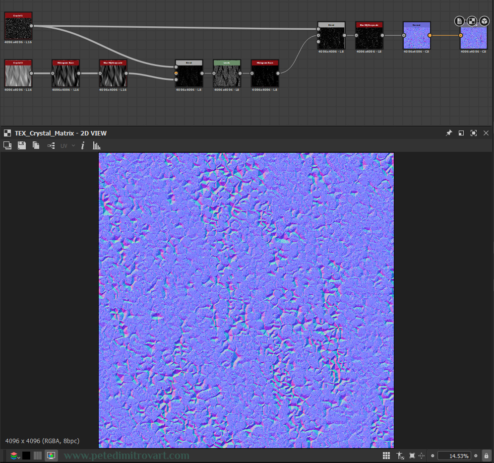
In your Substance Designer little window that gives you a preview of your texture, your normal map end result might look overly noisy and pixelated. A bit glitchy, like what I have in the image above. After you export it, using the next step, you can open up your final image and you will see that it does not look that overly noisy and glitchy. It will still have stepping lines, lots of them, but they will appear much better.
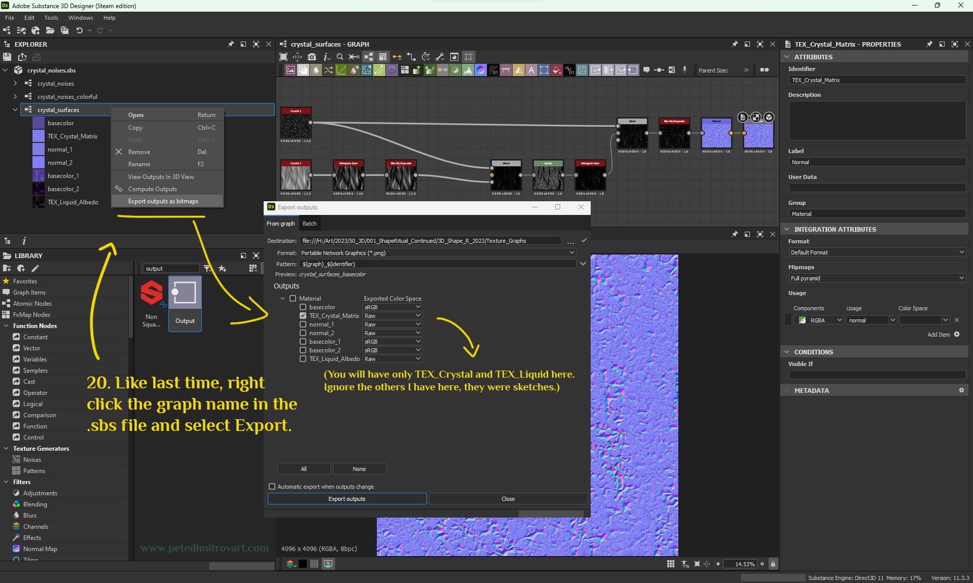
Lets export to a bitmap (an image). Right click the name of your graph. You can find that under the name of your current *.sbs file, in upper left corner of Designer. Hit “Export outputs as bitmaps”. From the window that appears, make sure your newly created normal texture output is selected. Pick a location to export it to and hit export.
Tip:
In this tutorial I exported a few of my textures as a *.PNG format. However, most of the time in my personal projects I save out as a *.TGA instead (Truevision Targa). Over at work at Rebellion, I save and use exclusively only *.TGA as well. That is pretty much the common standard used in the games industry.
In general, *.TGA is a very high quality file format. This is incredibly beneficial for texture types like normal maps, where lossy compression, for example *.JPG is detrimental. *.PNG is lossless, yet as mentioned above, in most game studios, *.TGA is the standard.
Conclusion
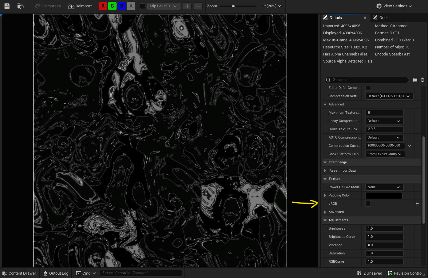
We are done and have created two textures and exported them. One is a black and white mask that we use like an “albedo” but tint in a color later in Unreal 5. The second one is a normal map “matrix” noise that we will use in a refraction shader.
Import your textures to your Unreal project. Your normal map will get picked up automatic by the engine as being a normal map, and will get its settings changed to the correct ones.
However, your black and white, “liquid” mask, after import, you want to double click and open in Unreal.
With the textures created and all imported, in the next entry of this tutorial we will create the “Polar Coordinates” main Material Graph that will support our VFX. We will use the textures in there.
Then we will create a second, smaller material shader. That one will be a refraction one and will be an additional layer of detail, to sit above our liquid spill vortex.
Next part of the tutorial: “The Amarantos Ritual - 07 - Vortex VFX Tutorial - Part Three”.
If you would like to buy the work files behind this tutorial series, follow the link by clicking the image below.
Cheers,
Pete.
If you enjoyed this blog post, consider subscribing in the form below. That way you will get a notification the next time I publish a new blog.