
Recolor
Quick update with some recoloring and some other details.
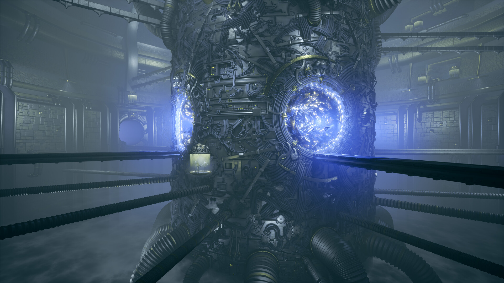
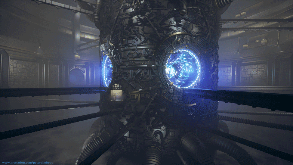
The original concept had blue tint while my vision of it so far was mostly warm gray. (If you would like a reminder of how the original concept looks, you can find it in blog one of the series). I wasn’t going to follow the concept word for word, but I could not stop but feel I might be missing out by not trying the colors in it.
As such after some experimentation I landed on the colors you see above. I liked those quite a bit more than the original warm tomes I had going on. I then went into trying to clean up the portal / event horizon VFX even more. The previous one was too emissive and noisy for my liking and I though it was too busy.
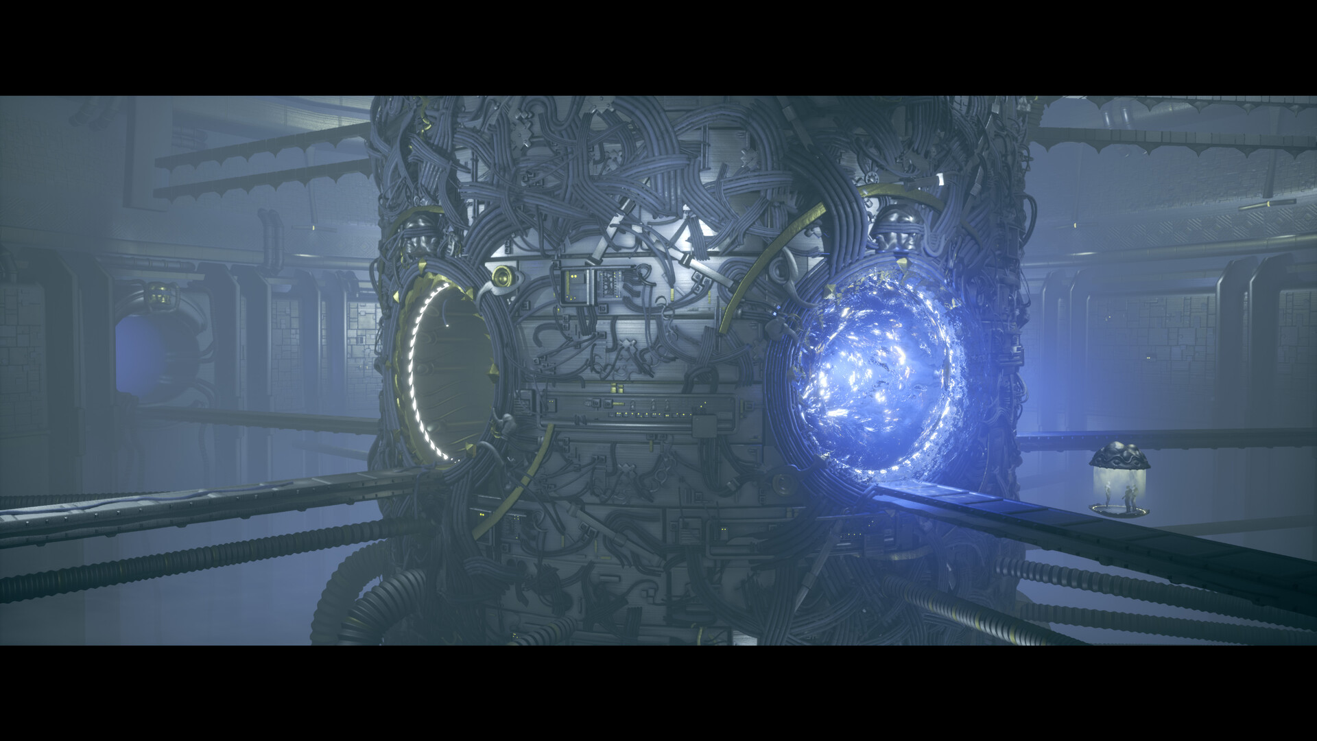
Here is another angle:
You can also see I cut out the concept of the red, warning like colors. I still want to convey the idea of the gate being partially broken and malfunctioning, but maybe going for red and alarming colors was too obvious and easy. Sure it worked out but I think there are more creative ways to do it, I just have to find them.
Gamut Analysis
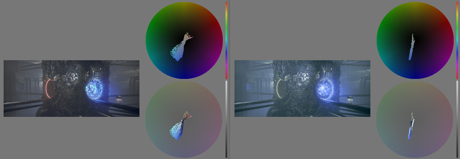
The gamut is much more limited in colors now and I think the end result is quite more harmonic composition wise. You can see a reading of it in the picture above. I added some cut and exposed wires but I have yet to try adding some sparks and other animated VFX. That might help sell the malfunctioning concept without the use of the red color.
Baking Normal Details
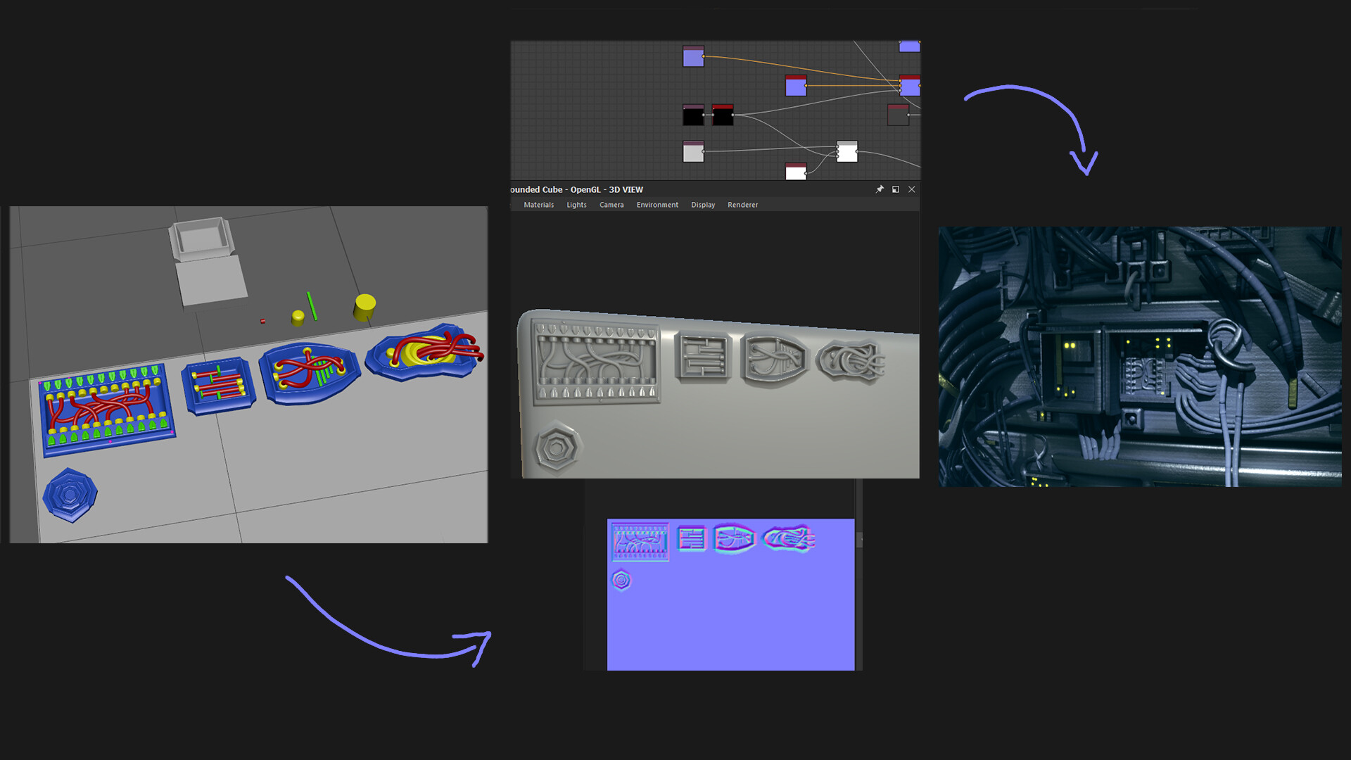
Next I went into making some more pipes for the background. I also made a depth fade shader that gives a force field like effect where some of the pipes go through. Then I went into creating some hard surface stencils and baked details to use and stamp in Substance Painter. I modeled them in Maya and then baked normals of them in Substance Designer. I took those normals to use in Painter. I have just a few going on now but I’m going to make more in order to cover some of the otherwise empty areas on the panel surfaces of the portal.
You can see it below:
Gif Progression
Here is a GIF of my dances with colors:
Let me know what you think.
Thanks for reading,
Pete.