Forewords
Towards the end of December 2018, few weeks after I wrapped up my project “The Animal Shrine”, I was approached online with an invitation to write about my process of creation. The invitation came from the creator of a website I had not heard of until then. The web was called IndieWatch.
I loved the idea and quite honestly was immensely flattered that someone took the time to write to me, let alone invite me to be featured onto their website.
Few years later this website closed and as such my article is sadly no longer up online. In order to bring it back to you here, I used a snapshot from 2022 as captured by Internet Achieve’s Wayback Machine.
Enjoy.
Article
Introduction:
My name is Peter Dimitrov. I am a freelance illustrator and painter, who in the last 3 years stepped in the realms of 3D art. I started studying at the University of Central Lancashire (Preston, UK), pursuing bachelors in Games Design. That is where I started to practice 3D for the first time (started around 2016. I will be graduating first quarter of 2019).
I was invited here, to write an article about the development of my latest, and as of now, first published 3D project. My debut in the medium, so to say.
One final disclaimer before we begin. In this article, I will briefly mention certain techniques but will link resources towards their use. I encourage you to look into them. Sadly I am limited in the number of things I can explain, as there is only so much I can cover without getting overly lengthy!
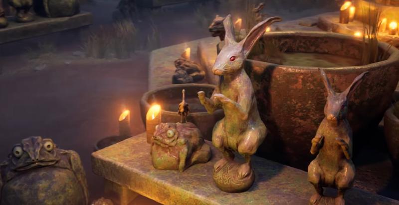
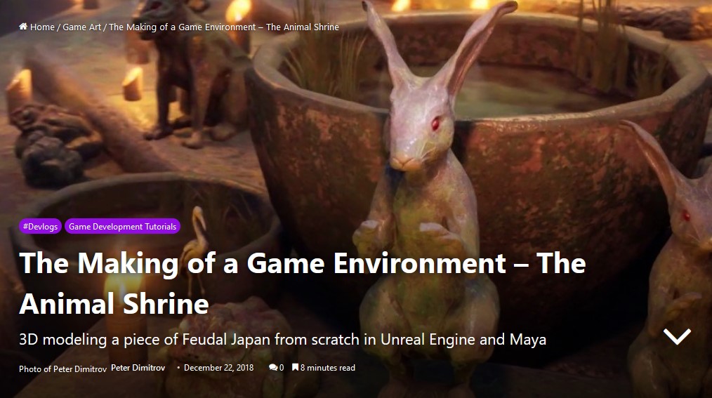
The name of the project is The Animal Shrine. It is an entry for an Artstation Challenge going by the topic of Feudal Japan. But before we go into any explanations, I invite you to take a look at the full finished project, over at my portfolio, here. The project was created from scratch in 49 days. That was the length of the challenge. We were prohibited from using any libraries of 3D models or textures.
Software:
First off, I will start by introducing you into my use of software. We all know that there are multiple programs out there, and a vast amount of ways to accomplish a certain task. My pipeline is an amalgamation of software that I’ve been taught to use at university plus lots of (and predominantly) self-taught techniques.
The whole project is put together in Unreal Engine 4. I’ve used one of the latest versions right now (4.21), deploying features ranging from being vital – for example for the look of my Volumetric Fog particle system; to small and relatively not important ones, such as Geographically Accurate Sun Positioning (which I ended up not using at end, but is still a cool thing you can look into).
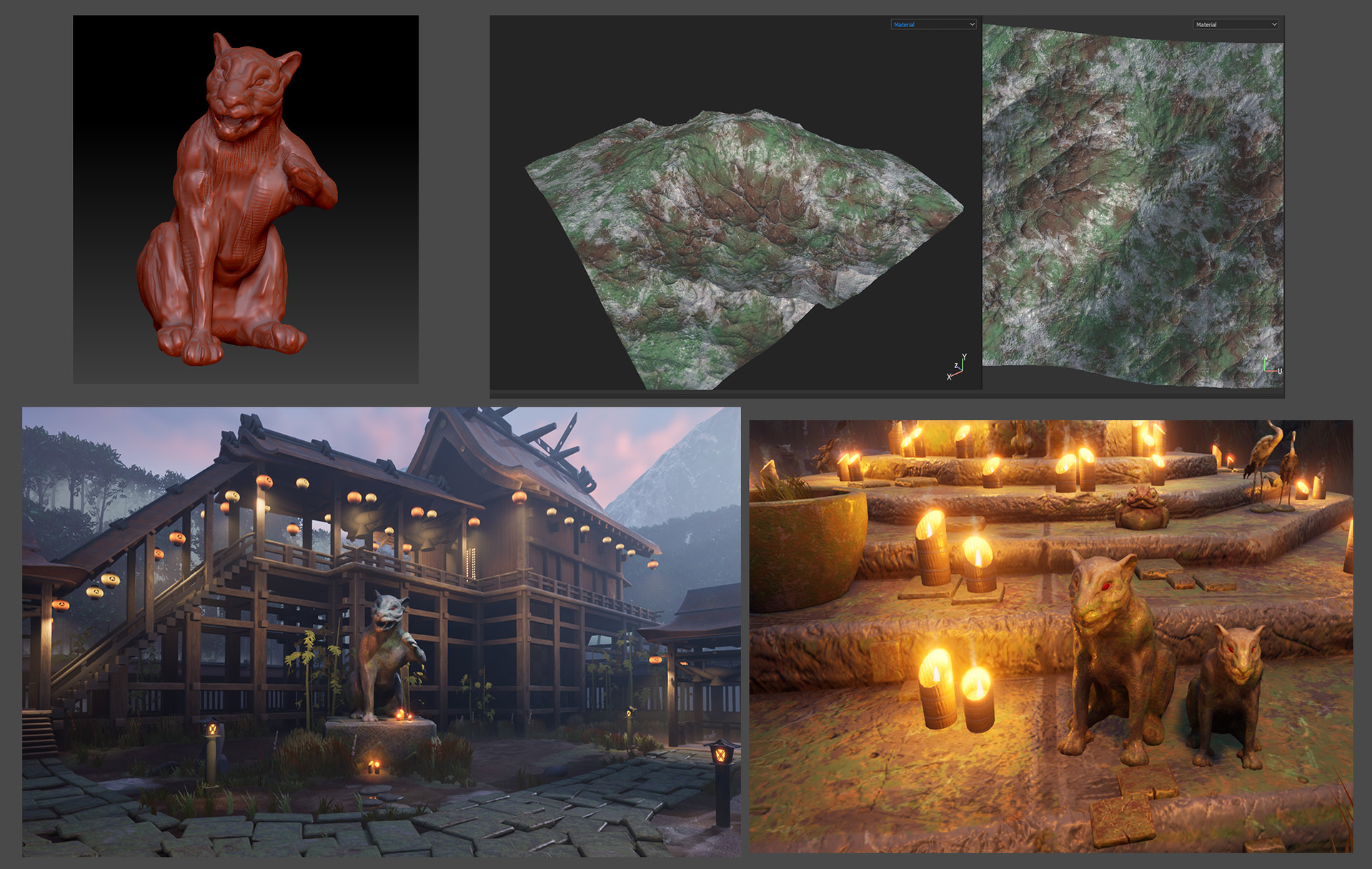
Every prop and texture you see is created by me. For their making, I modeled most of them in Autodesk Maya. At the start of the challenge, when I had more time, I turned every model into a high-poly one in Maya, and then moved it into Zbrush in order to increase the poly count even more and hand-sculpt some detail on the surfaces. I would then decimate the final result, and bake it into the low-poly version that I had UV-mapped prior to that. For mapping, I used the new Maya 2017 upgraded UV editor. I got a few comments on how it must have been crazy mapping everything. It indeed was, but probably the sole reason I managed to make everything in the tight deadline of the 2 months we were given, was this new UV editor. A lot of stuff in it is automated and saves tons of time. One big example would be the feature to scale every UV island so that they match the texel density. Something, that prior to this would be done by eye, by applying a checker-board texture, and scaling up and down everything by hand, trying to match what you see. Well no more. By the end of the challenge, I sadly had no more time to hand-sculpt every detail. As such, I started to bake high-poly on low, without sculpting anything on the high. Might sound pointless, but you still generate Ambient Occlusion, Curvature and Thickness Maps, and they can be vital in the quick making of textures.
When talking about baking maps, its good to mention where I do that. I used Substance Painter. Baking any kinds of maps in that program, Normals, Ambient Occlusion (AO), or anything else, is literally like a child’s play. Use of xNormal or Maya for baking maps still exists in the industry, but I see no point in that, given that we have Painter. Making your maps in it would be only a matter of firstly making sure that your UVs are created in a good way. Then, secondly, you turn your low into high-poly, export them separate making sure that they match locations. Most of the time you won’t even need a cage file.
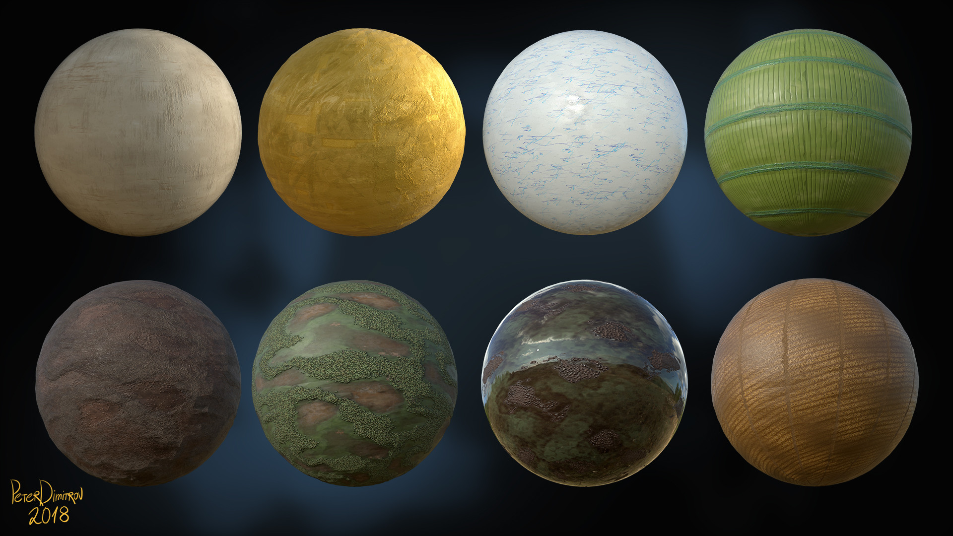
I created a lot of materials in Substance Designer. Those would be basic textures like wood, gold, paper, stone, ground dirt and so on. I noticed that I am very picky when it comes to wooden textures, and as such created around 2-3 very different in visual look materials. I wasn’t sure on which one to settle down, but it all turned out good as I realized that I can just combine them in different ways after importing them in Painter, and achieve a lot of variety. I will share a few tips that require a bit more advanced knowledge in Substance Designer.
I exported every material as ( * ).sbsar. I then imported that for use in Painter. Its crazy how much you can do, if before exporting, you expose the right variables. In Designer, the work you do goes into final nodes called Outputs. My suggestion would be to run your final results for each node into one final node before that. Expose said node and then have control over everything. For example: for Base Color, get your work into a HSL Node, expose the Hue, expose the Saturation and expose the Light. Put that into the Output. For the Normal, expose the Intensity. Before the Roughness output, put a Levels node, and expose every single aspect of it too. Now save that as ( * ).sbsar. Import it to Painter. When you open it there and apply the material to part of your model, you will see that suddenly, if you don’t like the color, you can go in the parameters of the material (whilst still in Painter, no need to go back to Designer) and just tweak the HSL sliders to your liking. You might import the finalized model into Unreal. Suddenly you see that it’s too shiny for your liking. You can go into the material in Painter again, and control the Levels you exposed in the Roughness and tweak everything to your liking once more.
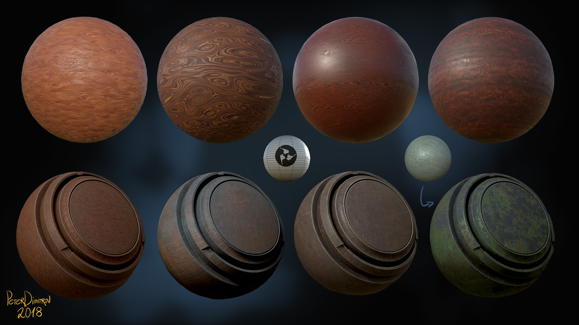
All of the stuff I said about exposing parameters might come out as a bit basic. But if you are smart about it, with just a little time investment you can create so much more. I created those basic wood materials you see and then exposed their color and roughness. Then, in Painter, using Smart Masks (deploying the Curvature and Thickness masks I’ve baked), I combined different types of wood, changed their color and roughness, and basically created a few materials that inside Painter I packed as Smart Materials. Then whenever I had a new model, fully baked, I would just slap that Smart Material on top and have a very good looking base to work off of in just a few clicks. For a project with such a tight deadline that was very important.
The only software, that I’ve used and not yet mentioned, would be World Machine and SpeedTree.
Kind of self-explanatory by their names, I used World Machine to create the mountains you see in the background. I am very much a beginner when it comes to that software, having picked it up for the first time only for this project. Still, its node based design, much like Substance Designer, was not hard to navigate at all. I created a very basic looking mountain deploying different noises. From the software, I exported a high-poly base model. You can work on the texture there too, and export bitmaps, but I had no time to dive into that. Instead, I took my high-poly in Zbrush. There I decimated it to low poly and used UV Master to generate UVs. I took both into Painter, baked channels, and used those channels to color it. It’s very easy, because stuff like the peaks of your mountain, go on a very specific value on the Curvature and Thickness bitmaps. As such, using some of the Smart Masks, you can pick the very tips of the mountain, and color them in white, to have snow for example. Change the value of Roughness to be shiny, and suddenly in under a minute, you have a very realistic looking mountain. I imported the model in Unreal, and just spinning and scaling it around, faked some variety and very long mountain range by reusing the model.
Foliage
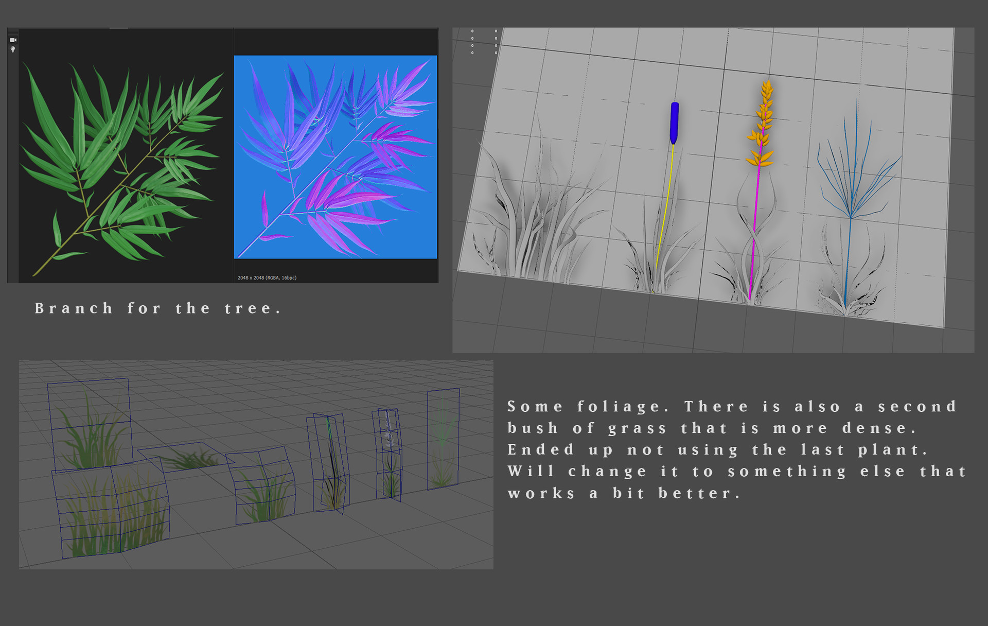
Most of the foliage you can see is created in Maya. The bamboo tree you see close to the camera in some of the shots is assembled in SpeedTree. The tree in the very distance is again created in Maya. For their creation, I used a pipeline very well explained by Karen Stanley. I made basic low-poly leaves and grasses in Maya. Some of them, I took into Zbrush for some detailing. Those high-poly models, I then took into Designer and having created a low-poly base plane and a cage, putting the foliage props in-between them, much like a pressing a flower between the pages of a book, I baked maps from which I colored and created my foliage textures.
This about covers the basics.
Painting and 2D Mediums
Unfortunately, there is much I have no time to go through, as it would call for the writing of multiple tutorials and not just a single article! There is only one final note left that I want to make. When working on an environment like this, pay attention to how the whole place looks. Look at the whole picture. Make smart decisions about your layout, the silhouette that your buildings and props make. Look around with your camera and try to capture dynamic shots from the very beginning, even if most props are just gray-boxed placeholders. If your composition is boring from the very start, even the most detailed and pristine model, modeling and texture wise, will not fix your problem or make the picture look better. I feel like all of this is something that can be much more obvious in painting and 2D. Study composition making in illustration and photography, even if you don’t have much of an interest in those mediums. They still can teach you a lot and improve the quality of your 3D work exponentially.
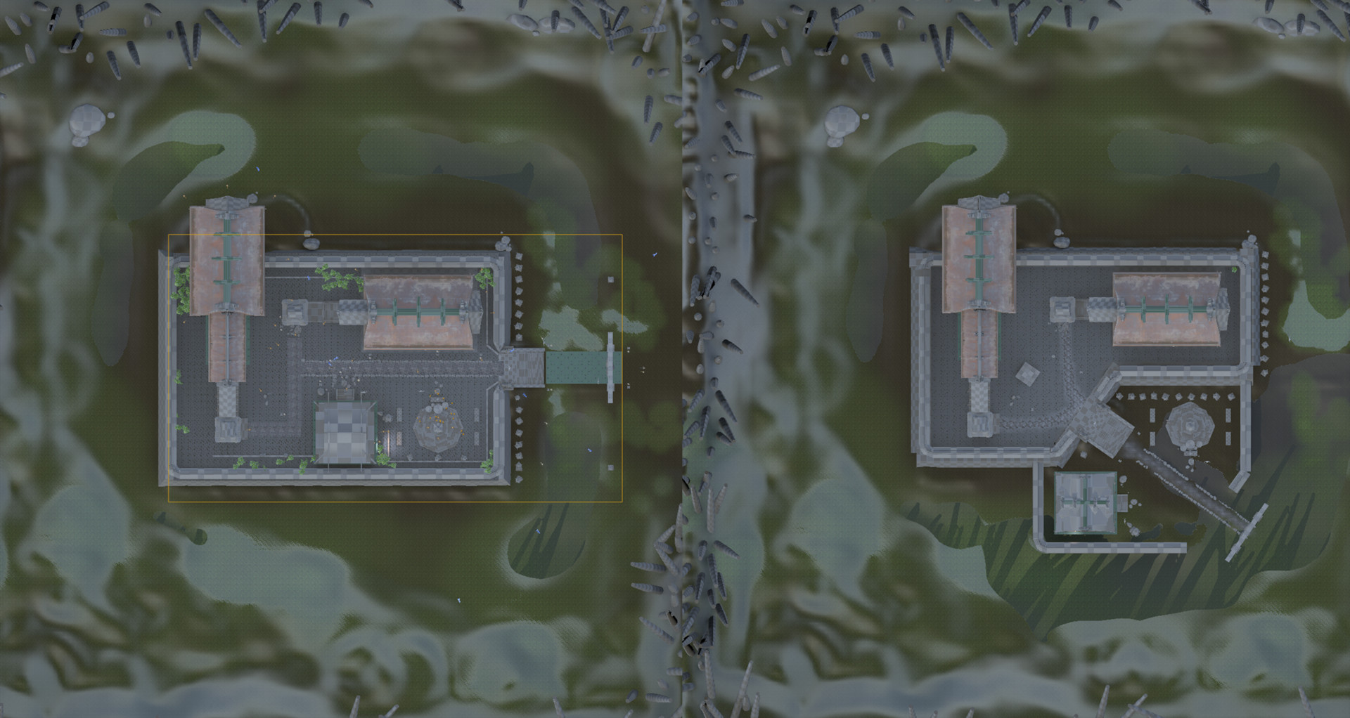
Thankfully, I can give you a good example of this project. I started the whole thing by containing it into one big rectangular shape. That would be a second, elevated level to which you go through some steps at the very front. I did lots of research and reference gathering before starting the project. My research told me, that in Japan, they indeed made shrines and places like the one I am creating, very contained, fenced in a very rectangular way.
Believably like that, did not change the fact, that even though I had some buildings even on another scaffold level, the whole place still looked very boring. I would fly around trying to pick some dynamic angles. I had few, but still not many, and even those came out a bit boring. At that point, as suggested by some friends and people over at my university, I decided to take a few of the buildings I had created to the ground level, and separate everything even more. That’s how the final layout was born.
Timelapse
I capture a lot of screenshots during the development. I assembled lots of them into one final, dev video. It overlooks the place in an aerial type of shot, before changing to a closer camera. You can clearly see what I explained there. You can watch it over on Youtube.
Conclusion
It was a pleasure to write this, and I do hope you find it useful and insightful. While working on our entries for the competition, we were requested to keep as detailed as a possible blog. To sort of prove that everything is indeed our work. You can go and read mine for some more tips and insight. Find it over here. I also created a sort of cinematic fly-trough video, trying to convey a story I made up for the place.
If you would like to follow my work, you can do so over at Artstation, Instagram or Facebook.
Take care, and if you liked the article, do keep an eye here on IndieWatch too. We might meet again for another one.