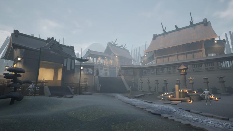
Revamp. Back to basics.
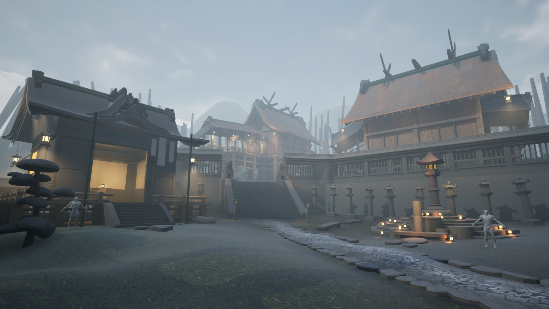
If there is one thing that painting and illustration has taught me better than any anything else, it’s the fact that sometimes you can feel in your gut that there is a problem in your composition, but you cloud your mind and decide to ignore it because of fear of failing in trying to fix it. The truth in nearly 10 out of 10 cases, though, is that if you put the time in and you do not ignore it, there is no chance you will not succeed in improving it.
In this environment, I could feel the square, too perfect shape. I thought that it fits nicely a shrine, or a temple like that. According to my research, in Japan they did build them in that fashion quite frequently. But that does not change the fact, that no matter what angle I would take with my camera, most of the shots were way too flat and kind of boring.
So I went in and used to my advantage the modularity of my props. I left the two main buildings elevated, but took the square hut and shrine down one level. I did that in hopes of capturing more dynamic shots with more interesting silhouettes and better shapes.
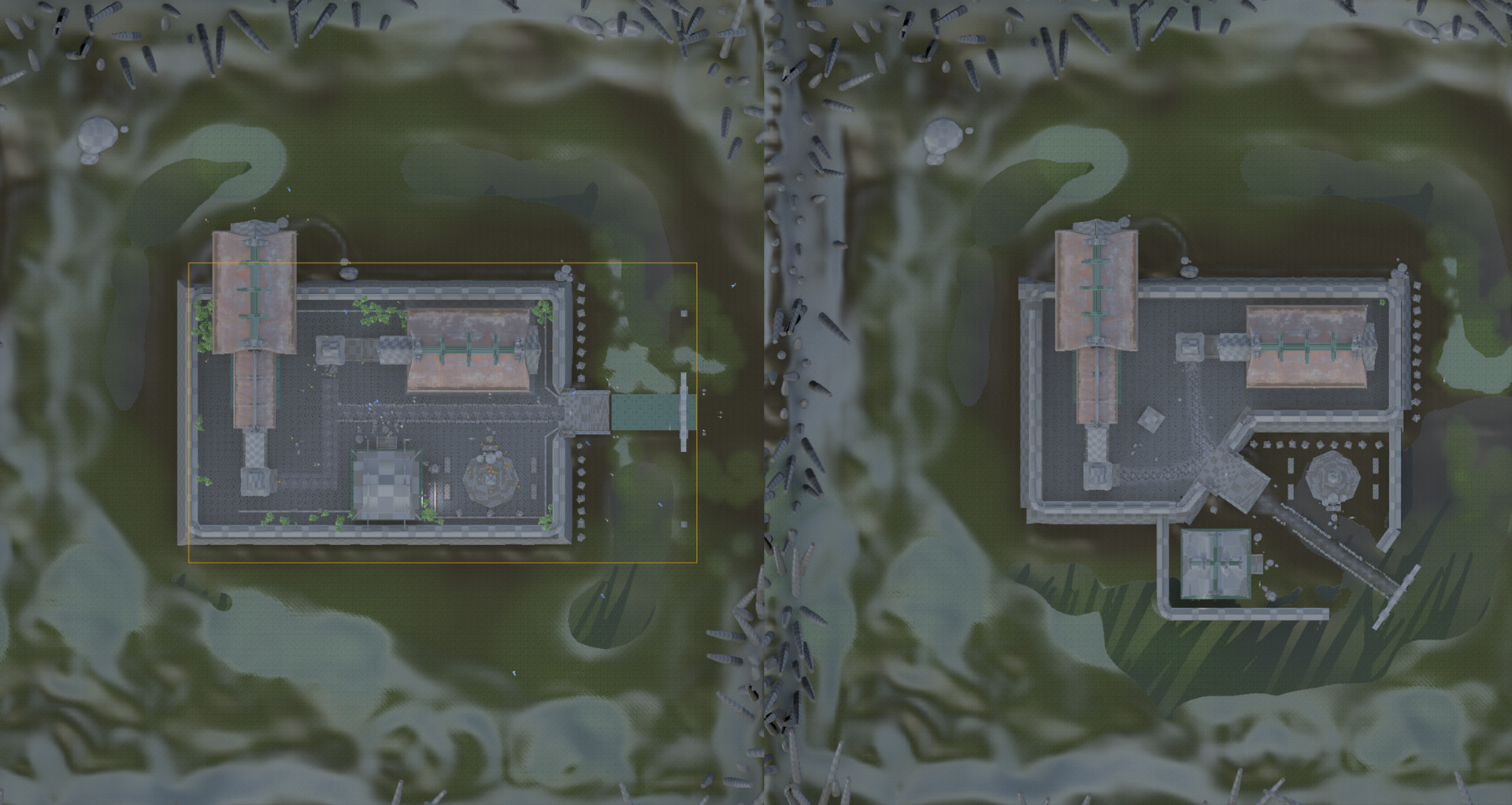
I feel like it did improve quite a bit, and although I will still be posting shots capturing the whole place, I am going to stick to some specific angles and work on what is seen in them.
The textures you see for the landscape are placeholders (kind of obvious when you take a look at those roughness channel values).
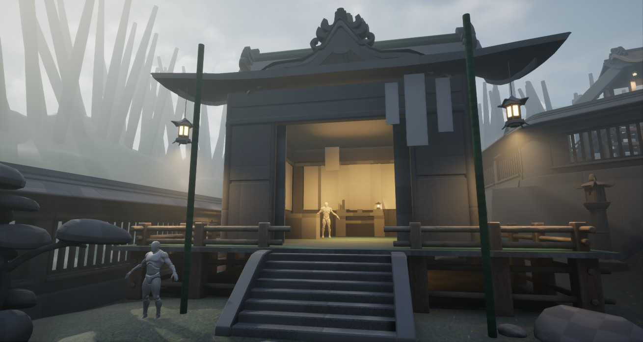
In my very first post I mentioned that I have a special idea for the square hut. I finally went in and blocked it. I want it to look like the workshop of a master calligrapher. All around on the walls and the entrance are hanging countless of scrolls with all sorts of fortunes written in beautiful calligraphy. It needs lots of work but I will try to keep it relatively simple and give it more detail with the scrolls. A good friend of mine from Japan will help me put some proper sentences and texts on those.
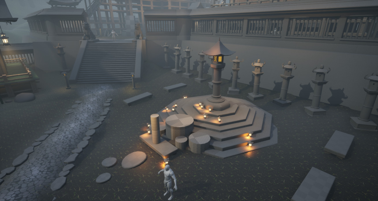
I placed some tiny lamps on the shrine, but the idea is that they will be candles put in bamboo sticks cut at a sharp angle. I blocked out a few shapes in front of it. One will be a trough and the ones next to it will be vases, plants and some statues at the very front.
Gif
We haven’t had a GIF for a while so here is one as usual. Starting from the beginning.
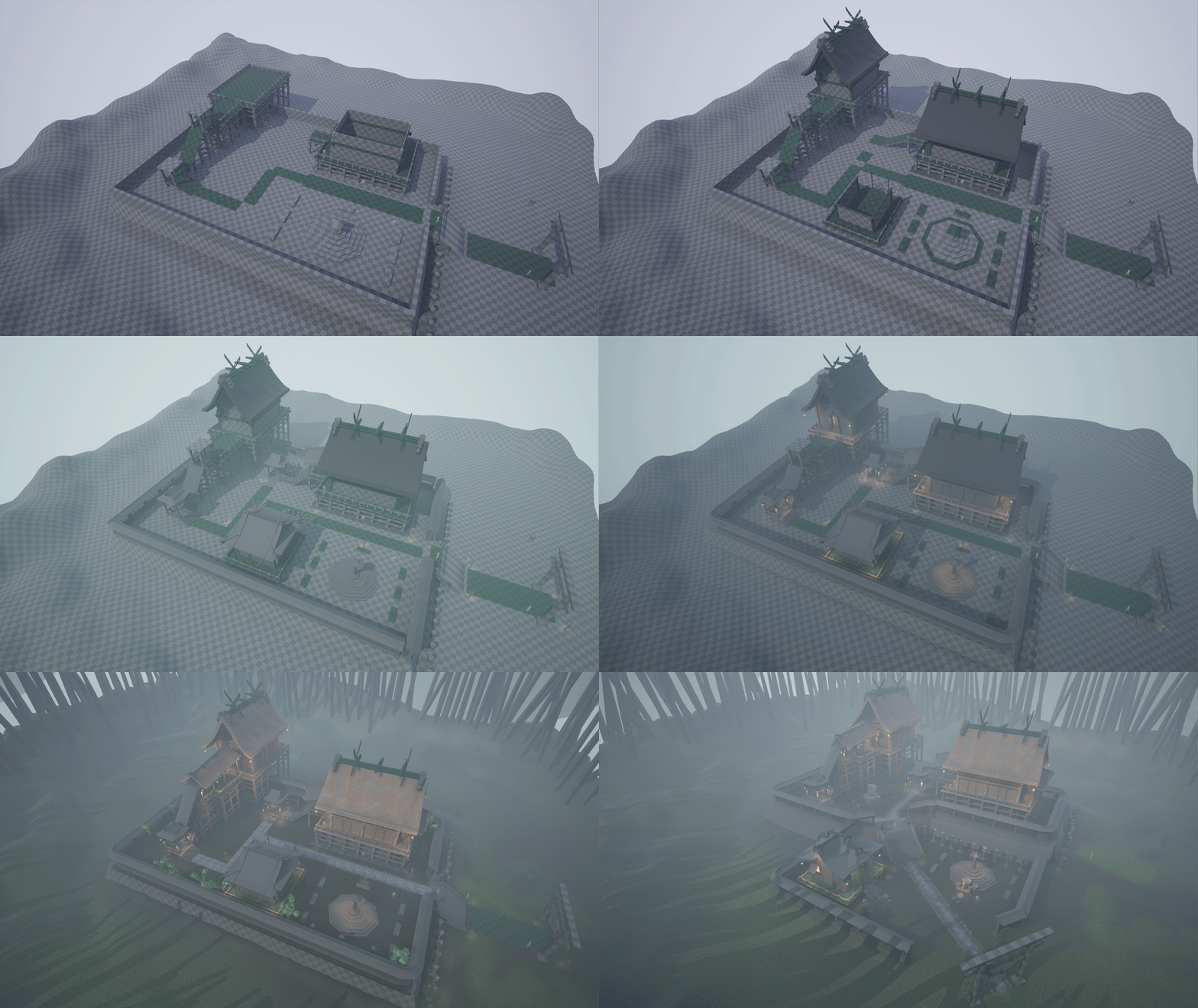
I hope you do agree that there is an improvement. I want to thank a few friends that gave me the valuable feedback of saying that the place was looking a bit too flat, even though I had it elevated and every single building was on a different construction level as well.
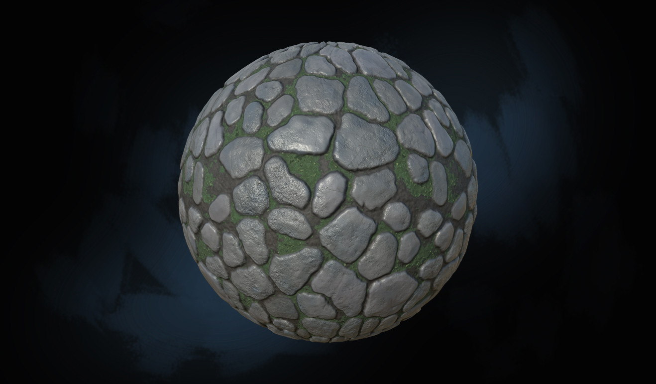
I have a few important props still missing, but I will get right to modelling those and then I will try to focus on getting finalized textures and models. I created a cobblestone material, which I still haven’t implemented in the scene.
Any comments are appreciated. Have a good night from me!
