Intro
Some of you know that I was in the middle of making a diorama with a tall tower in the middle of it. That is in the shape of a Mage tower, as per the mages seen in World of Warcraft.
I don’t usually do fan art, but I thought I will render something unique and of my own, but add the Kirin Tor sigil on top, indicating that it’s designed to be potential fit to the WoW universe.
I decided to do all of that mainly for learning and practice. I hadn’t done any World of Warcraft, or League of Legends, stylized art in the past. This was the first time.
In the midst of completing this tower diorama, it felt challenging and overwhelming to figure out how to populate the small, yet daunting looking isle I was creating.
Thats when I decided to scale down even further. Cut in half the island that the tower sits on. Cut the tower itself away too. Keep its magical entrance, the portal, then take it from there and texture everything to something that is a closer fit to WoW. In the process, I was also going to learn how to make hand painted textures and visuals that fit the game.
Once that small piece of land were complete, I would go back to the bigger one. The tower itself. So far, I’m on track with this plan. My smaller diorama is complete. I’ve made three video devlogs showcasing how I approached creating this small piece of diorama.
This blog post documents my third video in that series. The environment is complete, and soon I will make a blog post showcasing that. In the meantime, if you are interested, you can find the finished art galleries over here, on my Artstation.
Video
I’m going to write about the different aspects of making the small diorama (not the tower, but the portal gateway one). I have lots of screenshots that show progress and behind the scenes, giving you insight of my decision making. It also shows some of my experiments. Those were were “sketches” and made me realize I need to go towards a different direction.
You can scroll down in this blog page, to read all of that. But before you do that, I invite you to watch my video devlog, that covers all of this. In here, I explain the art in detail and I give you as much insight as I could.
Grass Props
I set off to creating some foliage for my diorama. I had painted some tiling grass texture. It gave me the first layer of detail I needed. That was the colors and the small, tiling visuals that went directly on my landscape actor.
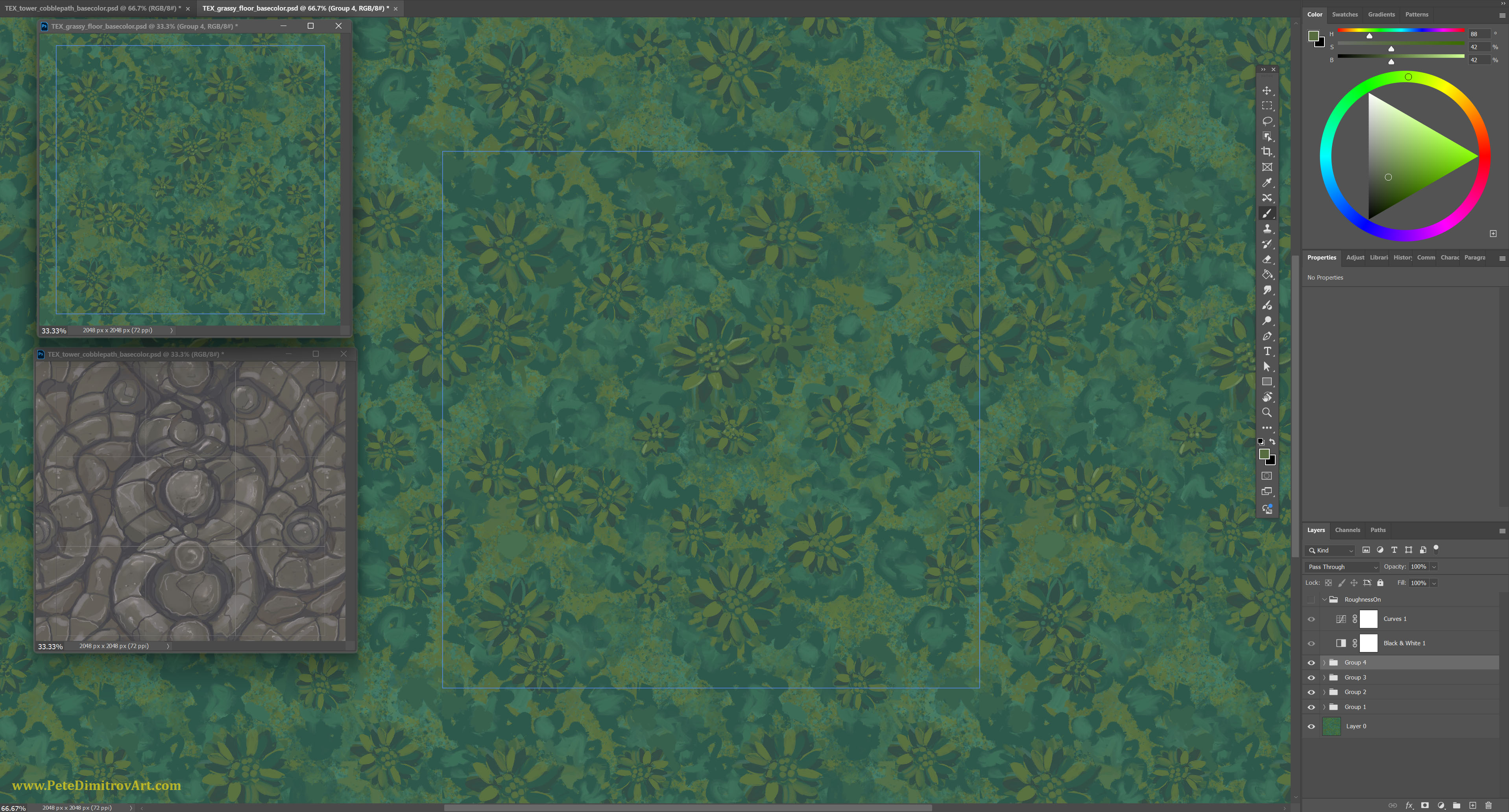
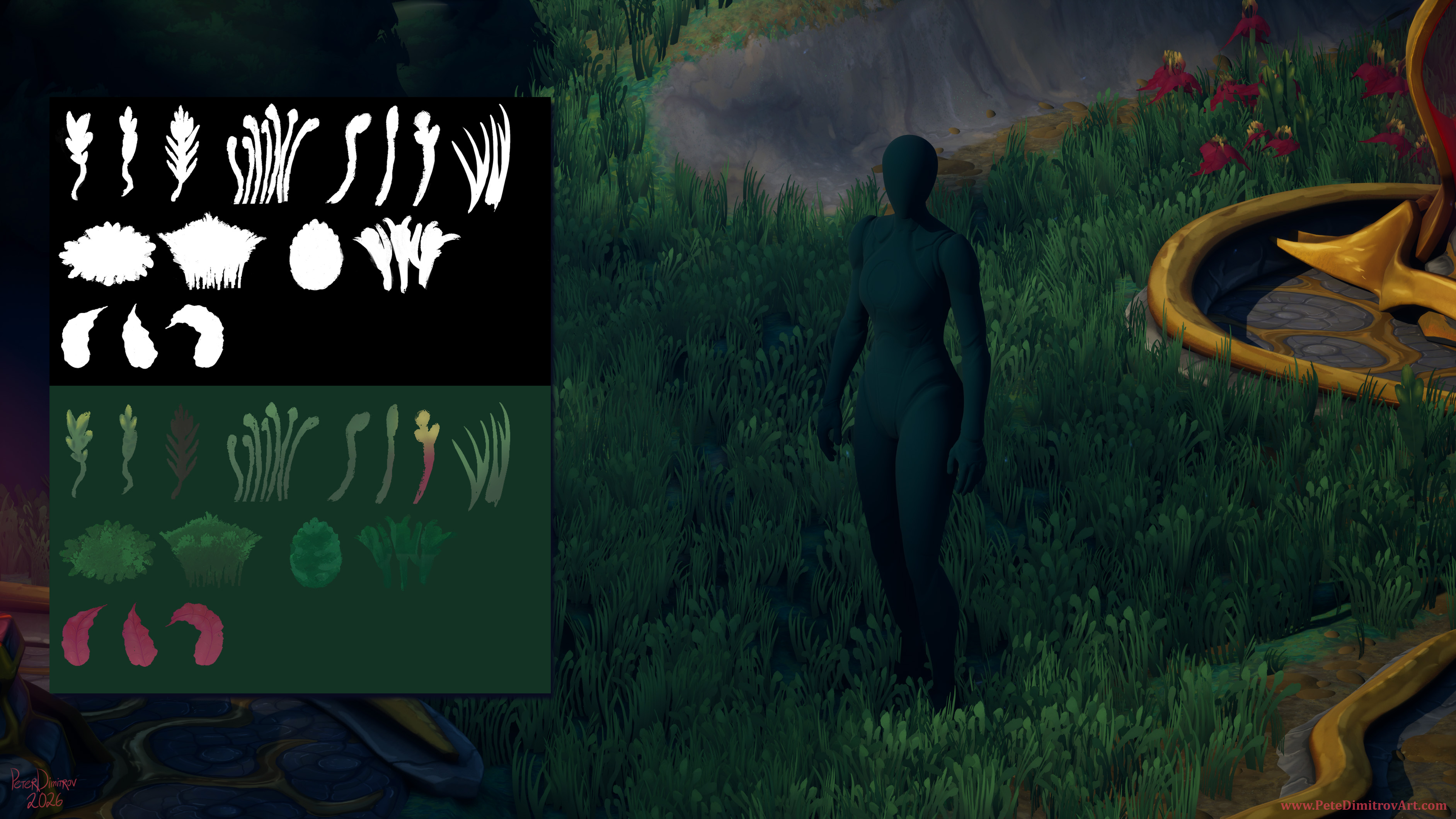
I did that by making a tiling noise in Substance Designer and then taking that into Photoshop. Inside of Photoshop, I hand painted details and refined the grass visuals. Once those were complete, I needed to bring some dimension to the otherwise flat grounds. It was time to paint some atlas textures. Those are silhouettes of grass blades and other pieces of vegetation.
I painted those directly in Procreate, on my iPad. I think its easier, quicker and with much less fatal errors resulting in crashes and work loss (that’s my typical experience in Adobe Photoshop, so these days I just avoid it, if I can).
This is how it looked:
Once I liked the shapes, I made a black and white opacity mask. That, I sadly had to do in Photoshop. I opened that on my PC, edited some values and removed the background. I saved that as b&w image, and together with the albedo texture, I loaded them in Blender.
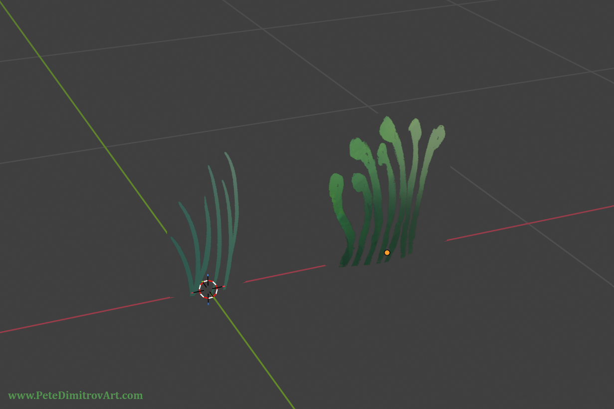
Inside of Blender, the two images went onto a material. That I then applied to a flat plane. The black parts of the opacity texture now gave the plane transparency. I can see only the grassy blades.
As a next step, I cut my planes into smaller cards, focusing only on the individual grass blades.
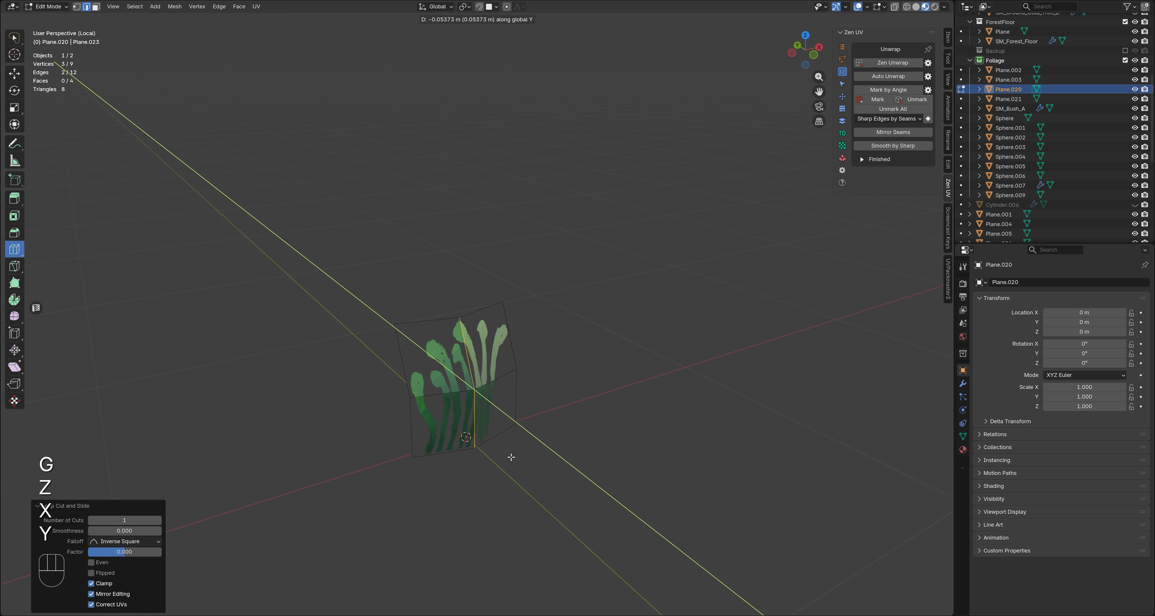
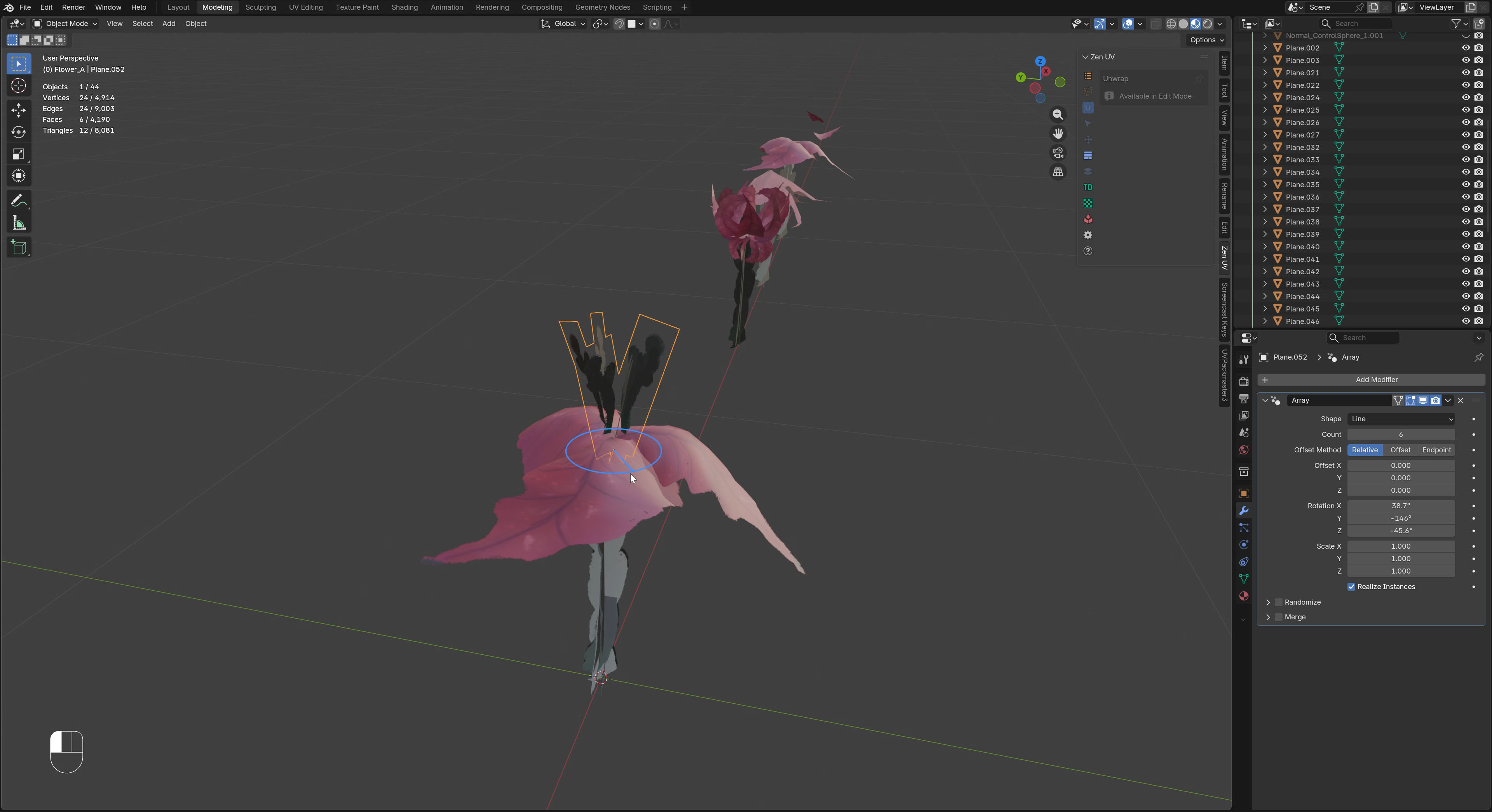
With the grass blades cut into separate pieces, I started to subdivide by hand those cards and give them more dimension. I do that by using Blender’s Knife tool. Once I have enough loops, I move them around using Proportional Editing and I subdivide. I try not to go crazy high-poly, but I try to give myself enough geometry so that I can make the grass planes have a bit of dimension. They shouldn’t be completely flat.
From there, I use Edit Normal inside of Bender. That way, I manipulate the normal direction of the planes to be more bright and get shadowed less, once imported in Unreal Engine 5.
With all of that to a standard I like, I import it inside of UE5. In there, I create a new foliage material, using the textures I already made. As a next step, I apply the material onto the geometry from Blender (the foliage planes I made myself).
The final result, I plug into the Unreal 5 foliage scattering tools. I change around the settings for density, alignment and scale. I splash large swashes of grass onto my landscape actor, directly in UE5.
Build Up The Grass
I didn’t make just one type of grass to then scatter that everywhere. I need instead, and I need to build up the density of the grass by making two or three different grass variants. As such my work on the grass foliage took a few hours, over a few days.
Once I had made one bulky, blobby grass (the first one I made), I went back to cut another one from my 2D atlas. This one was thin, sharp grass (my second prop). Then, as a third, I made a single strand grass that had a bit of yellow on top.
I exported and refined those slowly. I didn’t rush. Once I had made each, I went into UE5 and my landscape and I tweaked my Foliage Scatter settings and introduced more and more density. As such, more and more variety, added slowly.
I wanted to write all of the above and remind you that creating a dense, rich canopy of grass on top of your landscape, will be a process. It will take multiple steps. You won’t create just one type of grass foliage asset and then call it a day. For richness, you want to make one or two more variants, and then scatter them on top of your existing grass work, but at a different scale. At least that is what did it for me. I hope those tips help you make some nice grass for your stylized projects as well.
Flower Props
I had my grass scattered, but on top I wanted another layer of detail. I wanted some color. That tied nicely into the idea of creating some flowers.
My scene already has quite a few main colors. There is the blues of the sky. There is the green from the land. There is warm gray from muddy paths. Then there is the biggest actor; the scarlet red from the portal and from the crystals. Finally, lets not forget the yellows and golds that come from my trims. That totals five colors. In reality, three or so are the main ones, the rest are slight branches of the main, familiar hues.
I didn’t want to mix another color in here. I didn’t want purples, saturated blues, digital cyans. Or mellow pink. The flowers I was to make could have used any of that, and it would have been very pretty. As I said, I already had plenty of colors. The natural conclusion was that my newly made flowers should use one of the preexisting colors. Thats why I decided to make the flowers be red in bloom.
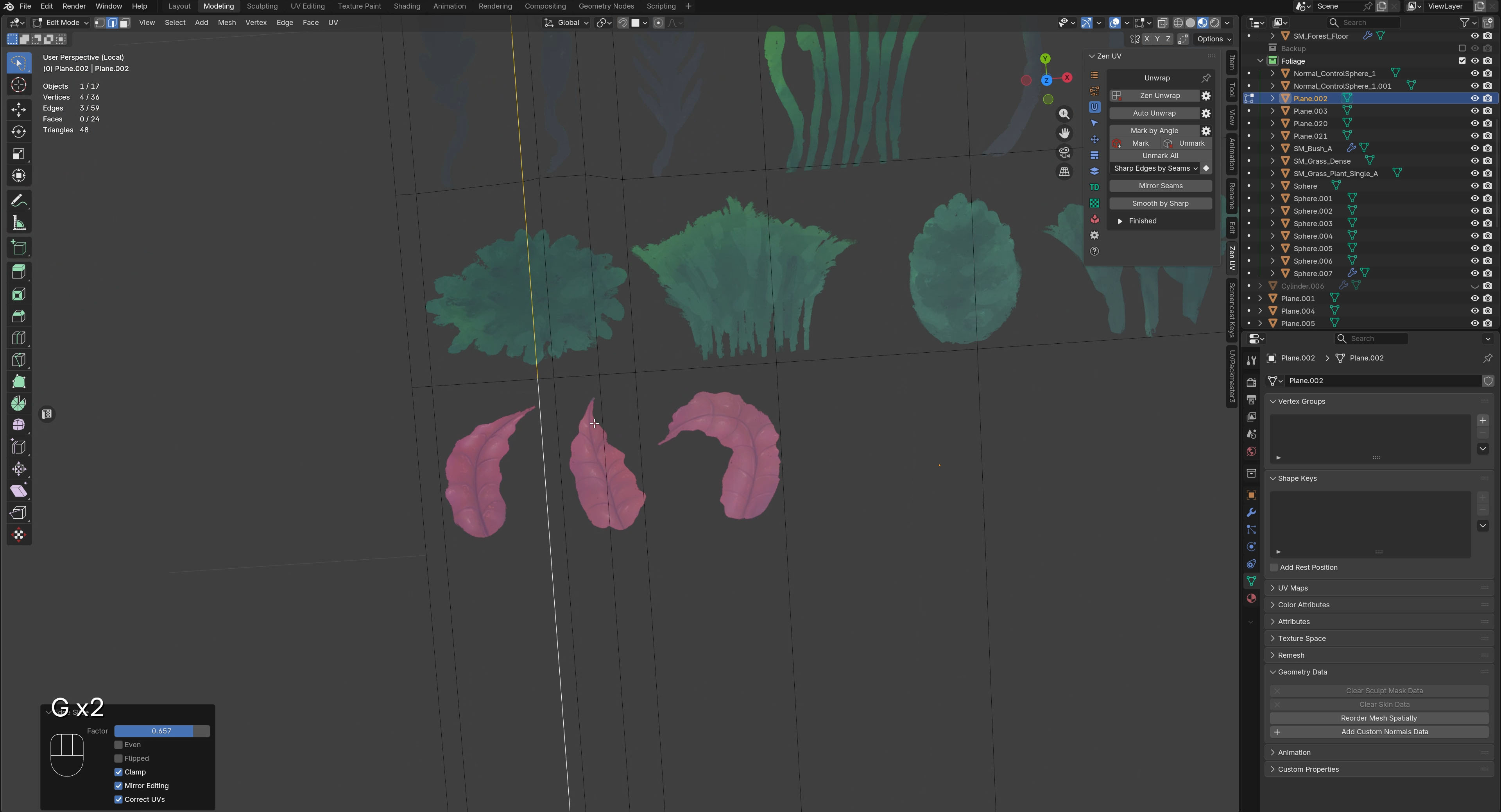
On my 2D atlas for foliage I had painted some red, autumn leaves. I didn’t end up using them as tree leaves, because from the start I was keeping away from the idea of creating trees for this project (Scope creep! We already have faced that a few times, lets not overly complicate and go into making tree props!). In that case, I decided to reuse my autumn leaves as the petals of a flower instead.
I went into Blender. I cut the leaves out onto planes. I subdivided. I went with the pipeline that I used for my grass. I bended the leaves and turned them into petals of a flower.
You can see all of this in the YouTube video above, in ways that I could not manage to describe in writing here. If you haven’t watched yet, scroll up and give it a go! The video is divided in chapters, so you could skip right into the one that shows the flowers and how I made that in Blender.
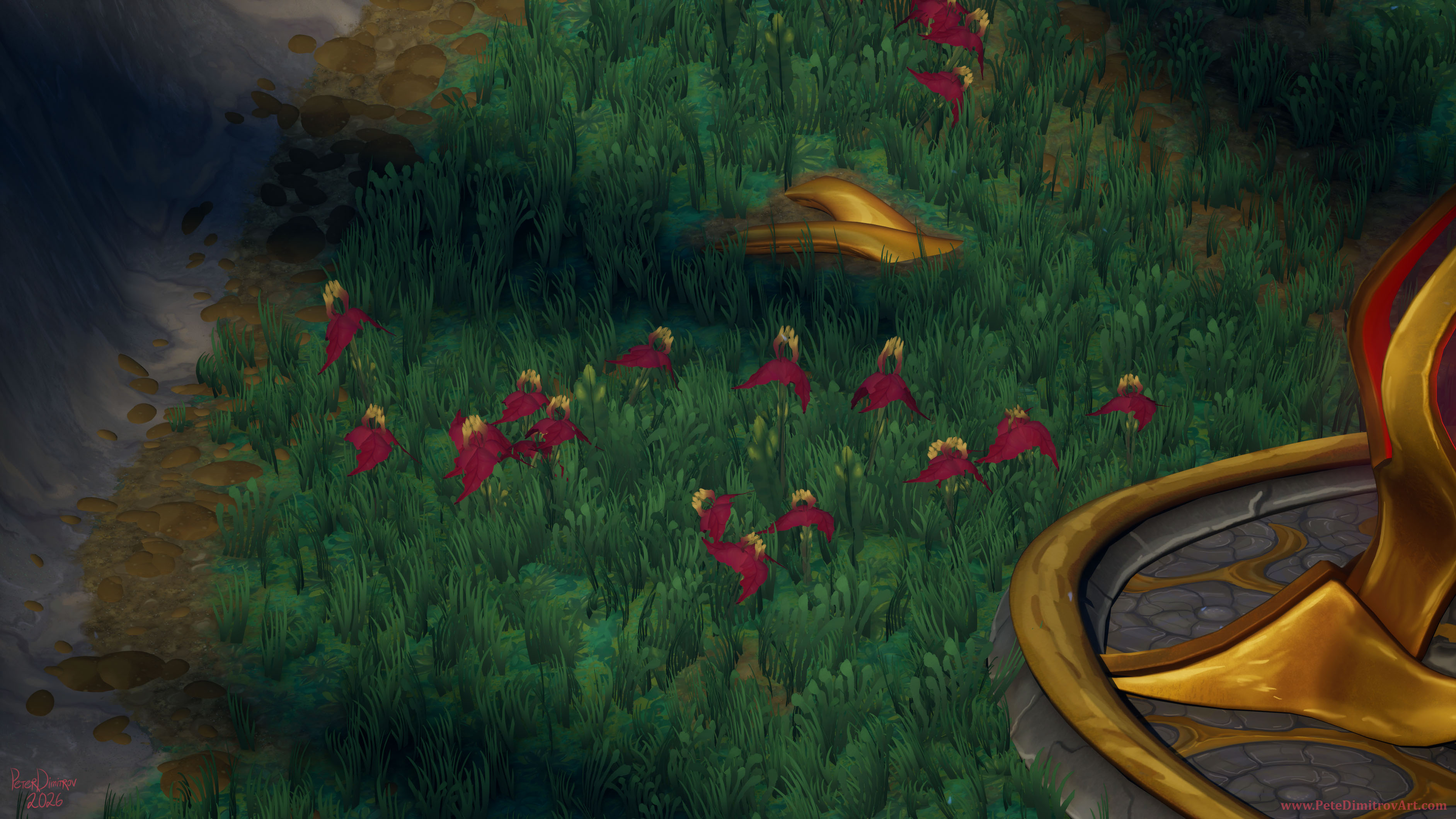
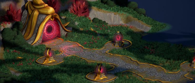
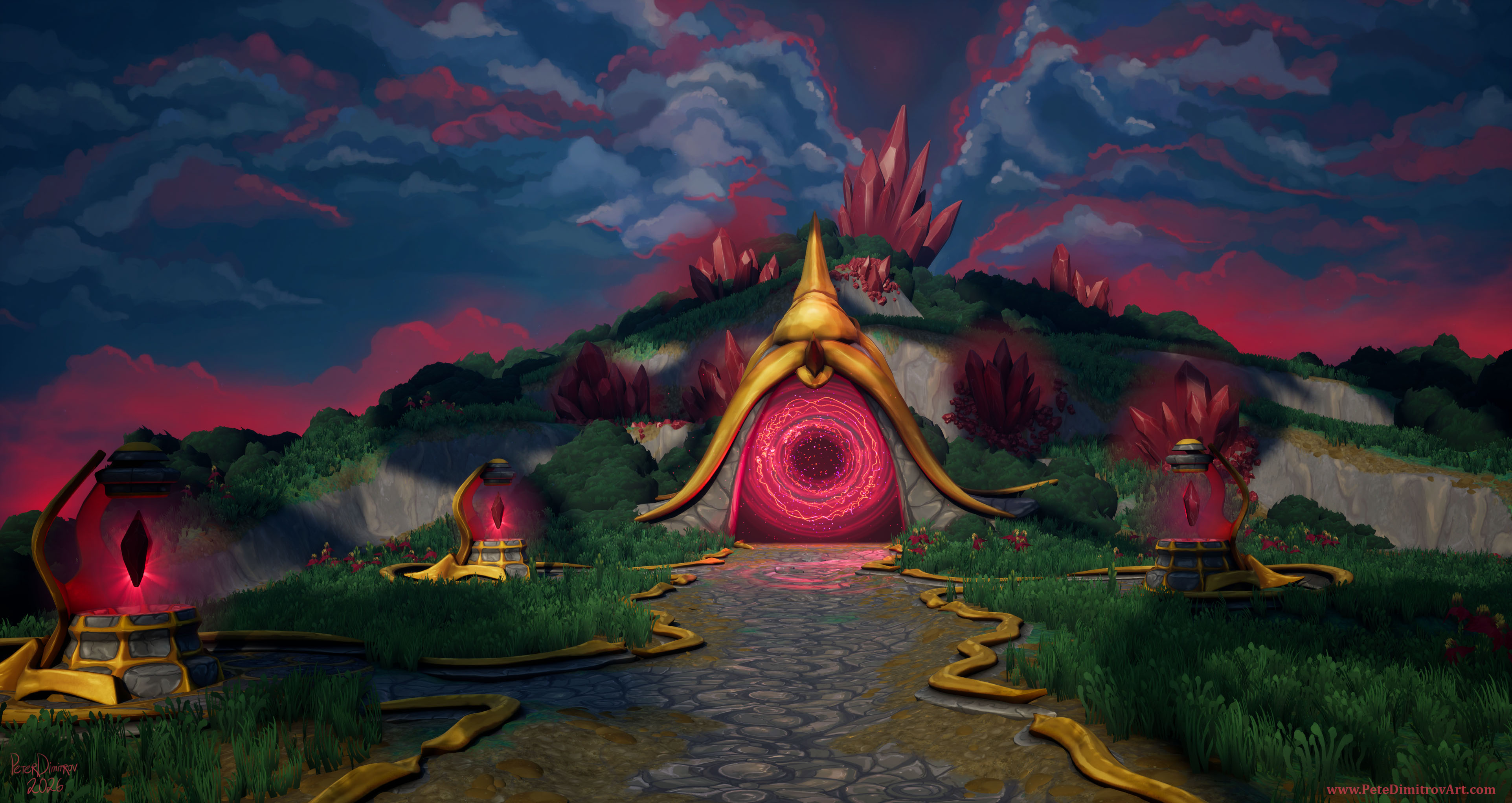
With the flower created, I scattered it at a varying scale in pockets, around the grassy landscape. The end result is this:
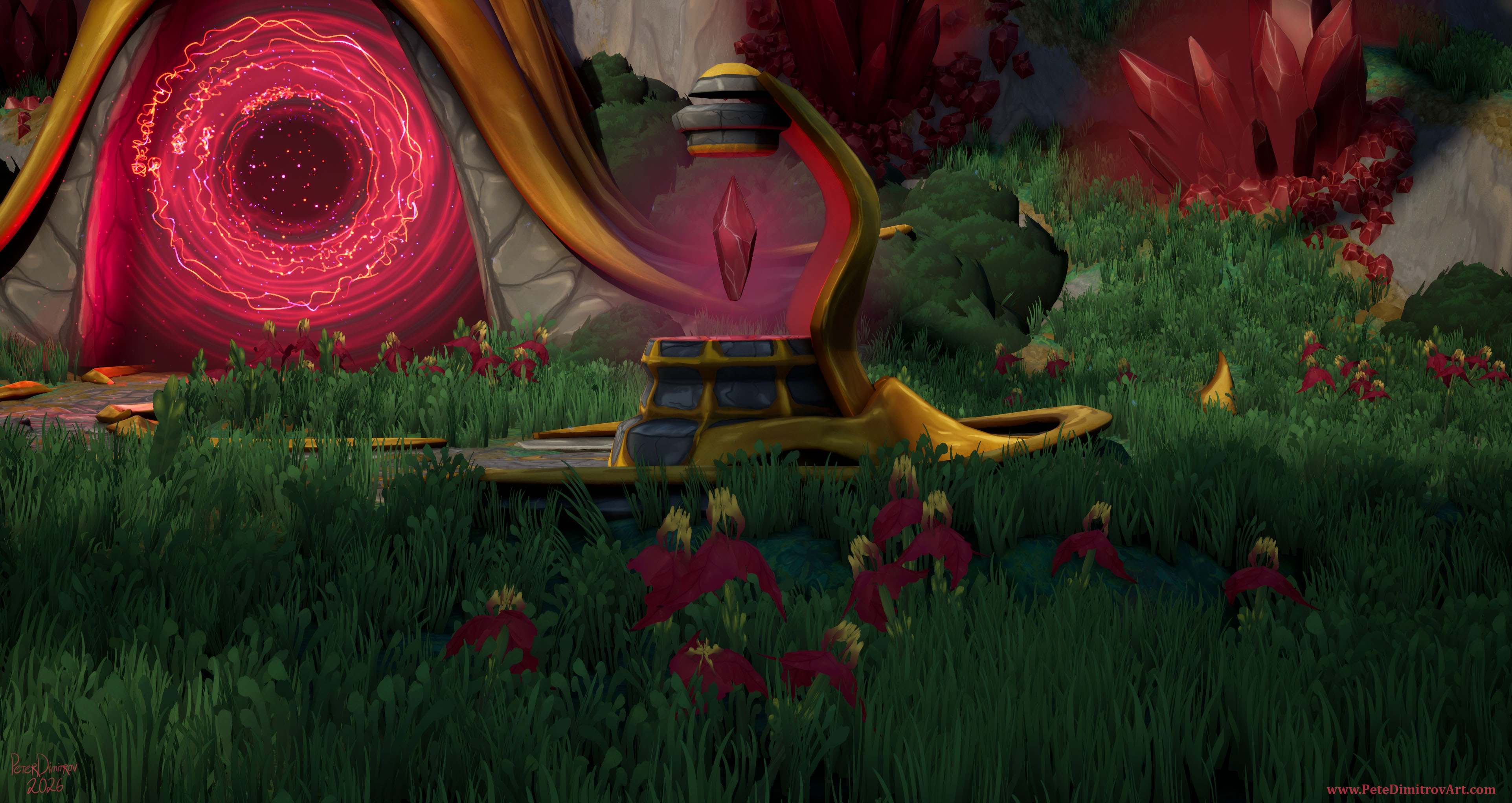
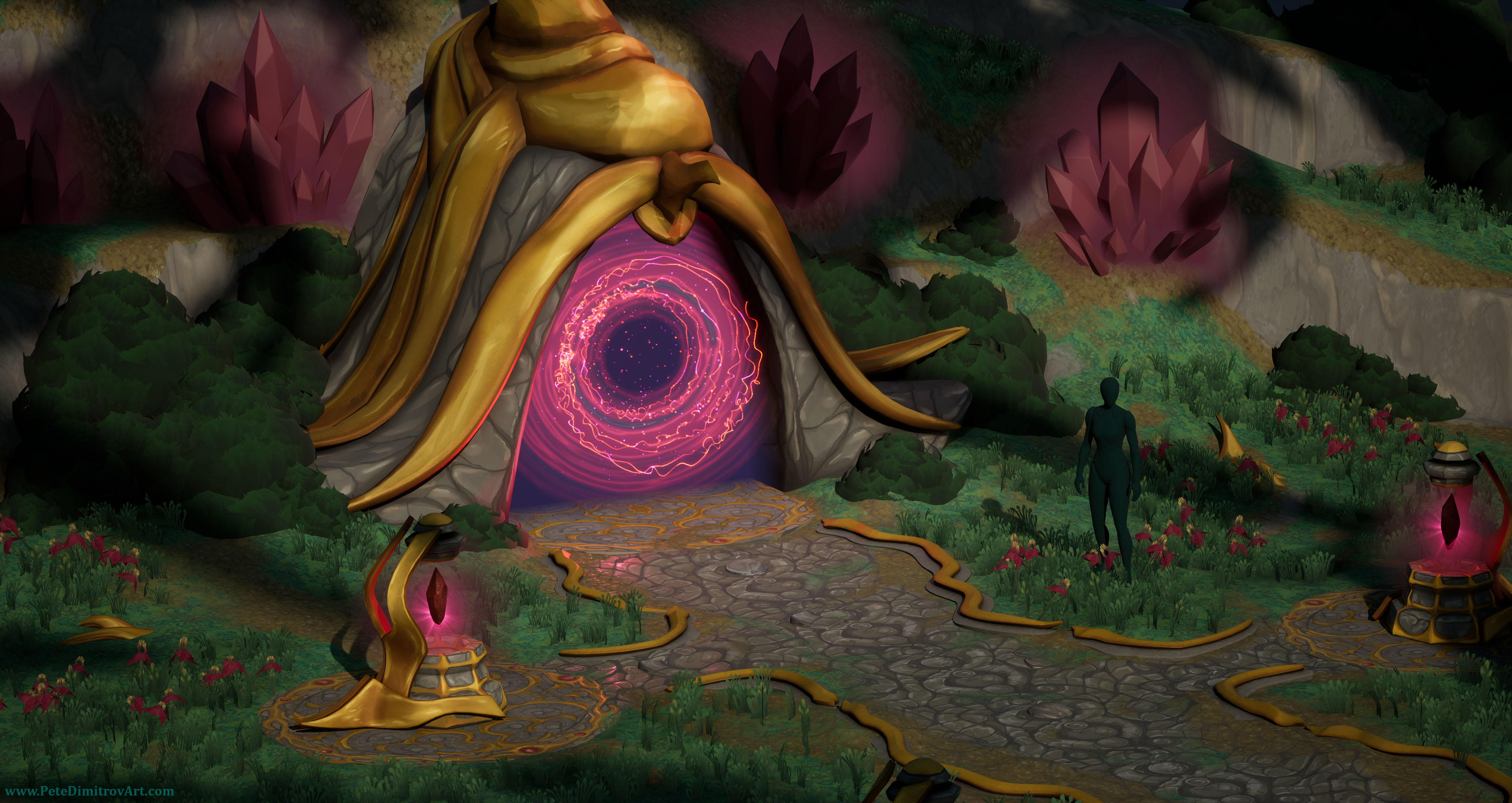
Texturing the Portal Door
I had lots of props and pieces in the scene that were not refined at all.
For example, the bushes were just oblong spheres with a green checkerboard textures. I was now slowly replacing all of that, however. The portal gateway prop was sitting untextured. I had the inner VFX and the event horizon of the portal refined. I actually made an entire tutorial series on how I made that - find it:
Creating a Functional Gateway Portal in UE5 - Models, VFX, Blueprints - Blender, Niagara, Substance Designer - Educational Tutorial Series - YouTube.
Even though the portal art was refined, geometry all around, the stuff that was holding the portal VFX, was unrefined.
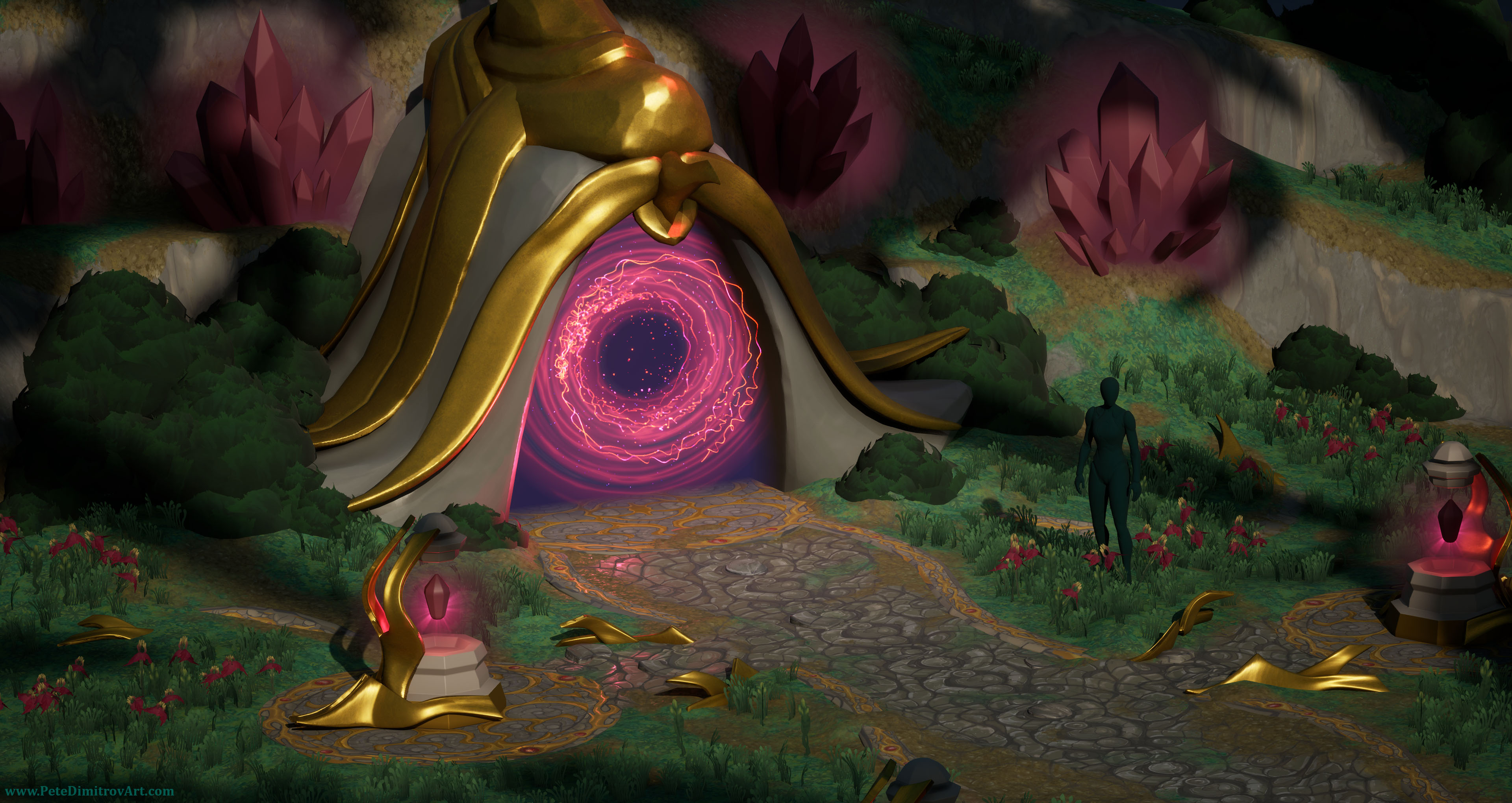
Before starting on yet more new props, I wanted to change that. As such I set off to hand paint the portal gateway prop. For a base, I used a tiling stone texture that I painted in Photoshop a few days prior. I slapped that onto the UV mapped gateway prop, instead of Substance Painter. I then masked the golden leaf elements and I reused some gold smart material I had set up when I was working on the mage tower version of this diorama.
With those rudimentary materials placed in, I started to hand paint cracks and details on top. I got from the gray, blank visual to a more refined stone and gold. All can be seen in the screenshots below.
Next Time
I’ve not made the next video yet, but I have all of my screen footage and screenshots for it. I’ll be editing it soon and you will be able to see more progress on this diorama. I think next time, we will look at the cobbled path sides. I like the cobble texture I made, but I was missing some framing devices at the edges of the cobble pathway. As such I decided to make some snake-like, golden extrusions that decorate the sides and frame the entire composition nicely.
If there is something specific that you would like me to talk about, when it comes to the making of this diorama, feel free to reach out in YouTube video comments or on Bluesky.
Thanks for reading,
Pete.
If you enjoyed this blog post, consider subscribing in the form below. That way you will get a notification the next time I publish a new blog.